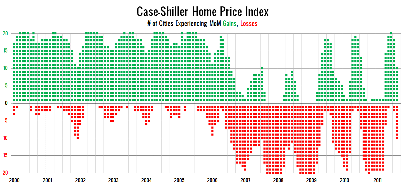
I came up with a new way to visualize the month-over-month price changes in the Case-Shiller Home Price Index for all twenty cities they track, which I posted over on the Redfin Seattle blog on Tuesday. I rather liked the simplicity of this new visualization, so I decided to clean it up a bit more and post another version here:
I’ve left out 2000 through 2004 on this chart, since those years all look pretty much the same as 2005, but you can view a full chart of 2000 through August 2011 here. In the more “normal” years before the bubble started to bust, most cities stayed month-over-month positive through the fall.
Ordinarily, the number of cities in negative territory doesn’t start to pile up until November or December. This year we went from just two cities negative in July to ten in August, which to me indicates that the market is still quite weak, and definitely not in any sort of “recovery” mode.


OMG.
You get actual spendable US cash money to produce this, IMO (wow, colorized-ooh) drivel ?
You’re a Good BSer, I’ll give ya that.
Keep paying your taxes, Olympia needs them.
Rate this comment:
0
0
RE: 3rd Generation @ 1 – Super-constructive feedback, as usual. I’m sorry to hear that armed thugs keep forcing you to return to this site despite how much you loath its content.
Rate this comment:
0
0
What’s interesting about that is it shows the national market, which apparently started heading south in 2006, while our market was still doing okay, if not too okay. What I don’t recall though is bad news about the overall economy (not housing market related) in 2006. Maybe I’m just forgetting something from back then.
Rate this comment:
0
0
I like this chart.
Good job Tim.
Rate this comment:
0
0
RE: 3rd Generation @ 1 –
OMG! Are you a 3rd generation welfare recipient? You spend your time taking negative anonymous potshots online? Phu-king coward.
Rate this comment:
0
0
RE: 3rd Generation @ 1 – Truly unique chart and with the color scheme it is just in time for Christmas. What is not to like? 3rd rhymes with herd, nerd, slurred and turd. You must be from Zillow.
Rate this comment:
0
0
RE: Kary L. Krismer @ 3 – 2006 was the “Seattle is Special” year, where we kept joking about pick ponies holding up values here in Seattle while values collapsed everywhere else. Tim’s (correct) theory was that Seattle was just “behind the curve.” The offset chart Tim publishes every month at the bottom of the Case Shiller posts is a legacy from that time. If I recall correctly, you were writing at the Seattle PI Real Estate Blog, where everyone there thought Seattle values could never decline, and kept making fun of us “Bubble Bloggers.” We kept trying to tell you guys that Seattle is next to fall, but you all would just laugh and say we’re crazy, or were wishing doom and gloom onto people. I find it funny how you forgot about that time period, and you apparently never did notice that every other city had falling home values in 2006 except here.
Regarding the actual blog post, I think that chart is awesome Tim! I for one am glad that you found an employer that would pay you “actual spendable US cash money” for stuff like this.
Rate this comment:
0
0
If I’m reading that correctly there were no cities in the CS index in June that were in negative territory? Which would be a first since 2005.
What were the two cities in July that were in the negative?
Rate this comment:
0
0
By Julie Lyda, RE/MAX Northwest Realtors @ 8:
Yes, that’s true, and I pointed it out when the June Case-Shiller data came out in August: “…every city actually gained ground month-to-month for the first time in a long time.”
Phoenix and Las Vegas. See the September post on the Case-Shiller data.
Rate this comment:
0
0
Good chart. Can you make Seattle a purple dot?
Rate this comment:
0
0
That lonely green dot on Jan. 2007 was probably Seattle.
Rate this comment:
0
0
as a visualization tool it’s fine and I like the color scheme
The drawback I find, is that each dot is the same size which disregards the difference in size of each market. If you had a few months where all the large cities in the index were in the negative and the small cities in the positive, this graph might looked balanced. While the national index was dropping hard.
Rate this comment:
0
0
By Hugh Dominic @ 10:
I like that idea. Also maybe toning down the red and green so it still indicates positive and negative, but doesn’t scream Christmas.
Rate this comment:
0
0
the same charting using year-over-year change would be much more interesting. this chart would be mostly red.
Rate this comment:
0
0
“4. Owning a home as a patient investor should be cheaper than renting. The down payment is capital invested, and the yield on that capital is lower shelter costs.
The benefit/yield on renting is that it doesn’t tie up scarce capital and it does not commit the renter to staying in one locale. These benefits require a premium, i.e. renting is more costly than buying and owning a home as a patient investor.
In a market with too many homes and too few qualified buyers (especially if subsidies and giveaways were removed from the system), this rent/buy equilibrium would likely be established by home prices dropping significantly. ”
http://www.oftwominds.com/blogoct11/healthy-housing-market10-11.html
“Right now, the housing market is so constipated with bad debt, politically untouchable banks, Central State manipulation and the corrupting grip of speculative financialization, that no buyer can be assured that he/she will be able to sell their home in the future.
This leads to a very rational hesitation: in a weak, fractured and increasingly volatile labor market, it is risky to commit oneself to buying a house that could rapidly decrease in value and cannot be sold.
Talk about a bad deal: not only is one’s capital trapped, you’re physically trapped in an asset which could fall dramatically in value if the constipated market ever clears.”
Rate this comment:
0
0
By The Tim @ 2:
We’ve each probably paid up to 1/100th of a penny per hour’s worth of entertainment that we’ve derived from this site. I’m guessing 3rd Generation has contributed a big fat zero.
Now that’s something to really get bent out of shape about.
Rate this comment:
0
0