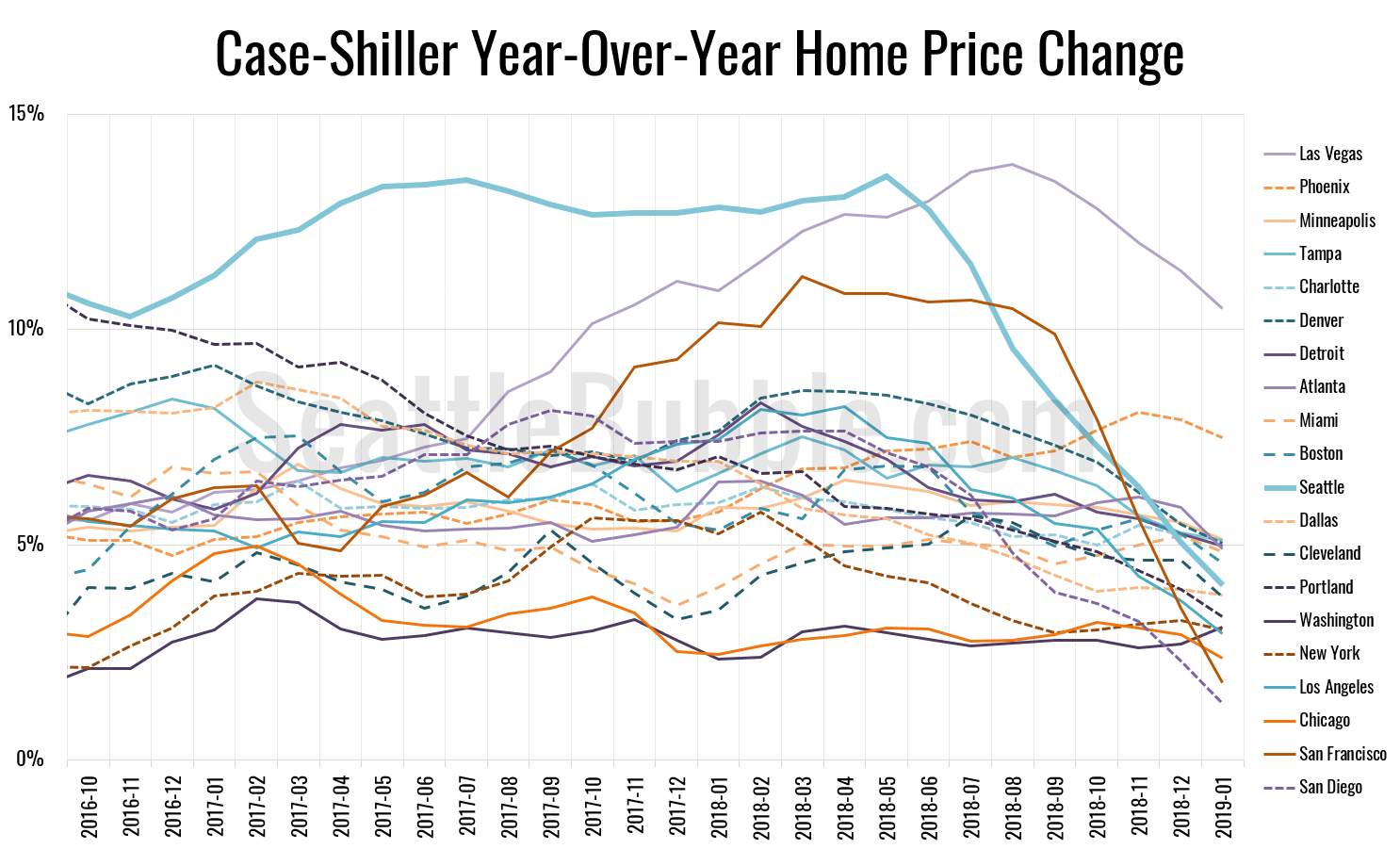
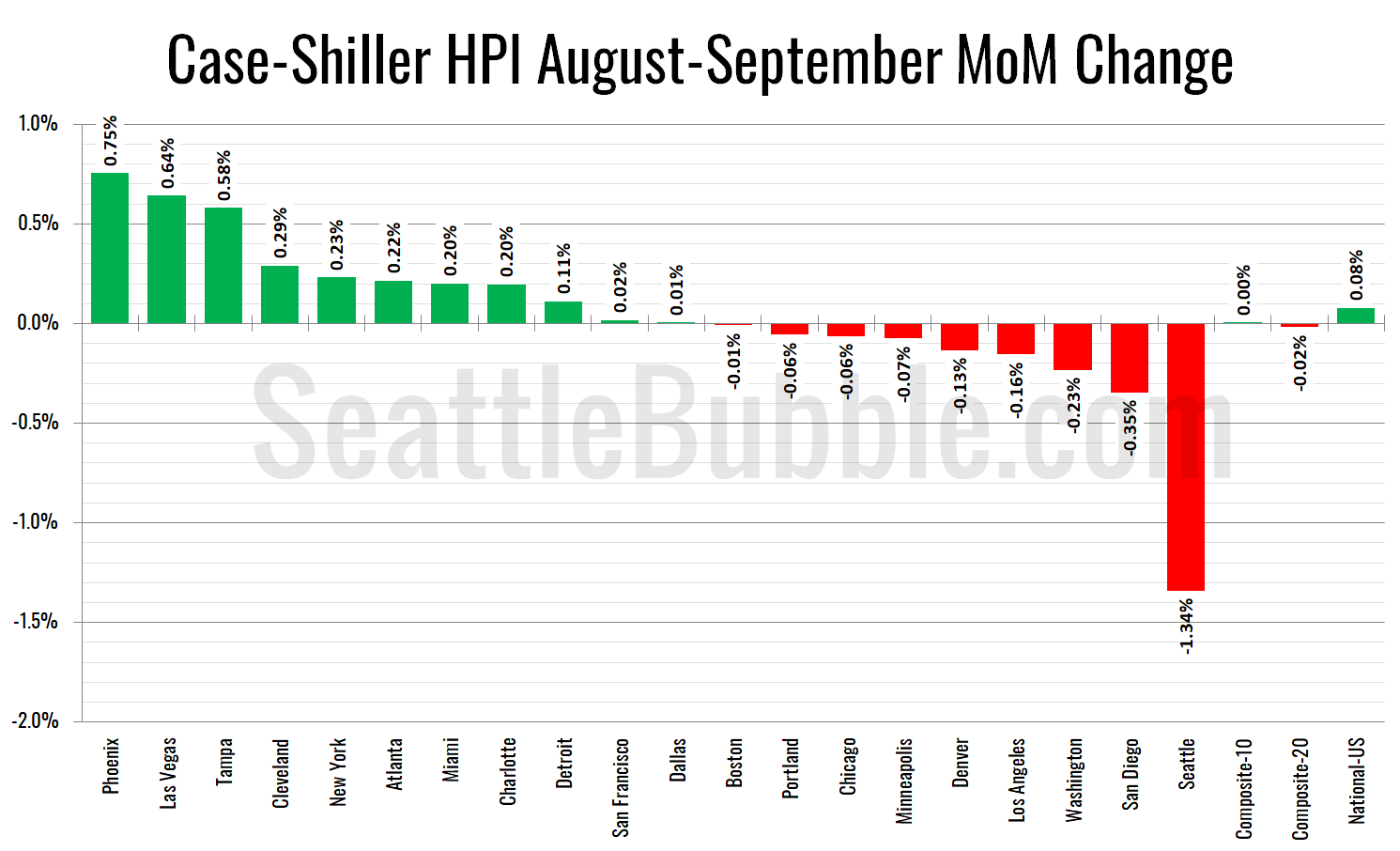
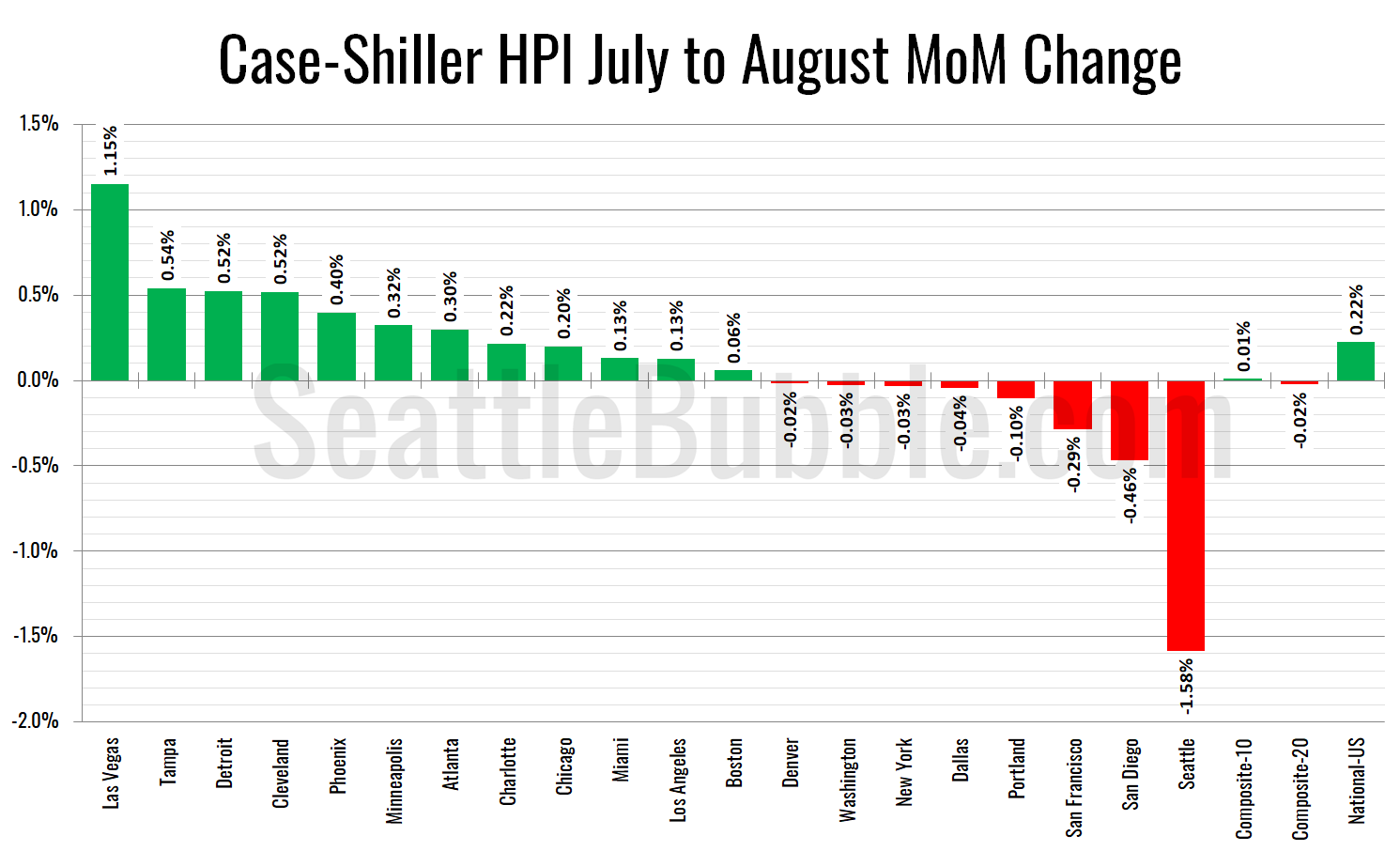
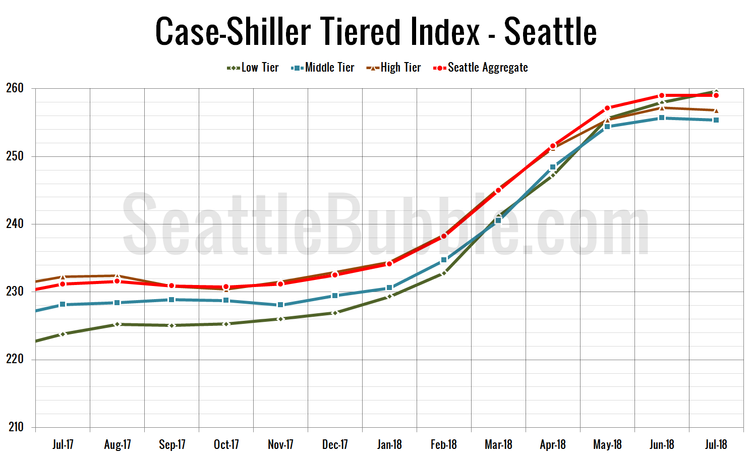
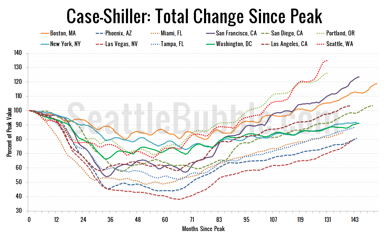
Seattle Bubble

News & discussion about real estate & the housing bubble in the Seattle area.

Seattle Bubble - News & discussion about real estate & the housing bubble in the Seattle area.

Entries Tagged as 'Case-Shiller'

Case-Shiller: Seattle Home Prices Bump Up Slightly Again in June

By The Tim on August 25th, 2009 at 6:30 AM · 51 Comments

Let’s make our regularly scheduled monthly check on the Case-Shiller Home Price Index. According to June data,

Up 0.4% May to June.
Down 0.3% May to June (seasonally adjusted)
Down 16.1% YOY.
Down 22.2% from the July 2007 peak

Last year prices fell 0.2% from May to June (not seasonally adjusted) and year-over-year prices were down 7.1%.

Here’s the usual graph, with L.A. & San Diego offset from Seattle & Portland by 17 months. Everybody’s getting some of the reduced rate of losses action, with Portland rising to -15.2%, Los Angeles at -17.8%, and San Diego at -16.0%. Note – Seattle: -16.1%, San Diego -16.0%. Hmm.

Case-Shiller HPI: West Coast

Note: This graph is not intended to be predictive. It is for entertainment purposes only.

Here’s the graph of all twenty Case-Shiller-tracked cities:

Case-Shiller HPI: All Cities

In June, ten of the twenty Case-Shiller-tracked cities experienced smaller year-over-year drops than Seattle (vs. nine last month). Dallas at -2.2%, Cleveland at -3.0%, Denver at -3.6%, Boston at -5.9%, Charlotte at -9.7%, Washington, DC at -11.7%, New York at -11.7%, Atlanta at -14.0%, Portland at -15.2%, and San Diego at -16.0%. Vegas pushed Phoenix out of the #1 spot for the largest year-over-year drop, as prices fell 32.3% in a single year.

Here’s an update to the peak-decline graph, inspired by a graph created by reader CrystalBall. This chart takes the twelve cities whose peak index was greater than 175, and tracks how far they have fallen so far from their peak. The horizontal axis shows the total number of months since each individual city peaked.

Case-Shiller HPI: Decline From Peak

In the twenty-two months since the price peak in Seattle prices have declined 22.2%. Still looks like more or less a flatline since March, putting Seattle slightly above San Francisco’s line, but slightly below Washington, DC.

The following chart takes the post-bubble years of 2007, 2008, and 2009 and indexes each January’s Case-Shiller HPI to 100 so we can get a picture of how this year’s declines compare to last year:

Post-Bubble Seattle Case-Shiller HPI by Year

Still tracking below 2008 compared to January, but performing slightly better than 2008 from March to June.

Here’s one more chart, for the folks that think that Case-Shiller is useless because it is somehow equivilent to the NWMLS data, but on a 2-month delay. The following chart shows 2009 home prices, indexed to January = 100, as reported by the NWMLS and by Case-Shiller.

Seattle Case-Shiller HPI and NWMLS SFH Median

The dramatic swing in the NWMLS data from down nearly 5% in March to up over 3% in June that had some people shouting about a bottom in home prices is non-existent in the Case-Shiller data. NWMLS March to June: +8.6% ($31,150). Case-Shiller March to June: +0.3%. This stark difference can most likely be attributed to a shifting geographic and sale tier mix, and is an excellent example of why the Case-Shiller data provides us a better picture of what’s really going on with home prices in the last few months.

Check back tomorrow for a post on the Case-Shiller data for Seattle’s price tiers.

(Home Price Indices, Standard & Poor’s, 08.25.2009)

→ 51 CommentsCategories: Statistics
Tags: , , , ,

Case-Shiller Tiers: Middle Tier Gains, Low & High Fall

By The Tim on July 29th, 2009 at 9:00 AM · 21 Comments

Let’s check out the three price tiers for the Seattle area, as measured by Case-Shiller. Remember, Case-Shiller’s “Seattle” data is based on single-family home repeat sales in King, Pierce, and Snohomish counties.

Note that the tiers are determined by sale volume. In other words, 1/3 of all sales fall into each tier. For more details on the tier methodologies, hit the full methodology pdf. Here are the current tier breakpoints:

  • Low Tier: < $268,947
  • Mid Tier: $268,947 – $395,294
  • Hi Tier: > $395,294

Interestingly, although the overall index fell slightly, the tier breakpoints increased from April to May, which would seem to indicate a shift in the sales mix of homes away from the low end toward the high end. This matches up with what I pointed out on the 8th, that there has been a general trend since the beginning of the year of increasing sales on the Eastside (more expensive homes) and decreasing sales in South King (less expensive homes).

First up is the straight graph of the index from January 2000 through May 2009.

Case-Shiller Tiered Index - Seattle

The low and high tiers both fell, by 0.3% and 0.7% respectively, while the middle tier increased by 0.3%. The “rewind” situation held steady for the third month in a row, with low tier rewound to March 2005 and the middle and the high tiers to May 2005.

Here’s a chart of the year-over-year change in the index from January 2003 through May 2009.

Case-Shiller HPI - YOY Change in Seattle Tiers

Not surprisingly given the directions of their respective indices, the YOY drop in the low and high tiers increased, while the middle tier decreased. Here’s where the tiers sit YOY as of May – Low: -18.4%, Med: -15.7%, Hi: -16.5%.

Lastly, here’s a decline-from-peak graph like the one posted yesterday, but looking only at the Seattle tiers.

Case-Shiller: Decline from Peak - Seattle Tiers

We’ve definitely got a spring price plateau instead of the spring price bounce we had last year.

(Home Price Indices, Standard & Poor’s, 07.28.2009)

→ 21 CommentsCategories: Statistics
Tags: , ,

Case-Shiller: Spring Home Price Bounce Erased in May

By The Tim on July 28th, 2009 at 6:15 AM · 61 Comments

Let’s make our regularly scheduled monthly check on the Case-Shiller Home Price Index. According to March data,

Down 0.3% April to May.
Down 16.6% YOY.
Down 22.5% from the July 2007 peak

Last year prices fell 0.5% from April to May and year-over-year prices were down 6.3%.

Here’s the usual graph, with L.A. & San Diego offset from Seattle & Portland by 17 months. Portland rose from April to May, so the year-over-year drops down there continue to come in smaller than here in Seattle. Meanwhile, down in SoCal, the losses shrank to less than 20% YOY. If this pattern keeps up, Seattle could be seeing larger YOY drops than Los Angeles & San Diego by September.

Case-Shiller HPI: West Coast

Note: This graph is not intended to be predictive. It is for entertainment purposes only.

Here’s the graph of all twenty Case-Shiller-tracked cities:

Case-Shiller HPI: All Cities

In May, nine of the twenty Case-Shiller-tracked cities experienced smaller year-over-year drops than Seattle (the previous four months it was eight). Dallas at -4.2%, Denver at -4.6%, Cleveland at -6.2%, Boston at -7.2%, Charlotte at -10.0%, New York at -12.1%, Washington, DC at -14.9%, Atlanta at -15.0%, and Portland at -16.3%. As usual, Phoenix had the largest year-over-year drop, with prices falling 34% in a single year.

Here’s an update to the peak-decline graph, inspired by a graph created by reader CrystalBall. This chart takes the twelve cities whose peak index was greater than 175, and tracks how far they have fallen so far from their peak. The horizontal axis shows the total number of months since each individual city peaked.

Case-Shiller HPI: Decline From Peak

In the twenty-one months since the price peak in Seattle prices have declined 22.5%. This spring’s flatline puts us right in line with San Francisco’s relative drop. San Francisco and DC both seem to be having uncharacteristically strong spring upticks this year.

Here’s the “rewind” chart. The horizontal range is selected to go back just far enough to find the last time that Seattle’s HPI was as low as it is now. This gives us a clean visual of just how far back prices have retreated in terms of months.

Case-Shiller HPI: Seattle Price Reversion

Seattle’s Case-Shiller value for May 2009 of 148.96 came in just barely below its May 2005 value of 148.97. Prices have now “rewound” four years and one month.

Finally, the following chart takes the post-bubble years of 2007, 2008, and 2009 and indexes each January’s Case-Shiller HPI to 100 so we can get a picture of how this year’s declines compare to last year:

Post-Bubble Seattle Case-Shiller HPI by Year

Note that last year the March to April uptick took two months to be erased, and prices fell nearly 12% from January to December. This year the March to April uptick was considerably smaller, and was erased in a single month.

Check back tomorrow for a post on the Case-Shiller data for Seattle’s price tiers.

(Home Price Indices, Standard & Poor’s, 07.28.2009)

[Update]
Since the news reports on the radio and in the papers this morning are focusing on the month-to-month increase in the 10-city and 20-city indices, I thought I would add this chart, which compares the month-to-month change for all 20 metro areas tracked by Case-Shiller:

Case-Shiller Month-to-Month Change

Of course, the seasonally-adjusted data (which is the only semi-sensible way to look at month-to-month numbers) paints a somewhat less rosy picture, but at least Seattle moves from fourth-worst to sixth-worst.

Case-Shiller Month-to-Month Change

→ 61 CommentsCategories: Statistics
Tags: , , , ,

Case-Shiller Tiers: Middle Tier Flattens, Low & High Tick Up

By The Tim on July 1st, 2009 at 6:00 AM · 28 Comments

Let’s check out the three price tiers for the Seattle area, as measured by Case-Shiller. Remember, Case-Shiller’s “Seattle” data is based on single-family home repeat sales in King, Pierce, and Snohomish counties.

Note that the tiers are determined by sale volume. In other words, 1/3 of all sales fall into each tier. For more details on the tier methodologies, hit the full methodology pdf. Here are the current tier breakpoints:

  • Low Tier: < $267,042
  • Mid Tier: $267,042 – $392,156
  • Hi Tier: > $392,156

First up is the straight graph of the index from January 2000 through April 2009.

Case-Shiller Tiered Index - Seattle

All three tiers bumped up in April, just like last year. The low and high tiers both bumped up 0.28%, while the middle tier increased just 0.03% The low tier has rewound to March 2005, the middle and the high tiers to May 2005 (all the same as March’s data).

Here’s a chart of the year-over-year change in the index from January 2003 through April 2009.

Case-Shiller HPI - YOY Change in Seattle Tiers

The low tier actually saw a slight moderation in YOY declines in April, similar to the blip we saw in the high tier in February. Here’s where the tiers sit YOY as of April – Low: -18.4%, Med: -16.3%, Hi: -16.4%.

Lastly, here’s a decline-from-peak graph like the one posted yesterday, but looking only at the Seattle tiers.

Case-Shiller: Decline from Peak - Seattle Tiers

Whereas April 2008 resulted in a bit of a bump in the chart, April 2009 looks like more of a plateau.

(Home Price Indices, Standard & Poor’s, 06.30.2009)

→ 28 CommentsCategories: Statistics
Tags: , ,

Case-Shiller: Anemic Spring Bounce in April

By The Tim on June 30th, 2009 at 7:00 AM · 116 Comments

Let’s make our regularly scheduled monthly check on the Case-Shiller Home Price Index. According to March data,

Up 0.2% March to April.
Down 16.8% YOY.
Down 22.3% from the July 2007 peak

Last year prices rose 0.7% from March to April and year-over-year prices were down 4.9%.

Here’s the usual graph, with L.A. & San Diego offset from Seattle & Portland by 17 months. Portland continued to turn in a slightly smaller YOY loss than Seattle. Meanwhile, down in SoCal, the losses continue to get smaller. If Seattle and Portland keep following the trend set by San Diego and Los Angeles, we will see the most extreme YOY drops next March.

Case-Shiller HPI: West Coast

Note: This graph is not intended to be predictive. It is for entertainment purposes only.

Here’s the graph of all twenty Case-Shiller-tracked cities:

Case-Shiller HPI: All Cities

In April, eight of the twenty Case-Shiller-tracked cities experienced smaller year-over-year drops than Seattle (the same number as the previous four months). Denver at -4.9%, Dallas at -5.0%, Boston at -7.7%, Charlotte at -10.0%, Cleveland at -10.5%, New York at -12.2%, Atlanta at -15.2%, and Portland at -16.0%. As usual, Phoenix had the largest year-over-year drop, with prices falling 35% in a single year.

Here’s an update to the peak-decline graph, inspired by a graph created by reader CrystalBall. This chart takes the twelve cities whose peak index was greater than 175, and tracks how far they have fallen so far from their peak. The horizontal axis shows the total number of months since each individual city peaked.

Case-Shiller HPI: Decline From Peak

In the twenty months since the price peak in Seattle prices have declined 22.3%. April’s uptick brought us further from the trendlines of Phoenix and Tampa, and closer to San Francisco. April saw similar upticks in Seattle, Portland, San Francisco, DC, and Boston.

Here’s the “rewind” chart. The horizontal range is selected to go back just far enough to find the last time that Seattle’s HPI was as low as it is now. This gives us a clean visual of just how far back prices have retreated in terms of months.

Case-Shiller HPI: Seattle Price Reversion

Seattle’s Case-Shiller value for April 2009 of 149.38 came in just above its May 2005 value of 148.97. Prices have now “rewound” a full four years (longer than this site has been in existence).

Finally, the following chart takes the post-bubble years of 2007, 2008, and 2009 and indexes each January’s Case-Shiller HPI to 100 so we can get a picture of how this year’s declines compare to last year:

Post-Bubble Seattle Case-Shiller HPI by Year

We got the uptick we were expecting for April, but compared to last year’s bump, I’d have to call it somewhat… anemic. If price declines only manage to match last year, Seattle’s index will be just over 29% off peak by December. If we continue to turn in stronger price drops than 2008, we’ll be closer to 32% off peak by December.

Check back tomorrow for a post on the Case-Shiller data for Seattle’s price tiers.

(Home Price Indices, Standard & Poor’s, 06.30.2009)

→ 116 CommentsCategories: Statistics
Tags: , , , ,

Case-Shiller Tiers: Low Tier Passes 25% Off Peak

By The Tim on May 27th, 2009 at 5:00 AM · 70 Comments

Let’s check out the three price tiers for the Seattle area, as measured by Case-Shiller. Remember, Case-Shiller’s “Seattle” data is based on single-family home repeat sales in King, Pierce, and Snohomish counties.

Note that the tiers are determined by sale volume. In other words, 1/3 of all sales fall into each tier. For more details on the tier methodologies, hit the full methodology pdf. Here are the current tier breakpoints:

  • Low Tier: < $264810
  • Mid Tier: $264810 – $387274
  • Hi Tier: > $387274

First up is the straight graph of the index from January 2000 through March 2009.

Case-Shiller Tiered Index - Seattle

All three tiers dropped again in March, with the middle tier taking the smallest hit at -1.7% and the low tier taking the largest at -2.4%. The low tier has rewound to March 2005, the middle and the high tiers to May 2005.

Here’s a chart of the year-over-year change in the index from January 2003 through March 2009.

Case-Shiller HPI - YOY Change in Seattle Tiers

The high tier reversed its trend of improvement from February, hitting a new low in March at -15.8%. The low tier fell furthest over the year yet again. Here’s where the tiers sit YOY as of March – Low: -18.5%, Med: -15.8%, Hi: -15.8%.

Lastly, here’s a decline-from-peak graph like the one posted yesterday, but looking only at the Seattle tiers.

Case-Shiller: Decline from Peak - Seattle Tiers

The declines in each tier seem to be tracking fairly close to each other the last couple of months.

(Home Price Indices, Standard & Poor’s, 05.26.2009)

→ 70 CommentsCategories: Statistics
Tags: , ,