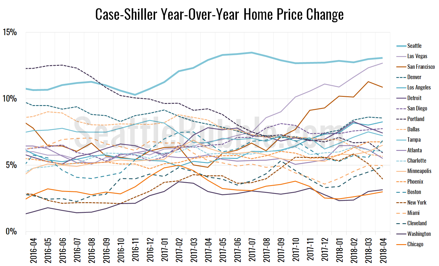
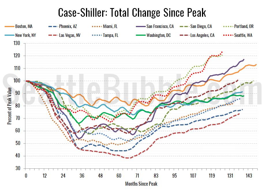
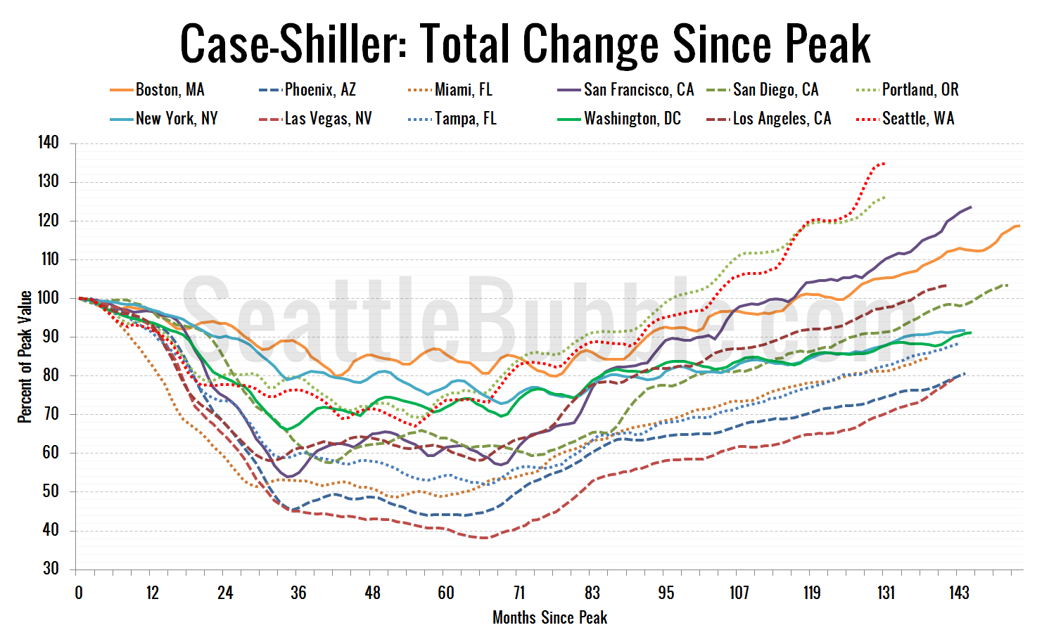
Seattle Bubble

News & discussion about real estate & the housing bubble in the Seattle area.

Seattle Bubble - News & discussion about real estate & the housing bubble in the Seattle area.

Entries Tagged as 'graphs'

Are More Pending Sales Falling Through?

Posted by The Tim on August 22nd, 2008 at 10:46 AM · 52 Comments

I mentioned this in the comments on a recent post, but I think it’s interesting enough to merit its own post. Since we regularly track pending sales as our measure of monthly sales volume in the monthly charts, I was curious to know whether the credit crunch has caused closed sales volume to diverge from pending.

What you see below is a graph of quarterly King County SFH sales volume according to the NWMLS, with closed sales offset by one month (since most closings take 30 days). The blue and red lines represent pending and closed sales (left axis), while the green bars represent the percent difference between closed sales and pending sales (right axis).

Pending & Closed Sales - King Co. SFH
Click to enlarge

For some reason the first quarter has historically seen the largest difference between pending and closed sales, averaging 8.8% fewer closed sales than pending sales from 2000 through 2007. The first quarter of 2008 stayed close to that figure with 7.5% fewer closed sales than pending.

The second quarter average difference for 2000-2007 was 4.1%. 2008 second quarter closed sales were off 15.9% from pendings, the largest quarterly discrepancy to date.

I think this will be an interesting data set to keep an eye on as the year progresses. 16% of pending sales falling through is certainly not something to ignore when the long-term average 2000-2007 has been just 4-5%.

Categories: Statistics
Tags: , , , , ,

Puget Sound Counties July NWMLS Update

Posted by The Tim on August 20th, 2008 at 11:33 AM · 99 Comments

Let’s check in on the NWMLS statistics from around the sound.

Here’s where the YOY stats stand for each of the six counties as of July 2008:

King - Price: -7.5% | Listings: +22.9% | Sales: -24.4% | MOS: 6.6
Snohomish - Price: -5.5% | Listings: +10.5% | Sales: -32.8% | MOS: 8.4
Pierce - Price: -10.0% | Listings: -5.8% | Sales: -13.2% | MOS: 7.6
Kitsap - Price: -10.9% | Listings: +4.2% | Sales: -15.9% | MOS: 8.9
Thurston - Price: -5.8% | Listings: -6.1% | Sales: -24.8% | MOS: 6.4
Island - Price: -18.8% | Listings: +8.9% | Sales: -13.5% | MOS: 10.7
Skagit - Price: -3.9% | Listings: +8.5% | Sales: -19.2% | MOS: 9.0

Following below are the graphs you’ve come to expect. Click below to continue reading.

[Read more →]

Categories: Statistics
Tags: , , , , , , , , , ,

July Neighborhoods Months of Supply Update

Posted by The Tim on August 18th, 2008 at 12:17 PM · 49 Comments

Here’s the latest update on months of supply, or “absorption rates” for the 30 NWMLS areas in King County. For an explanation of what months of supply means, please refer to the original neighborhood MOS breakdown post. Don’t forget you can view a map of these areas here.

Remember: Over 6 MOS is a buyer’s market, which gives buyers more negotiating power, but doesn’t mean homes are priced attractively for buyers or that it’s a good time to buy. Before this year, the longest that King County as a whole has sustained a MOS above 6 was 4-5 months in the winter of 1994-1995. July MOS for King County came in at 6.62 (compared to 4.06 for July 2007), bringing the current run to eleven months.

In the graphs below, you’re looking at the MOS for the “Res Only” data from the NWMLS King County Breakout pdfs for the one-year period of August 2007 through July 2008. The bar graph is centered vertically on 6.0 MOS, so that it is easier to visually tell the difference between a seller’s and buyer’s market (i.e. - shorter bars mean a more balanced market). Each graph again has the same scale on the vertical axis and has the King County aggregate figure plotted in red on the far right, so they can be easily compared.

[Read more →]

Categories: Neighborhoods · Statistics
Tags: , , , ,

New Market Analysis Tools from Redfin

Posted by The Tim on August 13th, 2008 at 5:00 PM · 32 Comments

Redfin rolled out some great new statistical features today that are definitely worth mentioning.

New Redfin StatisticsAutomated market statistics broken down by city, neighborhood, or zip code, with charts showing inventory, price per square foot, and price reduction trends over the last year.

CEO Glenn Kelman announces the new features in a blog post today:

Redfin released a big, beautiful new version of its website last night. For the first time in years, there’s a whole new web page on the site — not just a map and a web page for each property on the map — but a set of graphs, pictures, charts, numbers showing all the pricing trends for each of the 9,000 neighborhoods, postal codes and cities Redfin covers. This is the good stuff, drawn straight from the MLS databases real estate agents use to list properties and the tax rolls that counties use to record sales.

It’s a big deal, because consumers have never had access to reliable real estate data down to the neighborhood level.

Now you can see what’s really going on with your neighborhood’s prices, right now: dollars per square foot, numbers of homes for sale, days on market, price reductions. We split out condos and houses because they’re priced so differently. The pricing graphs show listings and past sales separately, so you get a view of what sellers expect and what they really got.

He also takes the time to go through a few other new features they have rolled out for home shoppers, so definitely go check out his whole post.

To access the spiffy new statistics, just type in a city, zip code, or neighborhood into the Redfin search field, wait for it to populate the map, then click “View [the area you typed] Inventory & Pricing Trends” in the upper-left corner of the map.

These tools are a great resource for figuring out what’s going on in the “hyper local” real estate markets that interest you. Kudos to Redfin for coming out with such great resources for home buyers and sellers to track what’s going on in their own back yard.

Categories: News
Tags: , , ,

Bubbles vs. Steady Appreciation

Posted by The Tim on August 1st, 2008 at 10:38 AM · 88 Comments

Here’s an interesting way to look at the Case-Shiller data: comparing the actual index values to theoretical values as they would look if they grew at a steady rate year-over-year.

Case-Shiller HPI and Annually Compounded Rates

The data starts in 1990 because that is the first year that the Case-Shiller index began tracking Seattle. 1990 may not be the best year to use as a baseline, since it was right at the peak of a good-sized run-up (see the 60-year Seattle home price graph), but it still gives us a good idea of where home prices would be if the appreciation curve had remained in a healthy range.

Up until about 2003, home prices in our area held pretty close to the 5% yearly appreciation curve.  At our peak, we crested just over 7% per year, and as of the latest data, Seattle’s Case-Shiller HPI sits at around 6.3% per year, or 25% above the 5% level.

For comparison, here is the same plot, but with New York, Chicago, Boston, and San Francisco added, and all cities re-indexed to 1990=100:

Case-Shiller HPI and Annually Compounded Rates

Is there some compelling argument why home prices in Seattle should be averaging around 6% per year appreciation since 1990, while values in other larger, more world-class cities are all tumbling below the 5% per year mark? If there is, I’d love to hear it. If not, I don’t see any reason to expect that prices won’t keep falling here in the Puget Sound until they are more in line with the norm.

This method was inspired by the Median House Price vs. Annually Compounded Interest tool written by regular commenter Jonness.  You can use the tool to compare hundreds of other cities in this manner. Jonness also has a number of other valuable home price comparison tools on his website HousingCorrection.com.

Categories: Statistics
Tags: , ,

June Neighborhoods Months of Supply Update

Posted by The Tim on July 28th, 2008 at 8:30 AM · 46 Comments

Here’s the latest update on months of supply, or “absorption rates” for the 30 NWMLS areas in King County. For an explanation of what months of supply means, please refer to the original neighborhood MOS breakdown post. I apologize for the tardiness, I was hoping to have the color-coded map ready by this month’s update, but no luck. You can still see a good map of these areas here though.

Remember: Over 6 MOS is a buyer’s market, which gives buyers more negotiating power, but doesn’t mean homes are priced attractively for buyers or that it’s a good time to buy. Before this year, the longest that King County as a whole has sustained a MOS above 6 was 4-5 months in the winter of 1994-1995. June MOS for King County came in at 6.04 (compared to 3.50 for June 2007), bringing the current run to ten months.

In the graphs below, you’re looking at the MOS for the “Res Only” data from the NWMLS King County Breakout pdfs for the eleven-month period of July 2007 through June 2008. The bar graph is centered vertically on 6.0 MOS, so that it is easier to visually tell the difference between a seller’s and buyer’s market (i.e. - shorter bars mean a more balanced market). Each graph again has the same scale on the vertical axis and has the King County aggregate figure plotted in red on the far right, so they can be easily compared.

[Read more →]

Categories: Neighborhoods · Statistics
Tags: , , , ,