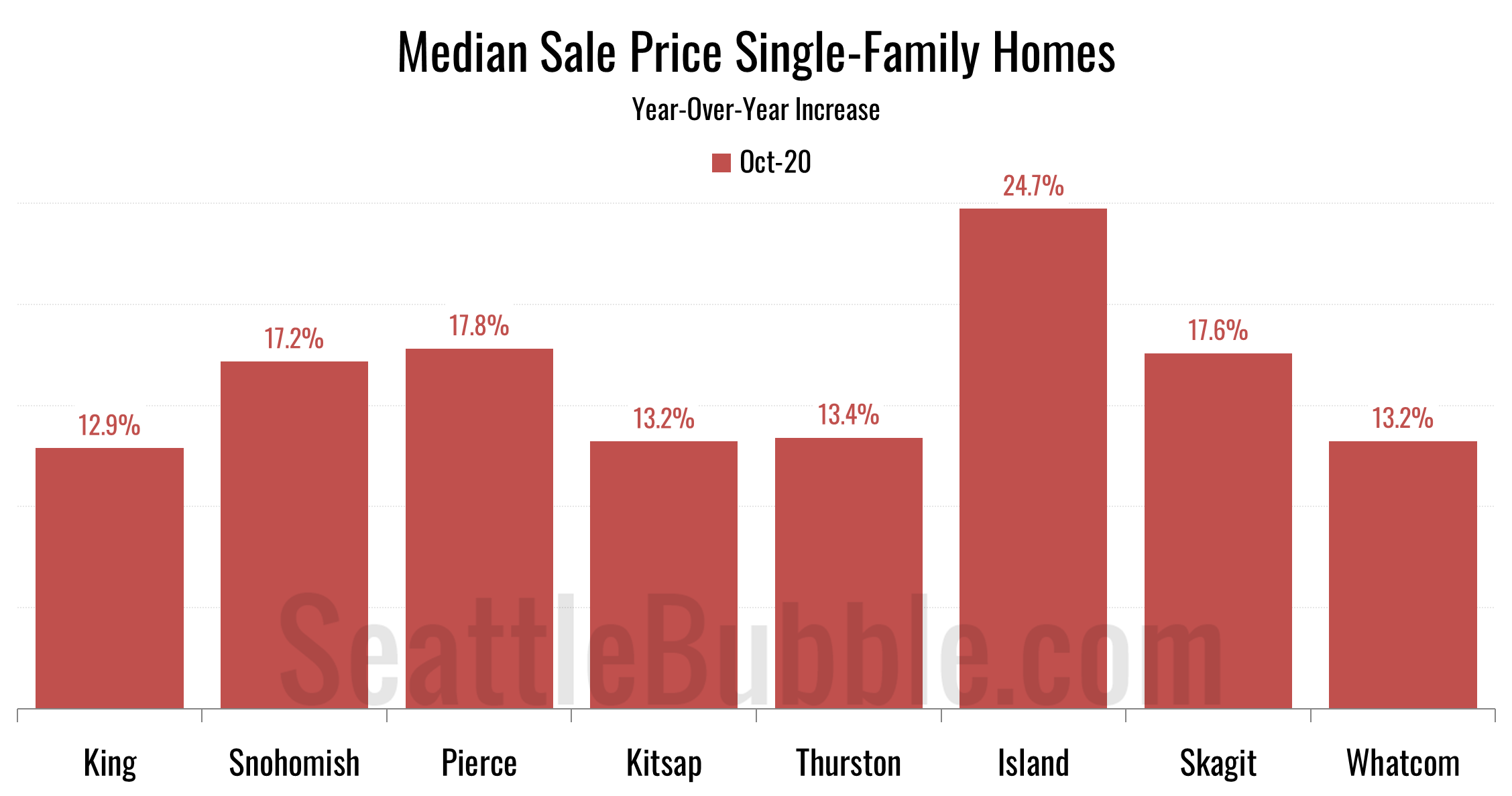
Let’s take a look at our stats for the local regions outside of the King/Snohomish core. Here’s your October update to our “Around the Sound” statistics for Pierce, Kitsap, Thurston, Island, Skagit, and Whatcom counties…
local real estate news, statistics, and commentary without the sales spin.
Let’s take a look at our stats for the local regions outside of the King/Snohomish core. Here’s your October update to our “Around the Sound” statistics for Pierce, Kitsap, Thurston, Island, Skagit, and Whatcom counties…
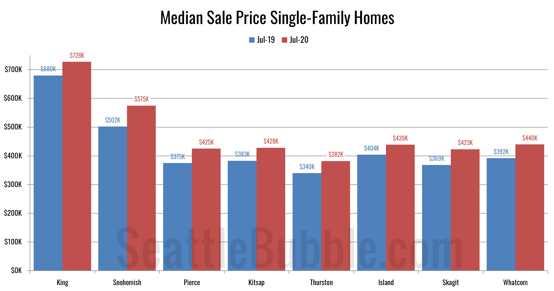
Okay, let’s get back to the data. It’s about time. Okay, it’s way past time. Anyway, whatever. Here’s some data. Since it’s been a while, let’s start with a few high-level stats from around the Puget Sound…
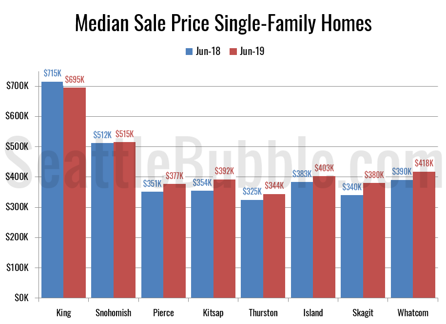
I promised an updated look at June data for the outlying counties, so let’s have a look at that. Here’s the latest update to our “Around the Sound” statistics for King, Snohomish, Pierce, Kitsap, Thurston, Island, Skagit, and Whatcom counties.
King County is the only place where prices are declining, and it also has the largest increase in active listings compared to a year ago. On the flip side, pending sales were up the most in King County, and it had one of the smallest declines in closed sales (sales rose in Skagit though). In most of the other Puget Sound counties, sales are declining, and listings are either falling or not increasing by much, and prices are rising.
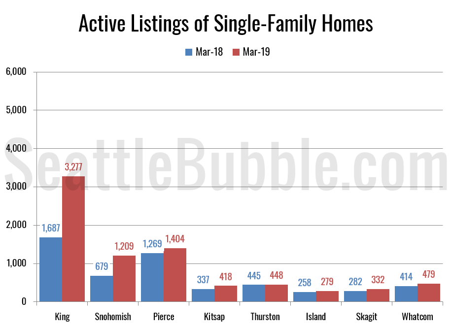
It’s been a few months since we had a look at the stats in the broader Puget Sound area, so let’s update our charts through March. Here’s the latest update to our “Around the Sound” statistics for King, Snohomish, Pierce, Kitsap, Thurston, Island, Skagit, and Whatcom counties.
King County still has some of the most dramatic changes, as the only county with a drop in the median price and by far the biggest increase in active listings. That said, active listings are up and closed sales are down across the board. Skagit, Kitsap, Pierce, and Thurston all still saw double-digit year-over-year declines in sales…
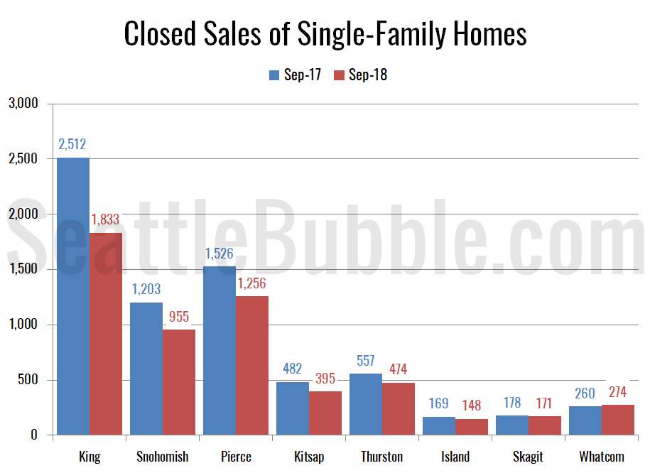
With September’s stats in hand, let’s look at broader Puget Sound area. Here’s the latest update to our “Around the Sound” statistics for King, Snohomish, Pierce, Kitsap, Thurston, Island, Skagit, and Whatcom counties.
…
The biggest gains in new listings and active inventory are still in King County. Snohomish, Pierce, Kitsap and Thurston all also saw some decent gains in inventory, but in Island, Skagit, and Whatcom inventory was flat or still down. Meanwhile, closed sales are falling everywhere but Whatcom.