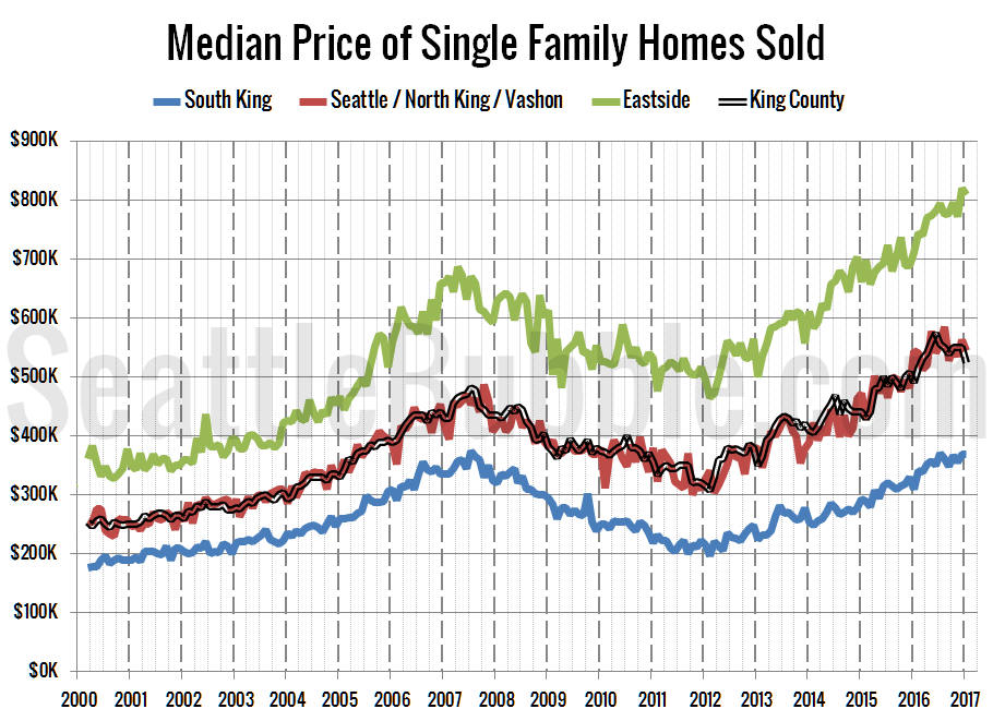
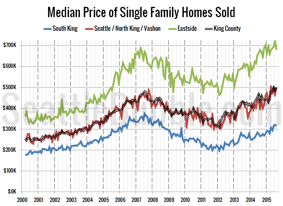
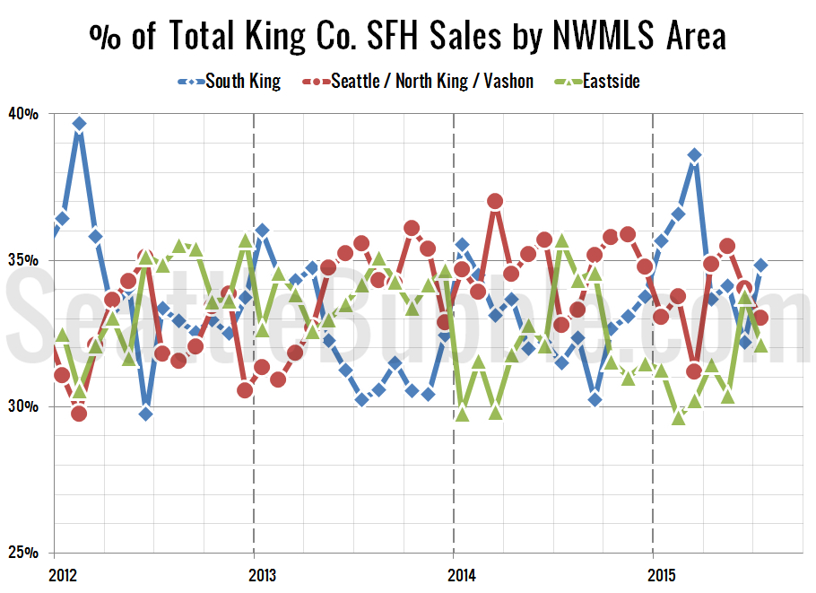
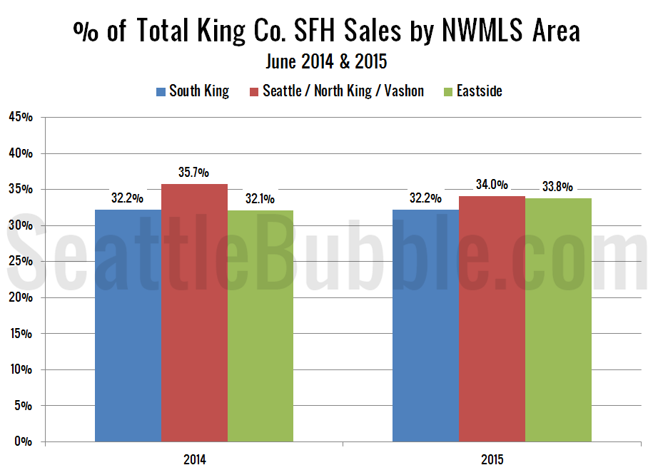
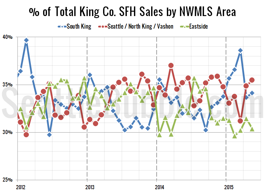
Seattle Bubble

News & discussion about real estate & the housing bubble in the Seattle area.

Seattle Bubble - News & discussion about real estate & the housing bubble in the Seattle area.

Entries Tagged as 'median'

King / San Diego Median Price Comparison Revisited

By The Tim on September 24th, 2008 at 7:00 AM · 72 Comments

I thought since I’ve been on a road trip in California the last week or so, it would be appropriate to post a quick update on the San Diego / King County median price comparison I originally posted back in March.

Here’s where King and San Diego counties stand as of August:

San Diego & King County Median Home Prices
Click to enlarge

Back in March (February’s data), San Diego was still about 5% more expensive than King, but if our two assumptions (King prices stay flat, San Diego’s declines slow) were to have held, San Diego would have been 7% cheaper by December.

Well, neither assumption has held true. King has declined 4% in the last six months, and San Diego’s price declines have accelerated. However, since San Diego’s price drops have actually increased their pace, San Diego County is now nearly 10% cheaper than King County.

Will the Seattle area continue to command a premium over sunny, tech-heavy, defense-industry, world-class Southern California? Time will tell, but I’m predicting that this particular situation won’t last much more than a year, maybe two.

→ 72 CommentsCategories: Statistics
Tags: , , ,

San Diego County Now Cheaper than King

By The Tim on May 20th, 2008 at 6:15 AM · 36 Comments

I thought it would be fun to check back in with an update on the San Diego / King County home price comparison I made back in March.

As of the latest Case-Shiller data (February) home prices San Diego have fallen 24% from their November 2006 peak. The Seattle area has dropped 6.5% from its July 2007 peak.

April median price for all homes sold (single-family + condos):

Both counties had an anemic spring bounce of sorts, but that didn’t stop aggregate home prices in San Diego County from falling below King County, thanks to a huge drop in March. Here’s an update of the graph from March, based on the following two supposedly realistic assumptions:

  1. King County home prices will remain flat through December.
  2. San Diego County home prices will continue to decline, at roughly half the rate they have dropped in the last six months.

San Diego & King County Median Home Prices
Click to enlarge

The gap has widened since March, and those assumptions now lead to an 11% price difference by the end of the year. But of course San Diego doesn’t have any tech jobs, and their economy is basically in the toilet, so that makes perfect sense. Wait, neither of those statements is true at all.

→ 36 CommentsCategories: Statistics
Tags: , , ,

Median Price Comparison: King & San Diego Counties

By The Tim on March 20th, 2008 at 10:38 AM · 118 Comments

Here’s an interesting comparison.

As of December’s Case-Shiller data, prices in San Diego County have fallen nearly 20% from their November 2005 peak. As of last month, their median price for all homes sold (single-family and condos) was $415,000 (source: San Diego Union-Tribune).

In the Seattle area, December’s Case-Shiller put prices off 4% from their July 2007 peak. Last month the median price for all homes sold in King County was $395,000 (source: NWMLS).

Now, if you listen to the so-called real estate “experts” around here, they will tell you that prices here in Seattle are just going to “plateau” and stay flat for a while, before continuing their ever-upward journey to the stars. On the other hand, no one in their right mind believes that San Diego’s price drops are over yet, given the continued severity of the foreclosure problem down there.

So let’s project the rest of this year for King County and San Diego County based on two allegedly reasonable assumptions:

  1. King County home prices will remain flat through December.
  2. San Diego County home prices will continue to decline, at roughly half the rate they have dropped in the last six months.

Here’s what that would look like:

San Diego & King County Median Home Prices
Click to enlarge

If those two predictions were to hold true, homes in sunny San Diego will be seven percent cheaper than here in King County by the end of the year. I’m probably just ignorant of how super-great-awesome the Seattle area truly is, but to me, that doesn’t seem very likely. I predict that if such a turnaround does take place, it won’t last long once people realize that they can move back to California and buy a home for less money than in Seattle.

→ 118 CommentsCategories: Statistics
Tags: , , ,

Revisiting the Median Price Sales Breakdowns

By The Tim on March 13th, 2008 at 2:06 PM · 14 Comments

I think it’s a good time to revisit the median price discussion that I first brought up last August.

The median price is a decent indicator of the general direction of home prices, but it definitely has shortcomings. The biggest problem is that the median is largely influenced by the mix of sales between high and low-value houses. In a relatively stable housing market, when the mix stays somewhat constant, the median gives a fairly accurate picture of what’s going on with prices. However, when sales of houses on one end of the price spectrum begin to drop or increase at a rate considerably faster than other price tiers, the median gets all screwed up.

In order to investigate this phenomenon, we can break King County into three regions. For a more in-depth explanation of this breakdown, refer to the original median price post.

  • low end: South King
  • mid range: Seattle / North King / Vashon
  • high end: Eastside

When we last checked in on this data, sales on the expensive Eastside had surged up, leading to a misleadingly high county-wide median price. Of course, that was July’s data, which was just before the tightening in the jumbo loan market. As you would expect, starting in September, sales in the predominantly jumbo Eastside market dropped back down to normal and below-normal levels.

Here’s the chart showing the percentage of county-wide monthly sales that each of the three regions has accounted for since January 2006:

Percentage of Sales by NWMLS Area
dashed line: 6 month rolling average | Click to enlarge

As a percentage of total county-wide sales, sales on the Eastside have dropped back down slightly, while sales in South King County have made a slight recovery from their lows of last summer. Meanwhile, Seattle continues to grab a larger and larger percentage of sales, as the slowdown hits the outlying areas first (this can be observed in the neighborhood breakdown posts as well).

You can also see that in recent months, there are a lot more dramatic spikes in the graph, as the mix of sales fluctuates somewhat rapidly. Here’s a graph showing how far each region is deviating each month from its average share over the last six months:

Percentage of Sales by NWMLS Area: Deviation from 6-month Average
Click to enlarge

I added the total YOY sales as a bar graph referenced to the right axis to demonstrate how much the declining sales volumes overall seems to be influencing the severe swings in the sales mix. As the decline in sales becomes more severe, the mix is more volatile, which leads to a less meaningful median price.

Here’s one more visual example of the problem with the median. The pie charts below show the breakdown in sales in February 2007 and February 2008.

Feb '07 & Feb '08 Sales Breakdown
Click to enlarge

In February 2007 the median price was $429,925, and was calculated from a pool of roughly 28% Eastside, 33% Seattle / N. King, and 39% S. King. In February 2008, the median price was virtually unchanged at $429,900, but the pool was noticeably changed to 27% Eastside, 38% Seattle / N. King, and 35% S. King. The Eastside made up nearly the same amount of the mix, but sales in low-priced South King County dropped faster than in Seattle, leading to an increase of five percentage points in Seattle’s share of the mix.

I point all this out just to remind readers that the median price is deceiving. Most likely, the price of homes in most parts of King County was not flat from February 2007 to February 2008 as the median price suggests, but was actually dropping. However, with Seattle making up a larger percentage of the total homes sold, that fact is being masked.

Unfortunately, looking at median prices for individual NWMLS areas (like we do for months of supply and inventory) wouldn’t be very instructive, since most areas have such a small number of sales and the median tends to fluctuate pretty wildly. The only real way to get around this problem is to look at resales of the same houses, and compare the price to the previously sold price. This is of course exactly what the Case-Shiller Home Price Index does, and again, I believe that February’s Case-Shiller data will indeed show a larger YOY decrease than the median. I’m predicting it will show around -2% YOY.

The bottom line here is that median prices are moderately useful as a broad gauge of market direction, but you shouldn’t put too much stock in the specific numbers.

→ 14 CommentsCategories: Statistics
Tags: , ,

Case-Shiller: Seattle Stagnant in July

By The Tim on September 25th, 2007 at 10:15 AM · 46 Comments

The prediction (emphasis added):

When July’s housing stats came out last week, the most confusing piece of data was that despite skyrocketing local inventory and tightening lending across the nation, the median price still jumped up 2.3% from June, bouncing back into double-digit YOY territory at a 10.6% increase since July 2006.

I believe that almost all of last month’s increase in the county-wide median can be attributed to this spike in sales on the Eastside.

I don’t think this explains away all of the median price increase over the last few months, but I do think it accounts for a good portion of it, especially last month. In theory, if sales distributions are indeed skewing the median, we should see the YOY change in the Case-Shiller Index begin to diverge from the YOY change in the median, since the Case-Shiller method avoids this particular shortcoming. I’ll keep you posted when July Case-Shiller data is released.

- Median Price Not Telling the Whole Truth, August 14

The data (available here):

Case-Shiller Home Price Index up 0.2% June to July, 6.86% YOY.

I don’t mind saying once in a while that it feels good to be right. I’ll try not to let it go to my head.

Here’s the usual graph, with L.A. & San Diego offset from Seattle & Portland by 17 months, to give you an idea of how closely we’re following their lead:

Case-Shiller HPI July 2007
Click to enlarge

There’s really not much else to say about the latest data. It shows pretty much exactly what I’ve been expecting. Let’s just say that we’re currently on track for a very interesting spring.

→ 46 CommentsCategories: Uncategorized
Tags: ,

Trendspotting

By deejayoh on September 6th, 2007 at 11:53 AM · 30 Comments

I’ve been gone a couple weeks on vacation, out of the country – where I was blissfully disconnected from the internet and all news of the US economy. In the course of catching up on goings on, I surfed over to Altos Research to see what they were reporting. I clicked through a number of the key population centers in King County and found the following:

Anyone notice a trend here? Now, these charts are based on median asking prices for properties that have been pulled off of publicly available sources of listings (e.g. REALTOR.com, Windermere). They do not represent homes closing. However, there does seem to be pretty similar trend across these cities. Asking prices have dropped fairly consistently since the late-April/early-May. As a matter of fact, through a set of random clicks – I only noted two communities (Sammamish and Medina) that seemed to be bucking the trend. I don’t claim this is scientific analysis – but it’s pretty interesting nonetheless. My buddy who runs Altos told me once that changes in asking prices were over 95% percent correlated with changes in closing prices. So if you think about homes taking 60-90 days to close, then shouldn’t we start seeing the same trend in closing prices in August and September? (and when do we get those August numbers, anyway?)

Addendum from The Tim

Speaking of trends, here’s a plot of the weekly “unique visitors” at Seattle Bubble over the same timeframe as the graphs above:

We were getting an average of 1,159 visitors per day back in October of last year, then 1,711 in March, and we reached 2,565 last month. Looks like the word is getting out…

→ 30 CommentsCategories: Uncategorized
Tags: , ,