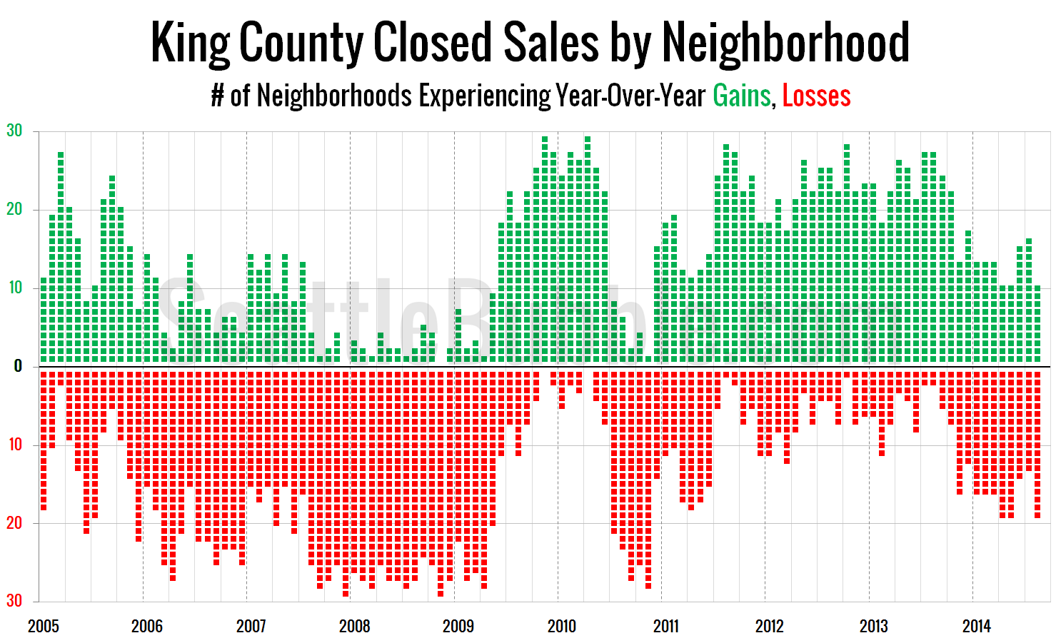
By The Tim on March 15, 2010
In our conversation last week about median prices, David Losh brought up an interesting question:
It would be interesting to see what the median price buys you this year compared to last year, or the year before.
.CNNTable {margin: 5px auto 15px;} .CNNTable td {padding: 0px 5px; text-align: center; font-size: .9em;} .CNNTable th {text-align: center;} .top_row {font-weight: [...]
Posted in Neighborhoods, Statistics | Tagged anecdote, median, Neighborhoods, NWMLS, Statistics
By The Tim on March 9, 2010
As we were digging through the February data from the NWMLS, some of us noticed something interesting. While the county-wide median price was basically flat year-over-year, there is a pretty strong divergence from region to region around the county.
Here’s what the YOY median price breakdown looks like at the region level:
SW King: -12.8%
SE King: [...]
Posted in Neighborhoods, Statistics | Tagged median, Neighborhoods, NWMLS, Tableau
By The Tim on February 19, 2010
Let’s check in on our January monthly neighborhood update to the neighborhood breakdown of Seasonally-Adjusted Active Supply (SAAS). For an explanation of what seasonally-adjusted active supply is, please refer to this post. Also, you may view a map of the areas discussed in this post.
As usual, courtesy Tableau Software (available free to use online), [...]
Posted in Neighborhoods, Statistics | Tagged graphs, Neighborhoods, NWMLS, SAAS, Statistics, Tableau
By The Tim on January 18, 2010
Let’s check in on our December monthly neighborhood update to the neighborhood breakdown of Seasonally-Adjusted Active Supply (SAAS). For an explanation of what seasonally-adjusted active supply is, please refer to this post. Also, you may view a map of the areas discussed in this post.
As usual, courtesy Tableau Software (available free to use online [...]
Posted in Neighborhoods, Statistics | Tagged graphs, Neighborhoods, NWMLS, SAAS, Statistics, Tableau
By The Tim on November 17, 2009
Let’s check in on our October monthly neighborhood update to Seasonally-Adjusted Active Supply (SAAS). For an explanation of what seasonally-adjusted active supply is, please refer to this post. Also, you may view a map of the areas discussed in this post.
As usual, the sweet interactive data visualizations (new and improved!) in today’s post come [...]
Posted in Neighborhoods, Statistics | Tagged graphs, Neighborhoods, NWMLS, SAAS, Statistics, Tableau
By The Tim on October 29, 2009
Let’s check in again on our regular monthly neighborhood update to Seasonally-Adjusted Active Supply (SAAS). For an explanation of what seasonally-adjusted active supply is, please refer to this post. Also, you may view a map of the areas discussed in this post.
As usual, the sweet interactive data visualizations (new and improved!) in today’s post [...]
Posted in Neighborhoods, Statistics | Tagged graphs, Neighborhoods, NWMLS, SAAS, Statistics, Tableau
Recent Comments