Via the Seattle Times: Judge rejects Seattle’s ‘first-come, first-served’ rental law as unconstitutional…
Tag: rent
News Brief: Seattle City Council attempts to outlaw economics
From the Seattle Times: Seattle City Council votes to impose moratorium on rent-bidding websites
The Seattle City Council voted Monday to impose a one-year moratorium on rent-bidding platforms…
Huge 2017 Apartment Boom Should Soften Housing Market
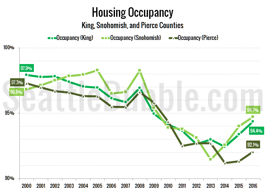
Get access to the full spreadsheets used to make the charts in this and other posts by becoming a member of Seattle Bubble. Good news for renters (and maybe hopeful home buyers, as well): 2017 should see the beginning of relief for the Seattle area’s crazy rental housing market. The infamous $750-a-month 130-square-foot ‘prison cell’…
Home Price to Rent Ratio Still Below Bubble Territory
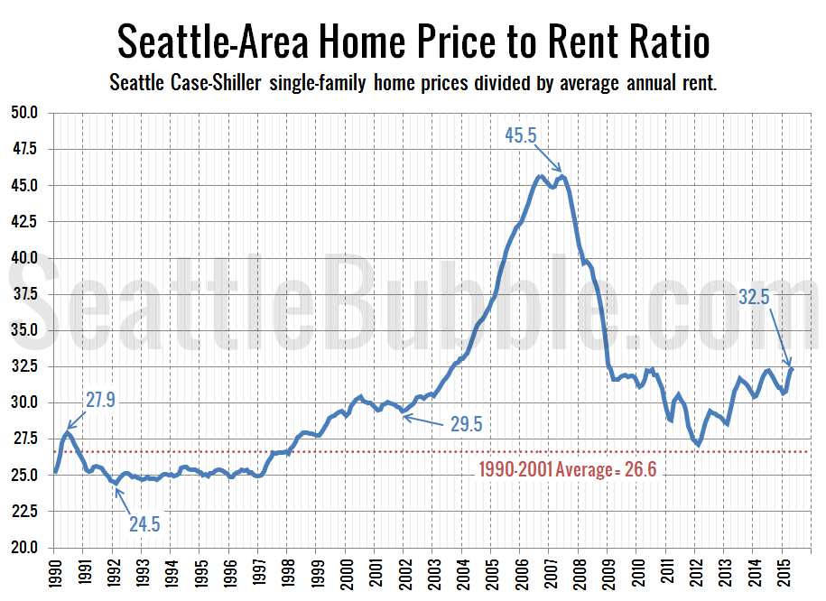
It’s been a while since we took a look at how rents are comparing to home prices in the Seattle area. Both home prices and rents have been climbing quite a bit in the Seattle area lately. We would expect this with a booming local economy, but if home price gains been significantly outpacing rent…
How Does Seattle City Councilmember Kshama Sawant Plan to “Make Seattle Affordable for All”?
I drove down to Leschi last weekend, and I saw a surprising number of yard signs promoting the re-election of Kshama Sawant to the Seattle City Council. As you can see in the photo at right (taken from her campaign’s Twitter feed), the slogan on these signs implies that Sawant’s main goal is to “Make…