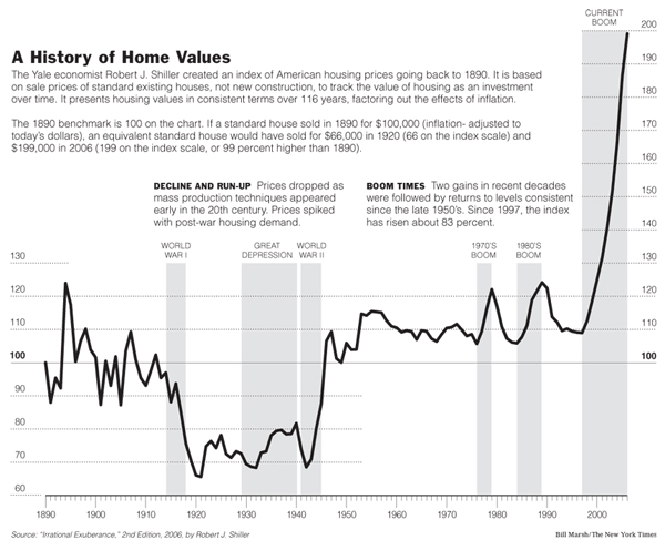
Updated graph from "Irrational Exuberance"

If you search on google for "irrational exuberance", it seems that the only takeaway anyone had from the book was the graph of inflation-adjusted housing prices taking off like a rocket up until late 2005. (http://www.biggerpockets.com/images/blog/shillerbig.gif) Has anyone seen an update of this data as of this year? I was going to try to update the graph myself (because I was curious), but when I pulled the most recent case-shiller data, it seems that they don't inflation-adjust it, so I can't exactly do that.
Comments
It wouldn't make sense for an index (which is just like a stock market index) to use inflation-adjusted numbers.
True. But it would also be nice if the vertical axis used logarithmic scale so that the most recent changes are not exaggerated.
The vertical axis...for an index? Or do you mean the graph from irrational exuberance? Because that's the index (exponential) divided by CPI (exponential), which means it shouldn't need to be displayed on a logarithmic graph. That's why it's so scary - it looked like it was exponential when it shouldn't have.