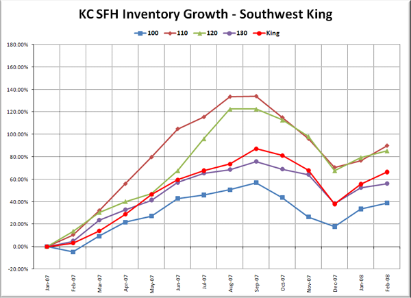
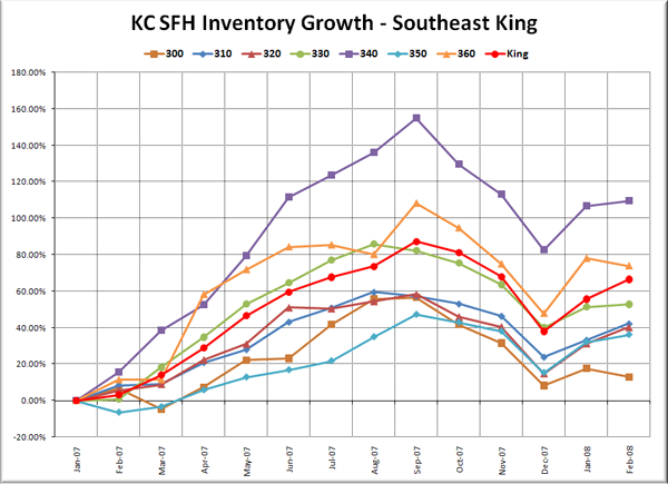
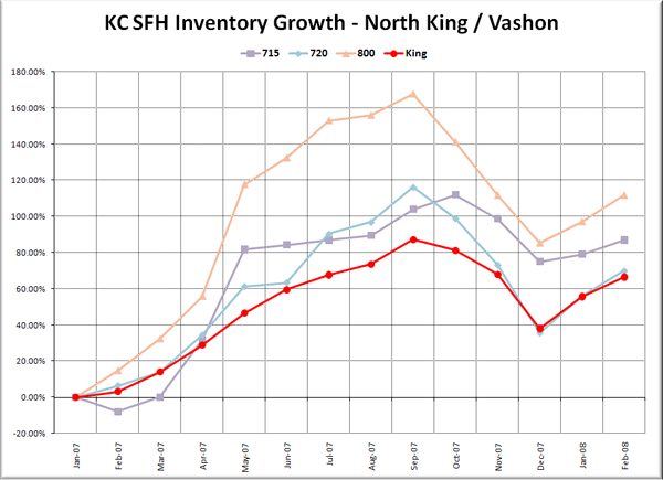
Here’s an update to the King County single-family neighborhood inventory growth charts I first posted last month.
The data that makes up these charts is publicly available from the NWMLS, and can be found in the NWMLS King County Breakout pdfs. Keep in mind that what’s being plotted here is total percent growth since January 2007. If it would be more helpful to present the data in a different way, I’m open to suggestions. Each graph still has the same scale on the vertical axis, for easy comparison. The King County aggregate figure is plotted in red with circles marking the data points.
For a description of which neighborhoods each area encompasses, as well as a map of the areas and a link to the source data, visit this page.
Note: Area 701 (Downtown Seattle) started the year with zero listings, then went up to 1 in June and 2 in January ’08, which would techincally have been an infinite percentage increase. On this chart it is displayed as a flat line.
The most extreme action last month seemed to be over on the Eastside, where the inventory in areas 510, 520, and 530 (Mercer Island, Bellevue, and Redmond) is just exploding. Area 520 (West Bellevue) earned the distinction of having already exceeded 2007’s peak inventory as of February. Over in Seattle, area 390 (Capitol Hill) almost joined that club as well, exactly matching last year’s October peak inventory of 305.
The areas with the least inventory growth between January and February were areas 300 (Enumclaw), 360 (Skyway), and 385 (Beacon Hill), which all actually had between 1% and 4% less inventory at the end of February than a month prior.
The areas with the most inventory growth last month were areas 600 (Juanita / Woodinville / Duvall – +16.4% MOM), 700 (Queen Anne / Magnolia – +16.7% MOM), and 510 (Mercer Island) with an incredible 22% spike in inventory in just one month.


