Here’s our monthly look at Seattle’s price tiers from Case-Shiller. Remember that Case-Shiller’s “Seattle” data is based on single-family home repeat sales in King, Pierce, and Snohomish counties.
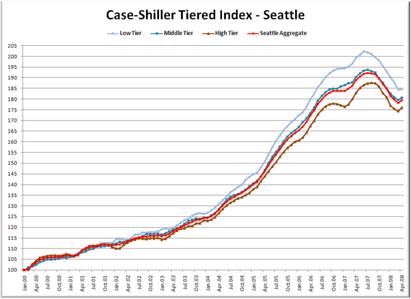
Now here come the graphs. First up is the straight graph of the index from January 2000 through April 2008.
All three tiers benefited from the little spring bounce, but the low tier saw the smallest bump, moving up just 0.1% to the high tier’s 1.0%. As a result, there is now a difference of just 8.5 points between the low tier index and the high tier index. At its peak, the low tier’s index was 15 points higher than the high tier.
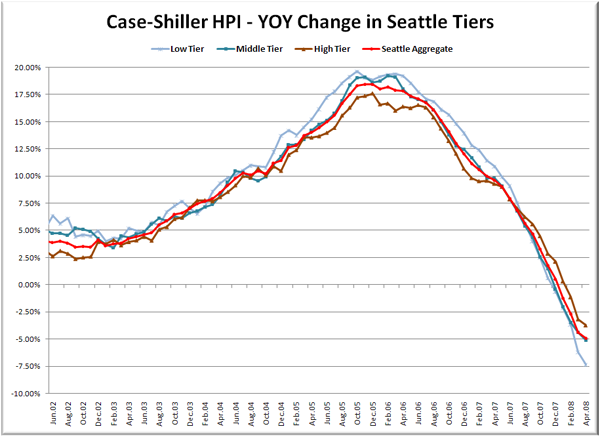
Here’s a chart of the year-over-year change in the index from June 2002 through April 2008.
Despite the bump, all three tiers extended their YOY declines in April. Here’s where they sit – Low: -7.4%, Med: -5.1%, Hi: -3.7%.
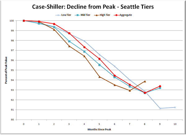
Lastly, here’s a decline-from-peak graph like the one posted yesterday, but looking only at the Seattle tiers.
This graph really makes it easy to see how little the low end was bumped up in April. Even with the bump, the total decline from peak ranges from 6.1% for the high tier to 8.8% for the low tier.
I suspect that next month we will return to your regularly scheduled decline.
(Home Price Indices, Standard & Poor’s, 06.24.2008)


