With the increasing disparity between pending and closed sales, using “Months of Supply” as it is traditionally calculated to provide a measure of market “strength” is becoming more and more misleading.
In order to address this issue, I have devised a new measure of market vitality: Seasonally Adjusted Active Supply (SAAS). To determine the SAAS, I am dividing the number of new listings in a given month by the number of closed sales, then multiplying by a seasonal factor between 0.7 and 2.1 to smooth out the strong seasonal variations.
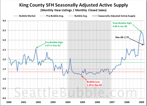
Here’s what the SAAS looks like for King County SFH as far back as we have reliable data:
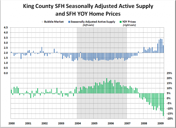
King County’s SAAS has definitely dropped down off the highs we saw through the winter, when it hit values between 3.3 and 3.4, but March’s SAAS of 2.75 was still higher than January through October of last year. We’re also well above the pre-bubble average of 1.85.
With Months of Supply we generally consider a value of 6.0 to be a “balanced market.” For Seasonally Adjusted Active Supply, I would put the “balanced market” point at about 2.0.
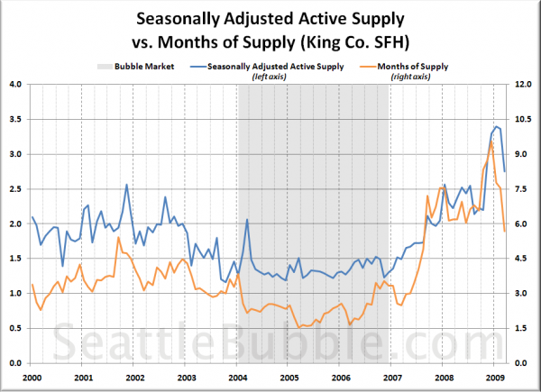
Here’s a comparison of SAAS and MOS for the same period as the chart above:
You can see that from 2000 through about midway through 2006, the two tracked fairly close to each other. In mid-2007 as the bubble begain to burst, MOS shot up much faster than SAAS, perhaps due to the rapidly increasing number of “stale listings.” Since last December as the gap between pending and closed sales has continued to widen, MOS has fallen much faster than SAAS.
SAAS seems to me to be a decent way to track the overall market action. I’d love to hear your feedback on this method and the picture that is painted by this data.
[Update:] Hit the jump below for a few more graphs of the SAAS data requested by readers.
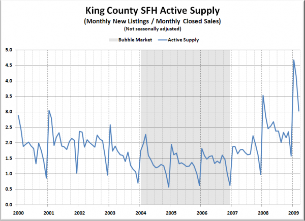
Here’s a look at the “Active Supply” without the seasonal adjustment:
Here are the monthly weights that were used to seasonally adjust the data:
Jan: 0.7
Feb: 0.8
Mar: 0.9
Apr: 0.9
May: 0.9
Jun: 1.0
Jul: 1.1
Aug: 1.1
Sep: 1.0
Oct: 1.0
Nov: 1.2
Dec: 2.1
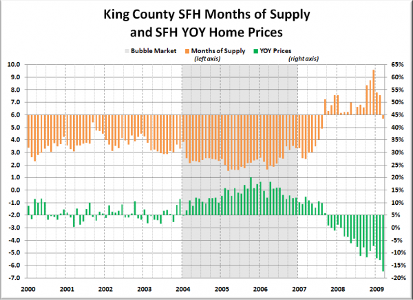
And finally, here are comparisons of MOS (centered on 6.0) vs. YOY median price (centered on 5.0%), and SAAS (centered on 2.0) vs. YOY median price (at 5.0%):
I would say that there seems to be a fairly good relationship between an SAAS around 2.0 and a “healthy,” sustainable 5.0% YOY appreciation.
