February market stats have been published by the NWMLS. Here’s the NWMLS press release: Northwest MLS brokers say housing market in Washington State indicates recovery.
“We are entering what is traditionally our busiest home selling season,” said NWMLS director OB Jacobi, general manager of Windermere Real Estate Company. “With the first job increase since 2008 and closed sales in King County up about 45 percent, there is every indication that our market is in recovery,” he added. Jacobi reported “significant traffic” at open houses, which he attributes to the first-time homebuyer tax credit and rising consumer confidence.
Ah yes, that old statistical standby, open house traffic.
Here’s your King County SFH summary, with the arrows to show whether the year-over-year direction of each indicator is favorable or unfavorable news for buyers and sellers (green = favorable, red = unfavorable):
| February 2010 | Number | MOM | YOY | Buyers | Sellers |
|---|---|---|---|---|---|
| Active Listings | 8,115 | +7.9% | -14.8% |  |
 |
| Closed Sales | 997 | +4.3% | +50.8% |  |
 |
| SAAS (?) | 2.49 | +7.0% | -26.5% |  |
 |
| Pending Sales | 2,079 | +17.8% | +64.5% |  |
 |
| Months of Supply | 5.3 | +23.5% | -30.2% |  |
 |
| Median Price* | $373,010 | -0.5% | -0.5% |  |
 |
Closed sales came in pretty much spot on where I predicted on Tuesday that they would. The median price dipped slightly, and unless we see a fairly significant month-to-month drop in March, is likely to inch into positive YOY territory this month, since March 2009 was the low point for that measure at $363,850.
Feel free to download the updated Seattle Bubble Spreadsheet, and here’s a copy in Excel 2003 format.
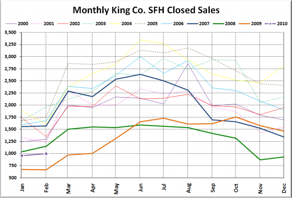
Here’s your closed sales yearly comparison chart:
Same story as January. More sales than 2009, but less than every other year on record.
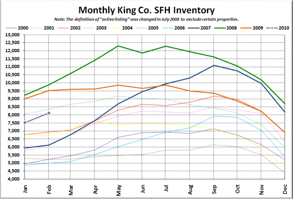
Here’s the graph of inventory with each year overlaid on the same chart.
Between 2000 and 2009, the total number of listings on the market increased an average of 3.5% between January and February. This year, they jumped more than double that, rising 7.9% in a month. Perhaps more sellers are buying the recovery talk and have become convinced that it’s a good time to sell?
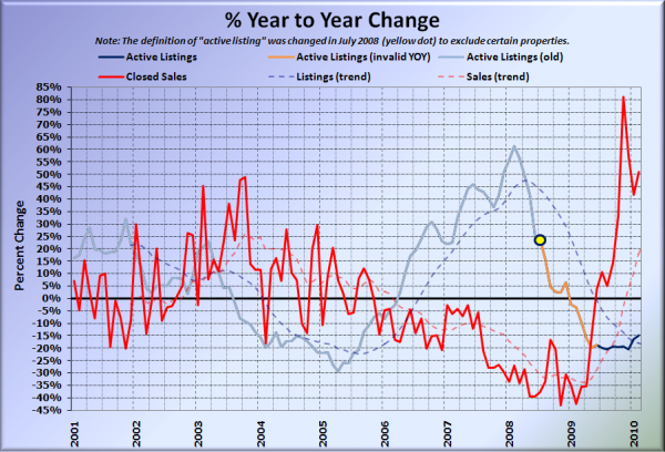
Here’s the supply/demand YOY graph. In place of the now-unreliable measure of pending sales, the “demand” in the following two charts is now represented by closed sales, which have had a consistent definition throughout the decade.
Still way up there in the positive territory, thanks to the absolutely dismal winter sales figures a year ago.
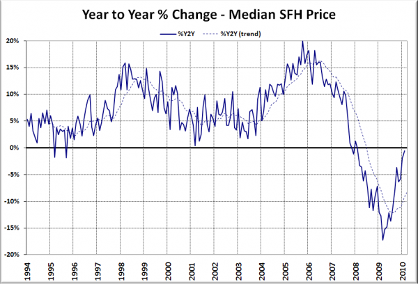
Here’s the median home price YOY change graph:
Almost back to zero there. I’m betting next month we’ll inch above zero, but who knows if we’ll stay there for long.
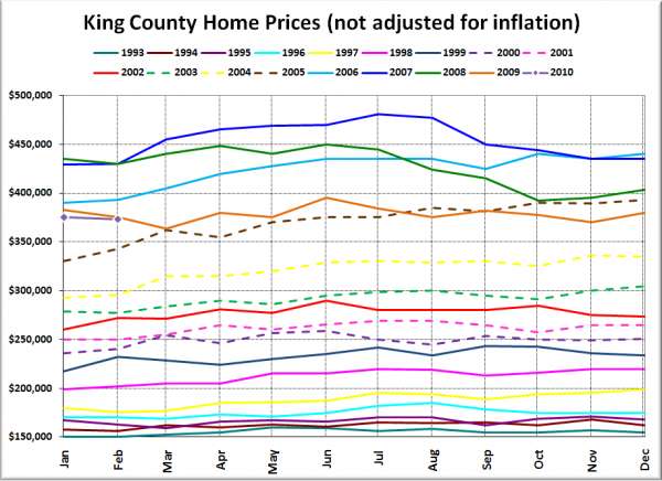
And lastly, here is the chart comparing King County SFH prices each month for every year back to 1994.
2005 was apparently a good year for home prices, so good that the market decided to revisit that level four years later and hang around for a year or so.
News blurbs to hold you over until tomorrow’s reporting roundup:
Seattle Times: King County home prices stabilize in February
Seattle P-I: Seattle home prices up over last year, report says
See, flat really is the new up.
