Let’s have a look at the latest data from the Case-Shiller Home Price Index. According to August data,
Down 0.8% July to August.
Down 2.4% YOY.
Down 24.1% from the July 2007 peak
Last year prices rose 0.1% from June to July and year-over-year prices were down 14.7%.
Since August’s data is a 3-month average that still includes June (the final tax credit month), I’m surprised to see the index fall as much as it did. It is also interesting to note that this is the first large (>0.5% points) deterioration we’ve seen in Seattle’s YOY data since April 2009.
Here’s an interactive graph of the year-over-year change in all twenty Case-Shiller-tracked cities, courtesy of Tableau Software (check and un-check the boxes on the right):
Seven of twenty Case-Shiller-tracked cities are now in positive YOY territory (down from ten last month): Phoenix, Los Angeles, San Diego, San Francisco, Washington DC, Boston, and Minneapolis. The three cities that dropped from YOY positive to YOY negative in August were: Miami, Detroit, and New York. Only Charlotte, Las Vegas, and Cleveland saw their respective YOY numbers move in the positive direction.
In August, fifteen of the twenty Case-Shiller-tracked cities experienced smaller year-over-year drops (or saw year-over-year increases) than Seattle (the same number as July):
- San Francisco at +7.8%
- San Diego at +6.9%
- Los Angeles at +5.4%
- Washington, DC at +4.8%
- Minneapolis at +2.9%
- Boston at +1.5%
- Phoenix at +0.4%
- Detroit at -0.1%
- New York at -0.1%
- Cleveland at -0.4%
- Miami at -1.0%
- Denver at -1.2%
- Dallas at -1.7%
- Atlanta at -2.0%
- Portland at -2.3%
Falling faster than Seattle as of August: Chicago, Charlotte, Tampa, and Las Vegas.
Hit the jump for the rest of our monthly Case-Shiller charts, including another interactive charts of the raw data and our monthly offset graph.
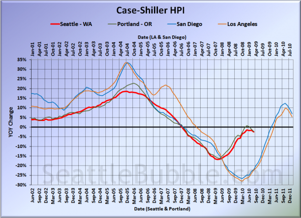
Here’s our offset graph—the same graph we post every month—with L.A. & San Diego time-shifted from Seattle & Portland by 17 months. All four cities turned down even more sharply on this chart in July. Year-over-year, Portland came in at -2.3, Los Angeles at +5.4%, and San Diego at +6.9%.
Note: This graph is not intended to be predictive. It is for entertainment purposes only.
Here’s an interactive chart of the raw HPI for all twenty cities through August.
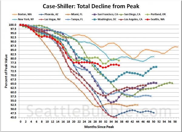
Here’s an update to the peak-decline graph, inspired by a graph created by reader CrystalBall. This chart takes the twelve cities whose peak index was greater than 175, and tracks how far they have fallen so far from their peak. The horizontal axis shows the total number of months since each individual city peaked.
In the thirty-five months since the price peak in Seattle prices have declined 24.1%, slightly more than last month.
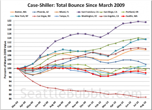
Here’s a complementary chart to that last one. This one shows the total change in the index since March 2009 for the same twelve markets as the peak decline chart.
Note the distinctive downward turn in every line but Washington DC, New York, and Las Vegas. Even seemingly invincible San Francisco started losing steam last month.
Check back tomorrow for the tiered price breakdown for Seattle.
(Home Price Indices, Standard & Poor’s, 10.26.2010)


