March market stats were published by the NWMLS yesterday. Here’s what they have to say about their numbers: Housing market doing "surprisingly well" without a stimulus.
“The market is doing surprisingly well without a stimulus,” observed Northwest MLS director OB Jacobi, president of Windermere Real Estate Company. “Considering that this time last year there was a rush of buyers trying to beat the tax credit deadline, to have the number of sales off just slightly points towards a strengthening market,” he added.
A comparison to two years ago reveals a double-digit jump in pending sales. Area-wide, the volume is up nearly 33 percent, rising from 5,701 pending sales in March 2009 to 7,570 for last month. For the four-county Puget Sound region, pending sales spiked nearly 42 percent compared to two years ago (from 4,266 to 6,049). “The glass is starting to look more half full than half empty,” Jacobi commented.
Mike Grady, president and COO of Coldwell Banker Bain, agreed. “Most real estate professionals will be happy to move past the year-over-year comparisons that have been made the first few months of 2011, as they reflect the boost given home sales by last year’s Homebuyer Tax Credit,” he noted, adding, “Home sales are now standing on their own—without the benefit of incentives—and the market is actually behaving quite typically.”
Of course everything looks great when you cherry-pick the data set you’re comparing with to be the absolute worst year on record. What a pointless comparison, though. How about we compare this spring to the 2000-2007 average?
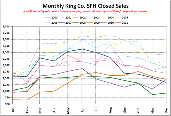
Here’s your closed sales yearly comparison chart, so we can do just that:
Wow, we’re doing way better than that orange 2009 line… about the same as the lavender and green 2010 and 2008 lines… and pretty crappy compared to every other line. In fact, March closed sales came in 33% below the 2000-2007 average. I wouldn’t exactly call that “behaving quite typically.”
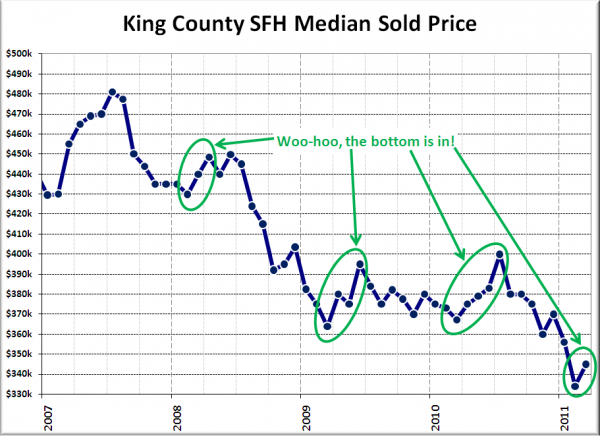
On the other hand, median prices ticked up in March, so that’s good news, right? Oh wait, that actually is pretty typical spring behavior during this housing bust.
All right, let’s get on with the rest of the statistics, shall we?
NWMLS monthly reports include an undisclosed and varying number of
sales from previous months in their pending and closed sales statistics.
Here’s your King County SFH summary, with the arrows to show whether the year-over-year direction of each indicator is favorable or unfavorable news for buyers and sellers (green = favorable, red = unfavorable):
| March 2011 | Number | MOM | YOY | Buyers | Sellers |
|---|---|---|---|---|---|
| Active Listings | 7,590 | +0.1% | -13.9% |  |
 |
| Closed Sales | 1,525 | +52% | -4.4% |  |
 |
| SAAS (?) | 1.72 | -10.7% | -22.5% |  |
 |
| Pending Sales | 2,435 | +24.1% | -11.4% |  |
 |
| Months of Supply | 3.12 | -19.3% | -2.8% |  |
 |
| Median Price* | $345,000 | +3.3% | -6.1% |  |
 |
Feel free to download the updated Seattle Bubble Spreadsheet (Excel 2003 format), but keep in mind the caution above.
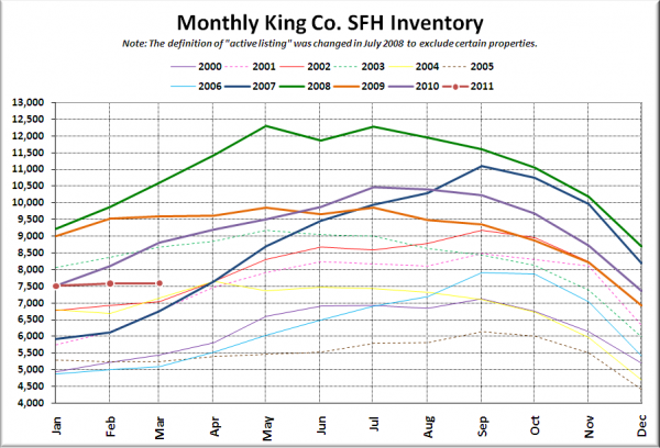
Here’s the graph of inventory with each year overlaid on the same chart.
Where the heck did all the sellers go? Oh, right. Most of them have finally realized that they’re not going to get their fantasy price for their home, so they’ve pulled it off the market, waiting, hoping, praying for a fantastical recovery in prices. They’re going to be waiting quite a while. I hope you like short sales, REOs, estate sales, and homes that have been lived in by the same family for ten or twenty years, because those categories will probably make up the majority of inventory for the next few years.
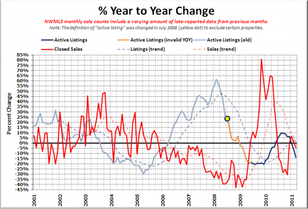
Here’s the supply/demand YOY graph. In place of the now-unreliable measure of pending sales, the “demand” in this chart is represented by closed sales, which have had a consistent definition throughout the decade.
Both still falling. Still hard to get a read for what it means for prices when both inventory and sales are dipping at the same time like this.
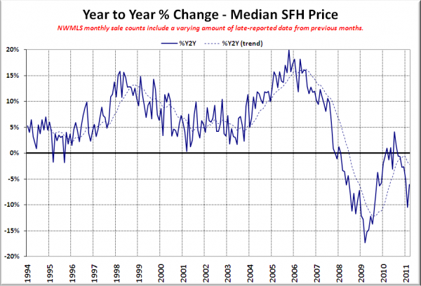
Here’s the median home price YOY change graph:
A bit of an uptick, but still lower than we were during all of 2010. Wow, the billions of dollars we spent on that tax credit sure was worth it.
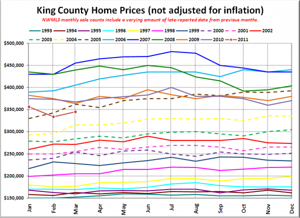
And lastly, here is the chart comparing King County SFH prices each month for every year back to 1994.
March 2011: $345,000
February 2005: $342,500
Here are the headlines from the Seattle Times and P-I:
Seattle Times: More spring in local home sales, but too soon to call it a trend
Seattle P-I: King County house prices rose from February, while sales fell
Check back on Friday for the full reporting roundup.
