Full disclosure: The Tim is employed by Redfin.
I just posted a lengthy write-up on the bizarre current state of the “national” real estate market over on Redfin, and thought you all might be interested in some of the more Seattle-specific data I pulled when doing research for the post.
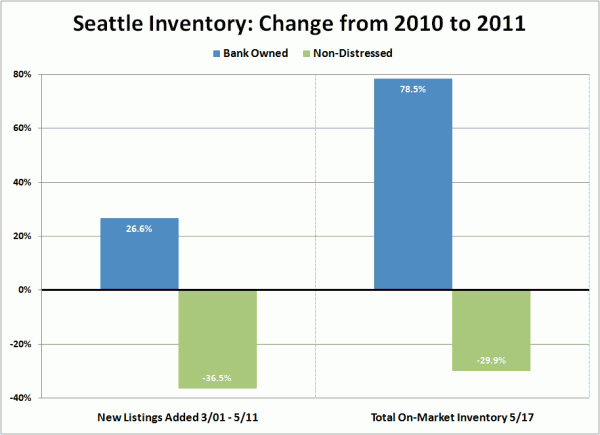
First up, a look at new listings and total standing inventory in King County, comparing this year to last year broken down by bank owned and non-distressed:
Wowzers. Bank owned inventory up big this year around Seattle, while non-distressed sellers seem to have decided to just sit it out.
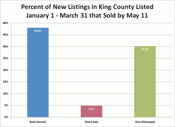
Meanwhile, bank owned homes are selling a bit better than non-distressed listings, but the difference isn’t huge:
Of course, the absorption of short sales is just pitiful. Yikes.
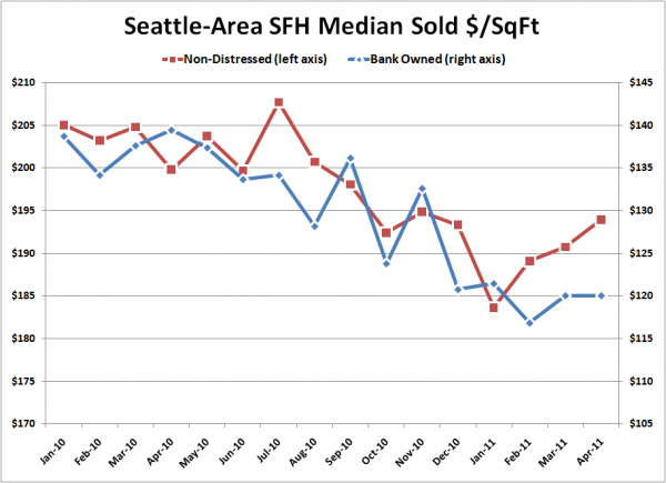
Finally, this chart was included in my Redfin post, but is worth repeating here. It shows the size-adjusted median price trend for bank owned homes and non-distressed homes. Note that they’re plotted on different vertical axis in order to better compare the direction of the trend.
The size-adjusted median price of non-distressed sales has picked up just a bit in the last few months while bank owned prices have basically flattened. It will be interesting to see if this is the start of a trend (due to the increasing rarity of non-distressed listings) or just a spring blip.
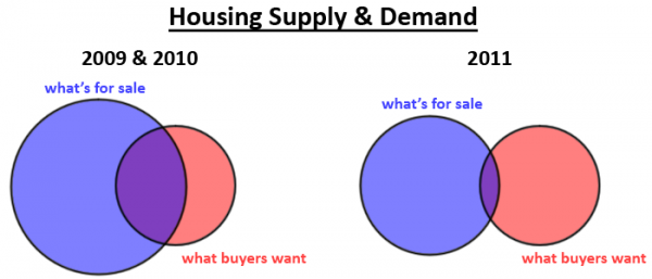
Finally, I created this Venn diagram for the Redfin post to illustrate the supply and demand dynamics we’re seeing in the market today, and I was so pleased with how simply it conveys the point that I wanted to share it here as well:
Thoughts?


