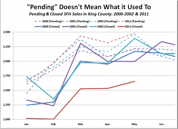
Here’s a visual I intended to whip up last week but ran out of time for. I noticed in the pending sales chart that 2011’s pending sales were trending fairly closely with the pre-bubble trend from 2000-2002, but when I looked over to the closed sales chart, the lines where nowhere near each other.
I thought it would be informative to plot pending and closed sales for those years on the same chart side by side, so here it is:
Average number of pending sales, January-April 2000-2002: 1,969
Average number of closed sales, February-May 2000-2002: 1,887
Difference: 4.1%
Average number of pending sales, January-April 2011: 2,091
Average number of closed sales, February-May 2011: 1,429
Difference: 31.7%
Just a public service reminder to take any reference to “pending sales” with a giant grain of salt as it clearly does not mean what it used to.
