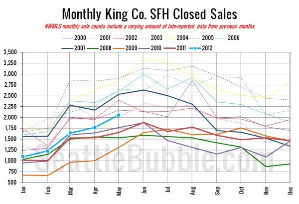
May market stats were just released by the NWMLS. Two big firsts in this month’s data. The first month-to-month increase in inventory so far this year and the first time closed sales of single-family houses broke 2,000 in King County since August 2007.
Now we finally know: Greg Perry’s 2009 prediction was just 3 years too early!
Here’s their press release:
Tight inventory, record-low mortgage rates fueling Western Washington home sales.
Low listing inventory and plunging mortgage rates are fueling buyer competition for homes close to job centers, according to brokers who commented on the latest market report from Northwest Multiple Listing Service.
…
“The six month trend of low listing inventory continues to cause strong buyer competition for homes close to job centers,” noted Northwest MLS director Joe Spencer, area director for Keller Williams Northwest Region. He said he does not expect this trend to change direction “for quite some time due to what appears to be long-term economic and demographic influences.”
Our buddy Joe Spencer, always spot-on with trend-spotting.
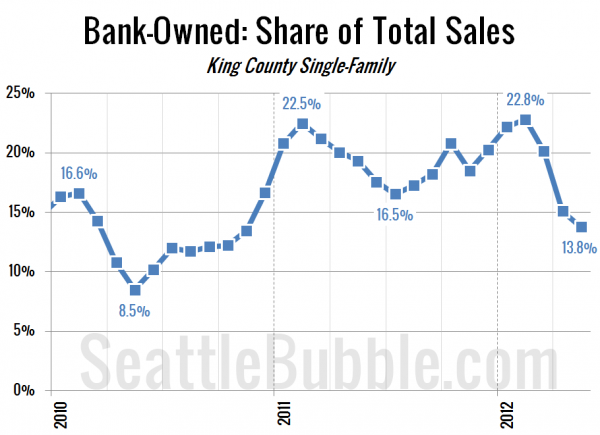
On a more serious note, it’s interesting that the trend we noticed last month of bank-owned homes making up a smaller percentage of sales continued in May, dropping to just 13.8% of sales. When you compare that with the 19.3% of sales that were bank-owned in May last year, the 4.9% bump in median price is really more like a flatlining of prices than an increase.
All righty, on with our usual monthly stats.
NWMLS monthly reports include an undisclosed and varying number of
sales from previous months in their pending and closed sales statistics.
Here’s your King County SFH summary, with the arrows to show whether the year-over-year direction of each indicator is favorable or unfavorable news for buyers and sellers (green = favorable, red = unfavorable):
| May 2012 | Number | MOM | YOY | Buyers | Sellers |
|---|---|---|---|---|---|
| Active Listings | 5,039 | +2.3% | -37.4% |  |
 |
| Closed Sales | 2,056 | +16.2% | +24.3% |  |
 |
| SAAS (?) | 1.33 | -6.7% | -19.2% |  |
 |
| Pending Sales | 2,981 | +4.7% | +20.0% |  |
 |
| Months of Supply | 1.69 | -2.3% | -47.9% |  |
 |
| Median Price* | $362,000 | +0.6% | +4.9% |  |
 |
Feel free to download the updated Seattle Bubble Spreadsheet (Excel 2003 format), but keep in mind the caution above.
Here’s your closed sales yearly comparison chart:
The pattern this year is looking a lot more like the pre-boom and boom years than it is the bust years. We’re still considerably below the volume seen during a typical May through the bubble, but I don’t think it’s reasonable to suspect that we’ll get back to that level any time soon.
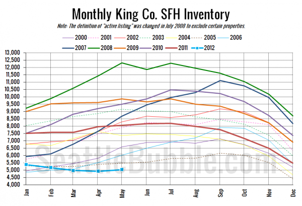
Here’s the graph of inventory with each year overlaid on the same chart.
Hey, an increase! About time. Still at a record low point for May though.
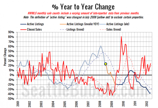
Here’s the supply/demand YOY graph. In place of the now-unreliable measure of pending sales, the “demand” in this chart is represented by closed sales, which have had a consistent definition throughout the decade.
No big change here. The supply and demand dynamics continue to support sellers far more than buyers in today’s market.
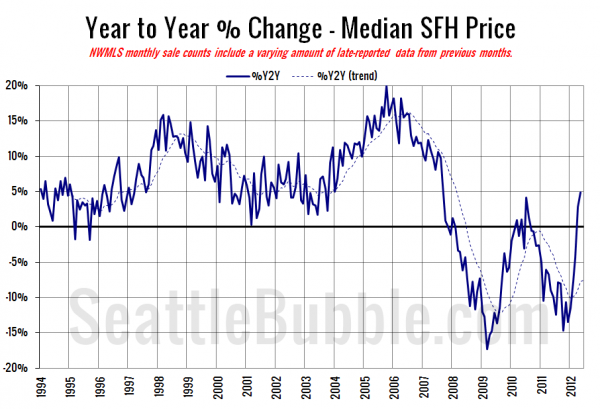
Here’s the median home price YOY change graph:
Thanks to the decrease in sales of bank-owned homes, this is the highest point we’ve been on the year-over-year chart since September 2007.
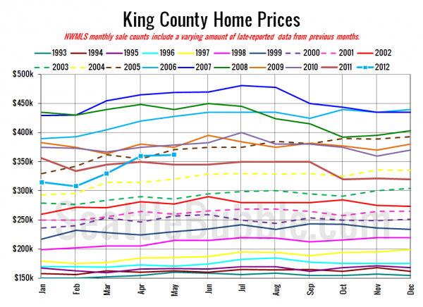
And lastly, here is the chart comparing King County SFH prices each month for every year back to 1994.
May 2012: $362,000
March 2005: $362,000
Here are the Times and P-I headlines.
Seattle Times: King County home prices rise for a second month
Seattle P-I: Seattle house prices post double-digit increase
Check back tomorrow for the full reporting roundup.
