It’s been a few months since I posted the histogram of monthly sales. Let’s take another look as of October’s data.
To generate the chart below, I took all the sales data for single-family homes sold in King, Snohomish, and Pierce Counties from the beginning of 2010 through the end of October. Since my data download puts late-reported sales into the month that the sale actually took place rather than in the month they were reported, there is a slight difference in the number of sales I’m counting vs. what the NWMLS reports each month.
By default the chart shows just King County sales in October. Use the controls below to scroll through different months, or to see what the mix looks like for Snohomish or Pierce County. I’ve also added color-coding and controls to separate out “non-distressed” sales from the sales of bank-owned homes and short sales.
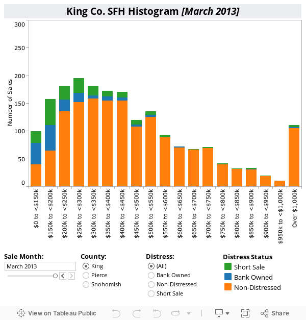
As you scroll through the months you can see the blue bars representing bank-owned homes getting smaller and smaller. At $350,000 and above, bank-owned sales have all but disappeared. Meanwhile, the overall curve continues to shift slightly to the right as the supply of bargain basement homes dries up.


We know that the economic crisis has about the same looking chart. Those that were impacted the most were the lower tiers of wage earners. Makes sense that the impact on housing would be the same.
Rate this comment:
0
0
RE: Pegasus @ 1 – While that is largely true, don’t assume that REO sales mirror houses that are foreclosed. Better houses may be more likely to get bought up at foreclosure, and not appear in the REO data. Also, some banks continue to market properties very poorly, limiting the sales price that they receive.
Rate this comment:
0
0
Well, perhaps the banks are selling them for the realistic, true value of what it takes to sell a home in a reasonable amount of time, rather than the guy who sets a pie-in-the-sky price because he can afford to wait for a day, years from now (or maybe never), when that price magically becomes market rate.
Rate this comment:
0
0
By Lo Ball Jones @ 3:
Yes. That’s why they are commanding a whopping 9 or 10% of the market.
http://seattlebubble.com/blog/2012/11/13/non-distressed-median-price-up-6-percent-from-2011/
Rate this comment:
0
0
What’s Missing from This Tier Diagram Chart
Is another Tier Chart to compare to. Like the number of listed homes in each pricing group. I’m assuming the low price groups will have “sky-scraper” sized tiers and the high priced ones, “dinky mole-hills”, in comparison.
Rate this comment:
0
0