Skip to content

Seattle Bubble

local real estate news, statistics, and commentary without the sales spin.

Menu
  • Home
  • About
  • Contact
  • Reference
  • Speaking
Menu

Tag: month-over-month

Price Gains Shrinking in All Twenty Case-Shiller Cities

Posted on October 30, 2014October 30, 2014 by The Tim

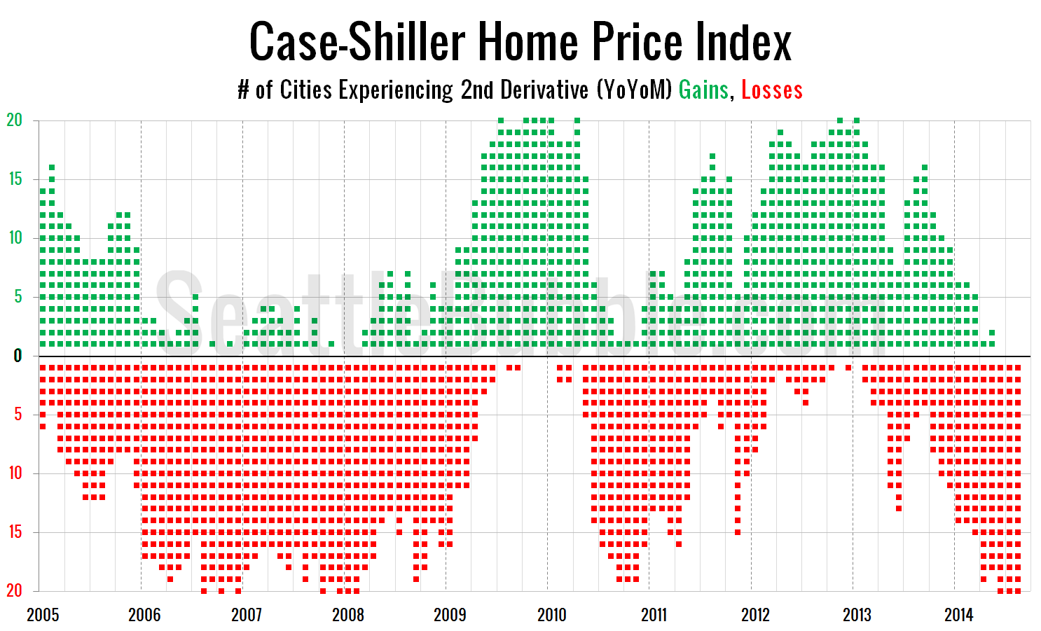
It’s been a few months since we last had a look at my favorite alternative Case-Shiller charts. First up, let’s have a look at the chart that depicts the count of cities showing second derivative (month-over-month changes in the year-over-year changes) gains or losses. For the last three months of data, every single city has…

Share:

  • Twitter
  • LinkedIn
  • Facebook
  • Reddit
  • Pinterest
  • Email

Case-Shiller Second Derivative Weakness Continues

Posted on May 29, 2014May 29, 2014 by The Tim

Before we shelf the March Case-Shiller data, let’s have a look at my favorite alternative Case-Shiller charts. First up, let’s take a look at the twenty-city month-over-month scorecard. Here’s the original post introducing this chart if you’d like more details. Click the image below to enlarge, or click here for a super-wide version with the…

Share:

  • Twitter
  • LinkedIn
  • Facebook
  • Reddit
  • Pinterest
  • Email

Case-Shiller: Home Prices Weakest Since Early 2012

Posted on March 27, 2014March 27, 2014 by The Tim

Before we put away the January Case-Shiller data, let’s have a look at my favorite alternative Case-Shiller charts. First up, let’s take a look at the twenty-city month-over-month scorecard. Here’s the original post introducing this chart if you’d like more details. Click the image below for a super-wide version with the data back through 2000….

Share:

  • Twitter
  • LinkedIn
  • Facebook
  • Reddit
  • Pinterest
  • Email

Case-Shiller: Second Derivative Losses Stack Up

Posted on September 3, 2013September 4, 2013 by The Tim

Before we put away the June Case-Shiller data, let’s have a look at my favorite alternative Case-Shiller charts. First up, let’s take a look at the twenty-city month-over-month scorecard. Here’s the original post introducing this chart if you’d like more details. Click the image below for a super-wide version with the data back through 2000….

Share:

  • Twitter
  • LinkedIn
  • Facebook
  • Reddit
  • Pinterest
  • Email

Case-Shiller: Second Derivative Gains Rapidly Evaporating

Posted on August 2, 2013September 4, 2013 by The Tim

Before we put away the May Case-Shiller data, let’s have a look at my favorite alternative Case-Shiller charts. First up, let’s take a look at the twenty-city month-over-month scorecard. Here’s the original post introducing this chart if you’d like more details. Click the image below for a super-wide version with the data back through 2000….

Share:

  • Twitter
  • LinkedIn
  • Facebook
  • Reddit
  • Pinterest
  • Email

Posts pagination

  • 1
  • 2
  • 3
  • Next

Tim’s Other Projects

Dispatches from the Multiverse

Tip Jar

Like what we're doing?

Drop us a tip!

Accounts

  • Log in
  • Entries feed
  • Comments feed
  • WordPress.org
©2025 Seattle Bubble | Built using WordPress and Responsive Blogily theme by Superb