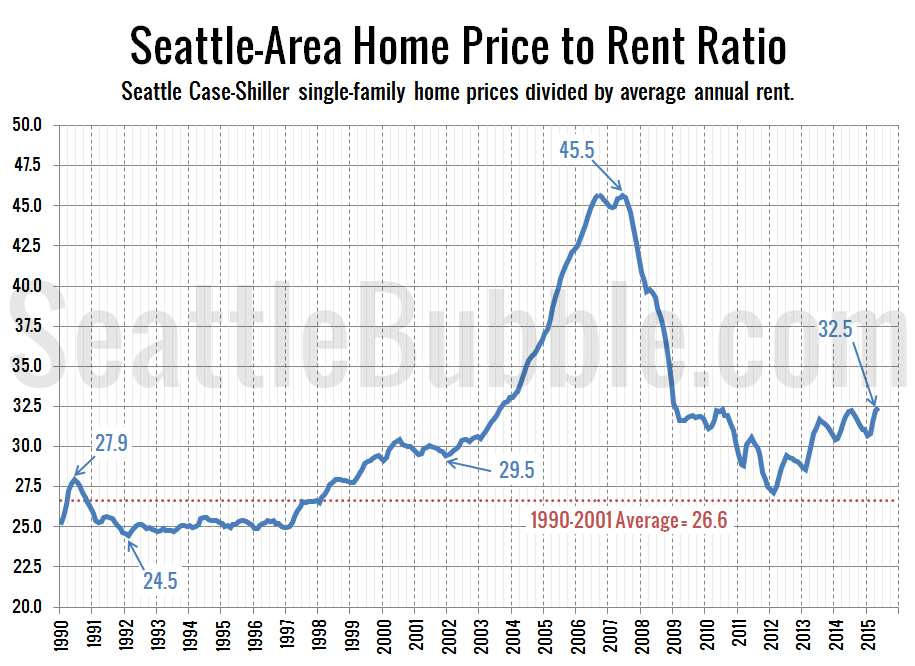
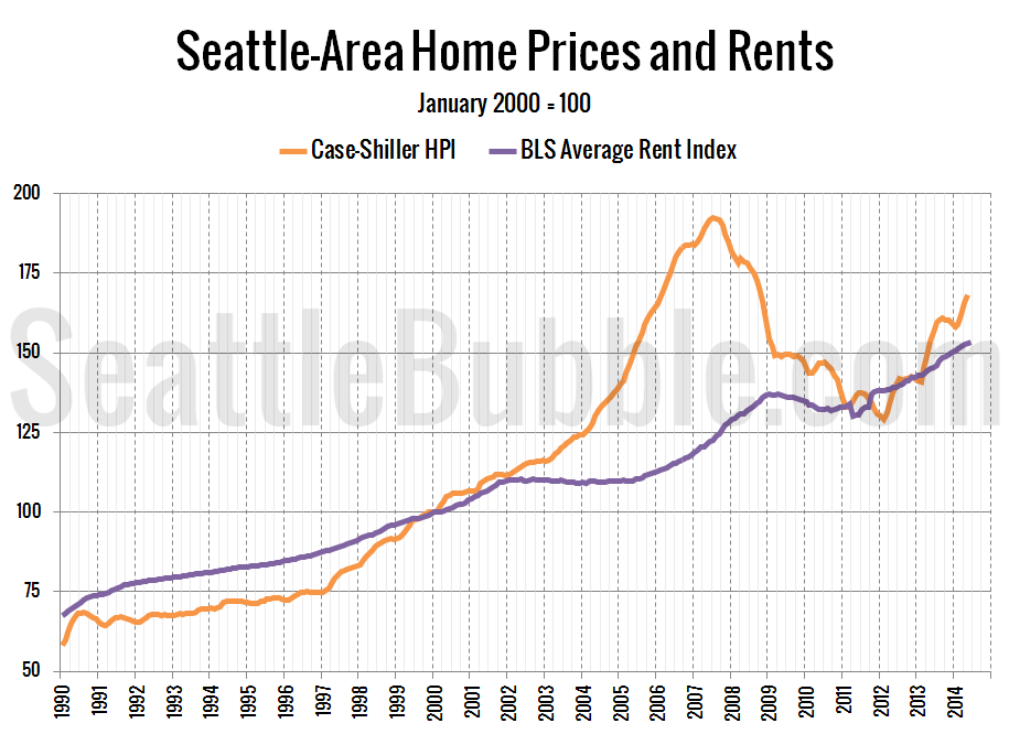
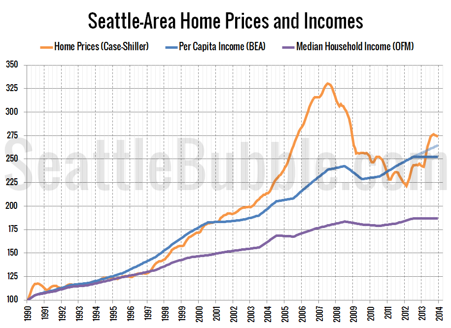
Seattle Bubble

News & discussion about real estate & the housing bubble in the Seattle area.

Seattle Bubble - News & discussion about real estate & the housing bubble in the Seattle area.

Entries Tagged as 'price-to-rent'

Rent vs. Buy Comparisons: Have the excesses been removed?

By The Tim on October 14th, 2009 at 6:00 AM · 102 Comments

Let’s try another rent vs. buy exercise to see if “all the excesses have already been removed” as some have claimed. Rather than delve into depth on a specific randomly-selected Seattle-area neighborhood, let’s instead look at what a specific type of house might cost you in multiple Seattle-area neighborhoods to rent vs. how much it would cost to buy.

Methodology
The prices quoted below are for a 3-bed, 2-bath single-family homes with 1,750 to 2,000 square feet. For the rentals, these are based on actual houses I found currently on the rental market. For the sales, I used sale records of actual prices that people have paid in the last three months. Where possible, I have located multiple samples that match the description above and taken the average price.

To calculate the monthly payment (principal + interest only), I’ll be using a 5.15% interest rate (roughly the average over the last three months), (generously) assuming 20% down on a 30-year mortgage. Keep in mind that the true cost of buying also includes insurance, taxes, maintenance, and a host of other costs generally not paid by a renter. For a more detailed breakdown of the total costs (and tax benefits) of buying, hit up this 2007 post.

I have also indicated the price to rent ratio, which is simply the home price divided by the total rent paid in a year.

Area For Rent P + I Home Price Ratio
Ballard $1,595 $2,070 $473,661 24.7
Queen Anne $2,000 $2,686 $615,000 25.6
Shoreline $1,415 $1,609 $368,379 21.7
Kirkland* $1,511 $2,040 $466,916 25.8
Redmond $1,450 $1,877 $429,625 24.7
Renton $1,250 $1,428 $326,938 21.8
West Seattle $1,650 $2,271 $520,000 26.3

According to a table of data from Fortune Magazine, Seattle’s price-to-rent ratio just before the local peak in prices was at 38.0, compared to a 15-year average of 23.3. In our table above, the average price-to-rent ratio for a 3-bed, 2-bath home in a handful of Seattle-area neighborhoods comes out to 24.3. Unfortunately, the two are not directly comparable since Forbes’ calculation included houses, condos, and apartments all among the rentals (which would drive the rental prices lower and the long-term average price-to-rent ratio higher), while my data was drawn only from single-family homes.

While home prices have come down some since I first researched the rent vs. buy discussion in detail back in 2007, a growing oversupply of repartmenting condos and accidental landlords is also pushing down rents recently, so the price-to-rent ratio hasn’t actually changed as much as one might expect.

Overall, price-to-rent ratios in the low-to-mid 20s still seems a bit high. Not crazy out of control bubble high, but it still looks like there is room for a bit more correction. Especially when you consider that the current prices are being artificially propped up by unnaturally low interest rates and the $8,000 tax credit in the midst of nearly 10% unemployment and a local economic scene that has yet to show any clear signs of turning the corner.

* [Updated, see comment #71 below.]

→ 102 CommentsCategories: Features
Tags: , , ,

Housing Stats: Seattle vs. Other Big Cities

By The Tim on September 24th, 2009 at 10:16 AM · 22 Comments

Building on the data that was presented yesterday, here’s a sortable table of some more detailed housing stats for the 25 largest US cities by population. Included below are population, density, median sale price, median price per square foot, median rent, median household income, median list price, and some ratios of sale prices to rents and incomes. Unfortunately sale prices are not available in Texas or Indiana (which is why I went with list price in yesterday’s post).

Click on any column header to sort by that column. Enjoy!

City State Pop. Density Med. Sale Med. $/sqft Med. Rent Med. HH Inc. Sale/Rent $/Sqft/Rent Sale/Inc. Med. List
New York NY 8,363,710 27,440 $471,200 $339 $985 $48,631 39.9 0.34 9.7 $449,900
Los Angeles CA 3,833,995 8,205 $442,800 $293 $986 $47,781 37.4 0.30 9.3 $447,000
Chicago IL 2,853,114 12,649 $255,500 $199 $832 $45,505 25.6 0.24 5.6 $276,000
Houston TX 2,242,193 3,828 $749 $40,856 $187,000
Phoenix AZ 1,567,924 2,938 $158,600 $96 $797 $48,061 16.6 0.12 3.3 $160,000
Philadelphia PA 1,447,395 10,721 $150,600 $122 $770 $35,365 16.3 0.16 4.3 $169,000
San Antonio TX 1,351,305 2,809 $698 $41,593 $159,900
Dallas TX 1,279,910 1,427 $737 $40,986 $215,000
San Diego CA 1,279,329 1,612 $394,800 $284 $1,209 $61,863 27.2 0.23 6.4 $427,000
San Jose CA 948,279 2,223 $486,800 $322 $1,249 $76,963 32.5 0.26 6.3 $499,000
Detroit MI 912,062 6,378 $51,600 $37 $704 $28,097 6.1 0.05 1.8 $16,500
San Francisco CA 808,976 17,323 $728,200 $579 $1,192 $68,023 50.9 0.49 10.7 $800,000
Jacksonville FL 807,815 1,062 $155,600 $95 $831 $48,699 15.6 0.11 3.2 $160,000
Indianapolis IN 798,382 2,152 $668 $44,325 $112,500
Austin TX 757,688 2,396 $829 $48,966 $253,000
Columbus OH 754,885 3,556 $137,300 $93 $703 $42,253 16.3 0.13 3.2 $129,900
Fort Worth TX 703,073 1,828 $753 $47,104 $155,000
Charlotte NC 687,456 2,516 $174,800 $101 $786 $52,690 18.5 0.13 3.3 $189,900
Memphis TN 669,651 2,327 $124,200 $72 $719 $35,143 14.4 0.10 3.5 $103,500
Baltimore MD 636,919 7,889 $169,300 $137 $778 $36,949 18.1 0.18 4.6 $149,900
El Paso TX 613,190 2,447 $564 $35,646 $149,900
Boston MA 609,023 12,561 $356,100 $365 $1,107 $50,476 26.8 0.33 7.1 $389,000
Milwaukee WI 604,477 6,296 $138,100 $118 $689 $35,281 16.7 0.17 3.9 $129,900
Denver CO 598,707 3,905 $229,500 $169 $726 $44,444 26.3 0.23 5.2 $275,000
Seattle WA 598,541 7,179 $386,500 $283 $881 $57,849 36.6 0.32 6.7 $450,000

→ 22 CommentsCategories: Statistics
Tags: , , , , , ,

TIME: Renting Still a Better Deal in Seattle

By The Tim on August 20th, 2009 at 5:29 PM · 17 Comments

In their latest issue TIME Magazine declares that in many cities, price-to-rent ratios indicate that buying a home has become a better deal than renting for the first time in years… but not yet in Seattle: Is Owning a Home Better Than Renting?

“A year ago, it was a better deal to rent,” says Andres Carbacho-Burgos, an economist at Economy.com “Now you have a significant number of areas, especially those hit the hardest by the correction, where, when you compare prices to rents, you’d be led to believe it’s a good time to buy.”

Home $weet HomeA significant number — but not everywhere. At TIME’s request, Economy.com ran the numbers for 54 metro areas and compared their current price-to-rent ratios to what their ratios have been over the past 15 years. The result: in 21 cities, renting still looks to be the better bargain. Among the renter-friendly outposts are Baltimore; Raleigh and Charlotte, N.C.; Salt Lake City; San Antonio; Trenton, N.J.; Philadelphia; Honolulu; Seattle; and Portland, Ore.

Of course, this is the same publication that published the now-infamous Home $weet Home issue at the height of the bubble in 2005, so it’s probably a good idea to take their advice with a large grain of salt.

That being said, the rent-vs-home-price analysis is a generally sound concept, and our latest update on this metric does show the ratio 19% above its 1990-2001 average. Unless there is some reason that Seattle is a considerably more desirable place to live than it was in 2001, Seattle home prices probably do still have a ways yet to fall.

(Barbara Kiviat, TIME, 2009.08.20)

→ 17 CommentsCategories: News
Tags: , , ,

Improvement in Seattle Home Prices vs. Economic Fundamentals

By The Tim on August 14th, 2009 at 7:21 AM · 57 Comments

Here’s an update to the area-wide price-to-income and price-to-rent ratio charts we first posted back in April.

These charts are based on per capita income, “Median Contract Rent” (from 2005 adjusted using the “rent of primary residence” component of the CPI), and Case-Shiller home prices indexed to the county-wide median. They are not intended to be used as a valuation tool for any specific home or neighborhood, but rather as a broad measure of the local housing market as a whole.

First up, the home price to income ratio:

Seattle-Area Home Price to Income Ratio

There has been a little bit of improvement since our last update, with the ratio falling another 0.19 points (3%). As of May (the latest Case-Shiller data presently available) the price to income ratio sits roughly 5% above the 1990-2001 average (an improvement from 8% in January).

Here’s the home price to rent ratio:

Seattle-Area Home Price to Rent Ratio

Improvement on that front as well, with the ratio dropping 12.7 points (3%) since the April update. The price to rent ratio is still 19% above its 1990-2001 average (an improvement from 23% in January).

Since incomes and rents are currently falling along with prices, neither ratio has improved as much as we might expect. In the five months between January and May this year, Seattle-area home prices fell 3.5%, but since income also fell 0.6% and rents dropped slightly as well (0.3%), neither ratio has fallen quite as much as the raw drop in home prices.

The mini-plateaus over the last few months in both of the above charts closely resemble the same spring “bounce” that was seen last year. Following last year’s spring plateau from May to December, the price to rent ratio fell 14%, while the the price to income ratio fell 11%. It will be interesting to see where each ratio sits at the end of this year.

→ 57 CommentsCategories: Statistics
Tags: , , , , ,

Seattle Homes Still 10-20% Overpriced Compared to Rents and Incomes

By The Tim on April 2nd, 2009 at 11:11 AM · 83 Comments

Inspired by this post from Rich Toscano down in San Diego showing that home prices there have reached historically reasonable levels when compared to rents and incomes, I thought I would put together some similar charts for Seattle to see how close we are to reasonable home prices.

Here’s the chart for home prices to per capita incomes, from January 1990 (as far as Seattle’s Case-Shiller data goes back) through January 2009:

Seattle-Area Home Price to Income Ratio

As of January, Seattle’s home price to income ratio is at levels last seen in May 2002. Not bad, but still about 8% higher than the 1990-2001 average, and 16% higher than where the ratio bottomed out during the bust that followed the early ’90s housing boom.

And here’s the chart for home prices to rents:

Seattle-Area Home Price to Rent Ratio

The home price to rent comparison has “rewound” to approximately October 2003, and is overall less in balance from a historical perspective than the price-to-income ratio. January 2009’s value came in 23% higher than the 1990-2001 average, 34% higher than the previous bottom, and even 17% higher than the June 1990 peak value.

[Update: I should add that the specific area-wide rent ratio values are somewhat arbitrary, and are only really useful to compare to their own past performance. I strongly recommend against using them as a valuation tool for any specific home or neighborhood.]

It’s worth pointing out that both rents and incomes in the Seattle area are currently on downward trends of their own, which will only serve to prolong the inevitable correction to historically sustainable ratios.

The good news is that at the present rate of correction, Seattle-area home prices will likely hit the “reasonable” range compared to local incomes and rents sometime late this year to early next year. Note that home prices will likely continue to fall even after we hit that range, (as they are currently in San Diego), but that would at least indicate that homes are no longer overpriced with respect to historical fundamentals.

→ 83 CommentsCategories: Statistics
Tags: , , , , ,

Rents to Rise, or Home Prices to Fall?

By deejayoh on January 3rd, 2008 at 12:57 AM · 81 Comments

One of the arguments often discussed with respect to the housing bubble is the fact that the ratio of prices to rents has been fairly consistent on a historical basis, but that this ratio has been blown out in the past few years as home prices have shot up. Indeed, this can be seen in the chart below, which compares King County median home prices to annual rents for a typical two-bedroom apartment for the past ~20 years. In this chart, you can see that home prices have typically hovered in the range of 20 to 25 times rent. But since 2001 this ratio has steadily climbed to the point where it stood at 38 times rent at the end of 2006.

price-to-rent-ratio

The strong historic relationship between rents and home prices is also validated in a recent academic paper on historic price to rent ratios, which shows that on a national basis, the same pattern has existed – with the price:rent ratio averaging about 20x – over the past ~45 years.

More recently, there have been several articles in the local press discussing the rate of rent increases. According to Dupre + Scott, Seattle rents have risen 8.6% in the past year – versus only 2.8% in total for the first six years of the century. Many who are bullish on local housing have commented on this as proof positive that it will be an increase in rents, not a decrease in home values that will bring the relationship back to its historic balance. The argument is basically that rents fallen behind incomes since 2001 – when the local economy slowed and the many people moved away after the dot-com boom. There is some merit to this. Rents have indeed been flat since the start of the new century. On the flip side, home prices have increased so rapidly during the same period it is hard to believe low rents are all of the cause.

So which is it? Rents too low? Home prices too high? Or some combination of both?

Recently, I came across a great data set from Conway Pedersen Economics, Inc, a local economics consulting firm – that provided enough history that I thought it would be possible to run some comparisons on rent increases vs. home prices using local data – and possibly shed further light on what is going on and where we are headed.

My basic premise is that rents and housing prices should track to each other at a fairly consistent ratio over time, but also and more importantly, that the rate of increase in both of these is governed by increases in income over time (as discussed here and here by Tim and myself, and in the aforementioned articles).

Using Conway-Pedersen’s annual data for housing costs and income back to 1985 – we can see that both rents and home prices have indeed closely tracked incomes over this time period. The correlation between the data series is quite strong.

housing-vs-income-correlation

  • Rents and income – as represented by the blue diamonds – have a nearly linear relationship. The correlation between these two time series is about 99%. During the time period for which I have data, incomes rose at a 4.8% CAGR, and rents rose at a 4.2% CAGR. You can see that at the end of the period, the current actual rent level appears to be below the trend line. Using a simple linear regression shows that rents were about 4% under where one might expect them to be based on income growth. But with an 8.6% increase in 2007 (the data only goes to 2006) it’s likely that the same analysis today would show them to be spot on.
  • The story for home prices and income – as represented by the red squares – is similar, but only through 2002. From 1985 to 2001, the time series for income and home prices were also about 99% correlated. As a matter of fact, you can go back to 1970 and find a 99.5% correlation. But in 2002, the two series diverged. Adding the last five years of data (the green triangles) drops the correlation to 97%, as home prices clearly move far above the 1985-2002 trend line. Using the function derived from a linear regression of 1985 to 2001 data to predict where prices should be relative to incomes shows that home prices at the end of 2006 were about 34% above what the long-term relationship would indicate.

So what is one to take away from this? Is it definitive? Hardly. It has all the usual caveats about sample size, my limited grasp of statistics, etc. But it is interesting that we do appear to have had a clear divergence from our long-term “steady state” relationship between housing costs for both rents and home prices.

My thoughts based on this data:

  • Given rent increases in the past year, is likely that rents are now back in line with income levels. Rent increases of ~5% per year are probably to be expected – vs. 2.8% for the first six years of this century. Expecting rent increases that vastly exceed income growth is probably wishful thinking (or paranoia, depending on whether you are writing or receiving checks) as rents have only been greater than +/- 5% of the income-predicted trend line for 2 of 21 years, and then only to the low side (under 8.3% in 1985 and by 6.2% in 1986).
  • The bulk of the diversion from the historical mean in price:rent ratio has been driven by home prices, all of which has occurred in the past 5 years.
  • If rent increases do indeed continue to track incomes at about 5% per year, it will take until 2015 to get back to a price:rent ratio of 25x if home prices just stay flat!

My best guess: we meet in the middle and are back in synch by 2011-12 – which would imply a 12-16% decrease in nominal home prices over the next three or four years.

What do you think? Comment away!

→ 81 CommentsCategories: Statistics
Tags: , , ,