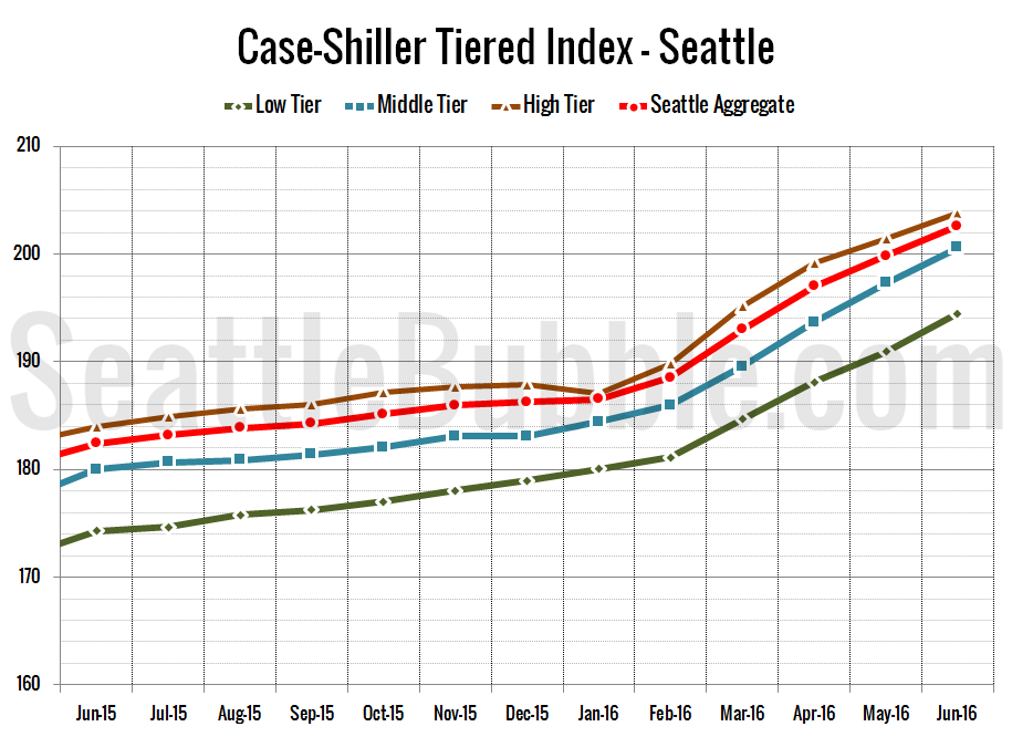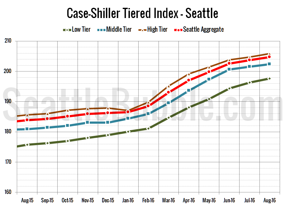
Let’s check out the three price tiers for the Seattle area, as measured by Case-Shiller. Remember, Case-Shiller’s “Seattle” data is based on single-family home repeat sales in King, Pierce, and Snohomish counties.
All three tiers are up month-over-month, but the rate of increase is slowing for the low and middle tiers.
Between July and August, the low tier increased 0.7 percent, the middle tier rose 0.4 percent, and the high tier was up 0.5 percent.