Here’s another question from a reader regarding inventory:
I have a question about the “houses on the market” stat that you called the press to task on for not reporting. Is it an absolute measure or a relative measure? Because certainly hundreds of new houses came on the market last year- definitely enough such that the case is that inventory has DECREASED as a % of total homes. It sounds as if you are saying that it’s purely an absolute measure, which doesn’t seem very helpful to me. And not only have the number of houses increased, but I’m guessing that the population increased also.
Just to make my case using extremes, suppose last year there were 4 million people in the area and 5,000 homes out of, say, 1.5 million total. That would be a “for offer” rate of 3.33%. Now let’s say 200,000 net new residents moved into King County, 5,000 net new homes were built, and 5,100 were “for offer”. OK, so the “for offer” rate would have increased to 3.38%- a 1.4% increase in listings. But the population has increased 5%. So, when considering all the moving parts, have they really “gone up”. I don’t know, you tell me.
Yes, the NWMLS figure of “active listings” (inventory) is an absolute measure. Unfortunately figures like “total homes in region X” isn’t something that we have available to us, so we can’t really know what percentage of “total homes” the “active listings” represents. The reader brings up a good point though, that when compared to factors like total homes and population, an inventory that is holding steady is actually decreasing, and even a slightly increasing abolute inventory is relatively decreasing. However, even though we don’t have a “total homes” figure, we do have one useful thing to compare inventory to in order to gauge the market: pending sales.
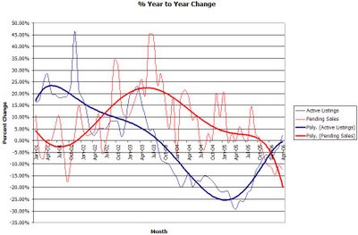
To try to understand the inventory versus pending sales situation a little better, I created this chart using the NWMLS data for “res only” in King County from 2001 to the present. I plotted the year-to-year percent change in inventory and pending sales. The thin lines are the actual data for each month, and the darker lines are a smoothed average using Excel’s polynomial “trend line” function.
Here’s what I find interesting about this chart. Around July 2002—arguably around the time that the Seattle market really started to heat up—the trend lines crossed, meaning that pending sales were increasing faster than new listings were being added. That is probably at least one of the reasons behind the extreme ramp-up in prices. However, about halfway through last year the active listings started on the road to recovery, and around December or January the lines crossed again in the opposite direction. Pending sales have been on a steady downward trend since late 2003, but now (absolute) inventory is actually increasing at the same time.
This is what I was referring to when I pointed out the positive numbers in the “% chg. Total actv” column and negative numbers in “% chg Pending sales” column. Despite the lack of statistics on population or total homes, increasing inventory coupled with decreasing sales volume is a clear sign of a slowing market, and it’s frankly quite disappointing that the local press is turning a blind eye to it. If this trend continues, there is no possible way that the median price can continue to rise like it has been lately. It’s just not economically possible.
