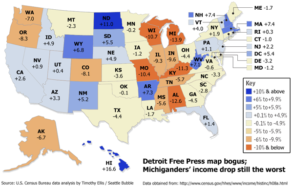
I’d like to make a correction to an earlier post. It was pointed out to me by the ever-vigilant Richard that the income map I posted earlier this week used data sets from two different sources for the two years they compared. The discrepancy was discovered by a pair of reporters at The Examiner.
More surprisingly, these figures didn’t match those in the Census Bureau’s Current Population Survey, or CPS, which showed that median household income in the US had fallen only 2.8 percent — and had risen in around 20 states, not four. Where, we wondered, had they gotten their figures?
An e-mail exchange with the journalists gave us the answer: They had taken their 2005 numbers not from the CPS, but from the American Community Survey, a new research product that is scheduled to replace the detailed “long form” census collected every decade. But they hadn’t taken the 1999 figures from the ACS — in fact, the ACS is so new that it didn’t even publish nationwide data for 1999. Instead, the journalists had taken the 1999 income figures from the official 2000 census.
Whoops. So what was Washington State’s actual change in median household income from 1999 to 2005? According to the US Census Bureau’s inflation adjusted household income table, incomes in Washington State fell only 7.0% from 1999 to 2005, not the 8.4% reported by the Detroit Free Press.
Bad news for Michigan residents, though. Not only is their income drop still the worst, but it’s actually worse than reported by the Detroit Free Press. Here’s the entire map, corrected by yours truly using the same data source for both years.
Overall it is a less grim picture than the bogus map, but Washington still sticks out as a loser among the western states. It should be noted that this does not change the point of my original post. Incomes have gone down in Washington, and thanks in large part to risky loans, during the same time period home prices have gone up. That’s just not healthy.
(Stuart Buck & Megan McArdle, The Examiner, 09.14.2006)
