Aubrey Cohen is on a roll, reporting the uncomfortable truth about the local housing market (granted, with a slight sugar-coating). The latest report is on the ever-increasing number of foreclosures in the Seattle area, another fact that is conveniently ignored by Elizabeth Rhodes at the Seattle Times.
The Seattle area continued to follow the national trend in May of more people facing foreclosure, but still stayed below the national rate, according to statistics released Tuesday.The Seattle area, defined as King and Snohomish counties, recorded 832 foreclosure filings in May, up 9.5 percent from April and 76.6 percent from May 2006, according to RealtyTrac, an Irvine, Calif., company that tracks foreclosure filings.
The Seattle-area rate of one filing for every 1,176 households in May was well below the national rate of one per 656 households and good for 131st among U.S. metro areas, down from 128th in April.
The large year-to-year increase in May was mostly the result of an unusually low number of filings in King County in May 2006. Seattle-area filings are up 15.8 percent for the year through May from the same period last year.
Filings for the state in May were up 21 percent from April and 40 percent from May 2006. Its rate of one filing per 1,153 households put it 20th among states, up from 23rd in April.
Nationally, May’s foreclosure filings were up 19 percent from April and up nearly 90 percent from May 2006.
“After a barely perceptible dip in April, foreclosure activity roared back with a vengeance in May,” James Saccacio, RealtyTrac’s chief executive, said in a statement accompanying the numbers.
“Such strong activity in the midst of the typical spring buying season could foreshadow even higher foreclosure levels later in the year.”
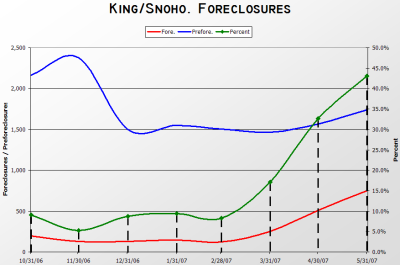
It isn’t that difficult to do the math. Unaffordable mortgages + stagnating appreciation (or even *gasp* depreciation) = increasing foreclosures. For a graphical look at the recent spike in local foreclosures, I present this graph, derived from data harvested from foreclosure.com by the vigilant Bubble Markets Inventory Tracking blog. Credit for the idea for this graph goes to the statistical powerhouse Deejayoh, whose posts on the forum are not to be missed.
The green line represents the ratio of foreclosures to preforeclosures, which as you can see has shot up in the last few months from less than 10% to over 40%. Could this be the beginning of an unpleasant and rapid spike, or is there some reasonable, one-time explanation for the sudden jump?
I just keep going back to that simple equation above.
(Aubrey Cohen, Seattle P-I, 06.12.2007)
