When July’s housing stats came out last week, the most confusing piece of data was that despite skyrocketing local inventory and tightening lending across the nation, the median price still jumped up 2.3% from June, bouncing back into double-digit YOY territory at a 10.6% increase since July 2006.
While the local press has their own theories—apparently based on whimsical fantasies and proud pink ponies—I’ve been doing some actual investigating into the more detailed reports from the NWMLS and have come up with a theory of my own.
The shortcomings of the median price as an indicator of actual price changes have been discussed here before, but typically in a hypothetical sense. For instance, we know that if low-end home buyers stop buying homes, while middle and high-end buyers keep buying, the median will increase. However, in the past we have not been able to observe this happening in King County via the data we have available to us. As you are about to see, I believe that is no longer the case.
The last time we investigated this topic we looked at actual price breakdowns. This data is not generally available to the public though, so I came up with a reasonable alternative: regional breakdowns within King County. This data is publicly available in the KCBreakout pdf files that are released by the NWMLS every month. Furthermore, it serves more or less the same purpose as price breakdowns, since the county can be split into three general regions:
- low end: South County (areas 100-130 & 300-360)
- mid range: Seattle / North County (areas 140, 380-390, & 700-800)
- high end: Eastside (areas 500-600)
The areas’ approximate June 2006 median price was:
- South County: $360,000
- Seattle / North County: $480,000
- Eastside: $640,000
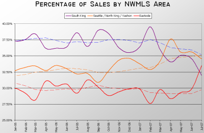
So, if we were to see (for example) a drop in sales in South King County coupled with an increase in sales on the Eastside while the median value of homes sold in each of those areas remained unchanged, the net effect on the county-wide median would be an increase. Let’s see what has actually happened in the King County single-family house market since January of last year:
From January of last year through about January of this year, the Eastside region averaged around 30% of the total closed sales, Seattle / North County averaged roughly 33%, and South County come in at about 37%. However, look what started to happen in February. The Eastside held pretty steady, but the percentage of sales in Seattle vs. South County began to converge, and essentially swap. This was followed up last month with a relatively large jump in sales on the Eastside, from 29.8% of the county-wide total in June to 33.5% in July.
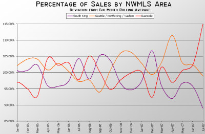
In fact, I believe that almost all of last month’s increase in the county-wide median can be attributed to this spike in sales on the Eastside. To get a better idea of the magnitude of this change, take a look at this graph, which shows the monthly deviation from the six-month rolling average for each area:
In July, the Eastside had a 15% larger portion of the total closed sales in the county than it had averaged over the January-June period, while the South County came in 11% lower. Seattle held mostly steady in July (just 1% lower), having had its large spike in April (up 11%), also primarily at the expense of sales in the South County.
What happens when the sales breakdown goes from 30-35-35 to 33-32-35 in one month, shifting sales from the least expensive area to the most expensive? Ta-da, you get a higher county-wide median.
So how much of the increase in King County’s SFH median can be explained by shifting sales patterns, rather than actual rising home prices? Before February of this year, I would have said “none.” But with Seattle’s share of the total homes sold in the county showing a steady increase, South County sales experiencing a steady decrease, and Eastside sales taking a sudden spike in July, I am now much more inclined to say “quite a bit.”
I don’t think this explains away all of the median price increase over the last few months, but I do think it accounts for a good portion of it, especially last month. In theory, if sales distributions are indeed skewing the median, we should see the YOY change in the Case-Shiller Index begin to diverge from the YOY change in the median, since the Case-Shiller method avoids this particular shortcoming. I’ll keep you posted when July Case-Shiller data is released.
Update: Guess what? My prediction about the July Case-Shiller data was dead-on. MoM change was just 0.2%, YoY was 6.86%. That’s quite a bit different from the median’s 10.6% YoY increase.

