September market statistics from the NWMLS are here.
As usual, when a public link to the usual monthly press release with links to the recap pdfs becomes available, I’ll post it here. For now, here is a link to the data on the NWMLS Marketing page
Here’s your King County SFH summary:
September 2007
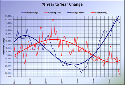
Active Listings: up 40.21% YOY
Pending Sales: down 32.14% YOY
Median Closed Price*: $450,000 – up 5.88% YOY
Pop quiz: What happens to home sales in an inflated housing market like Seattle when you cut the legs out from under the jumbo loan market? Apparently, you get plummeting sales and wild swings in the median. The 32.14% drop in pending SFH sales was the largest year-on-year dip on record, while the 26.4% drop month-to-month, was the third-largest. Only four months on record (which goes back to 2000) had fewer pending sales than last month, and every one of those was in the dead of winter (Jan-00, Dec-00, Dec-01, Dec-02).
Inventory continued the now-normal rate of a 40%+ YOY climb, putting the total number of houses on the market at nearly double what it was two years ago.
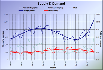
The big story this month (aside from the wild swing in the median) is Months of Supply, which reached a new record high of 7.21. That’s the first time the number has been above six since some time in the early ’90s, and quite possibly the first time ever over seven. Even I was surprised to see it jump so high so fast. Wow.
While the median price dropped nearly $30,000 (6%) from August, giving up almost all of this year’s gains, I think this is largely due to the jumbo loan tightening. Keep the previously-discussed shortcomings in mind when looking at the median. Of course, it seems likely that the media will latch on to the median and headline their stories with it.
Here’s an added bonus. The Seattle Bubble Spreadsheet is now in Excel 2007 format, with new pretty colors on many of the graphs, and additional customization options. Those of you with older versions of Excel should still be able to open it using the free converter provided by Microsoft. However, if you still want the old 2003 format, shoot me an email.
Here’s the supply/demand YOY graph:
Wow, that’s a steep drop at the end of the red line…
Here’s the chart of supply and demand raw numbers (note that I had to adjust the right-side vertical axis for the record-high MOS):

