A while back, Case-Shiller began releasing more detailed information for each of the twenty markets they track. Specifically, the index can now be viewed broken into three tiers: low-priced, middle-priced, and high-priced. Some readers have expressed interest in this information, so let’s take a closer look at Case-Shiller’s Seattle data.
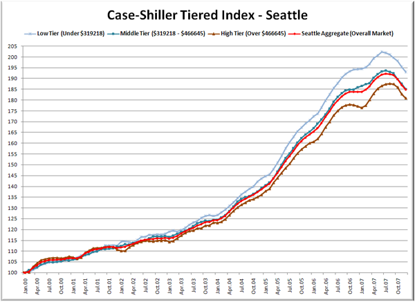
First up is a straight graph of the index from January 2000 through December 2007.
As you can see, there’s not a huge variation here, but there is a noticable difference in the performance of the three tiers. The low tier peaked in June 2007 at 202.4, the middle tier in July at 193.8, and the high tier in August at 187.6. This means that from January 2000 to Summer 2007, the low tier gained 102%, the middle tier 94%, and the high tier 88%.
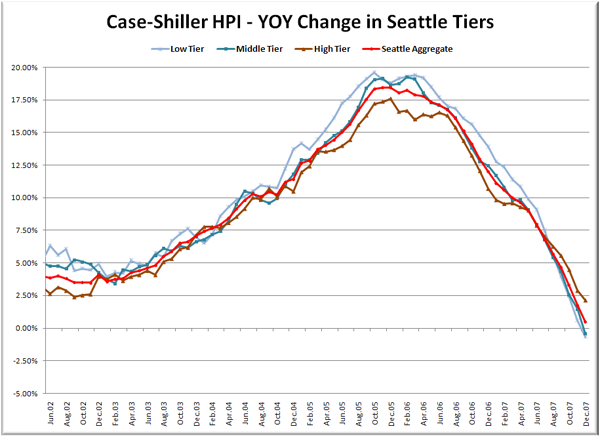
Here’s a chart of the year-over-year change in the index from June 2002 through December 2007 (I selected that date range to match the time-shifted graph in the standard Case-Shiller posts).
All three tiers experienced their peak appreciation from late 2005 to early 2006, with the low tier maxing out at 19.6% in October 2005, the middle tier reaching 19.3% in February 2006, and the high tier topping out at 17.6% in December 2005. While winter is usually the slow season for real estate, the Case-Shiller method of tracking only same-house sales tends to smooth out such seasonality. Also worth noting is the fact that the high tier is the only one that has yet to cross into YOY negative territory. December data put the low tier at -0.66% and the middle tier at -0.42%. The high tier’s +2.14% was enough to keep the aggregate index from going YOY negative yet.
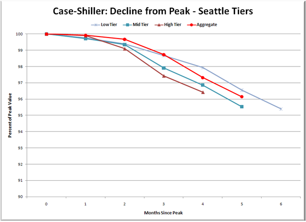
Lastly, here’s a decline-from-peak graph like the one posted yesterday, but looking only at the Seattle tiers.
Nothing too astonishing here. The low tier has been declining longest, but the high tier has been declining fastest. When we have more data as the decline drags on, this will probably prove to be more interesting.
I’m not really sure if you can draw any conclusions from this data, except to note that if the theory of “where prices rose fastest they will fall fastest” is true, the low-priced homes have further to fall, while the higher-priced homes will indeed “hold their value” better. Here’s a question for you: Do you, the readers, find this data interesting enough to merit a monthly post, or should tiered data be posted more like once a quarter?
(Home Price Indices, Standard & Poor’s, 02.26.2008)


