A number of readers have pointed out that despite what Seattle residents may think, there is in fact a world outside of King County. These inquiring readers are interested in seeing what the stats we discuss on Seattle Bubble look like for other local counties around the Puget Sound. Well, this post is for you. Following is a graphical look at the NWMLS data on prices, listings, and pending sales from January 2000 through January 2008 for King, Snohomish, Pierce, Kitsap, Thurston, and Skagit counties. It doesn’t get much more Puget Sound than this.
This post has a total of seven different graphs, so click below to continue reading.
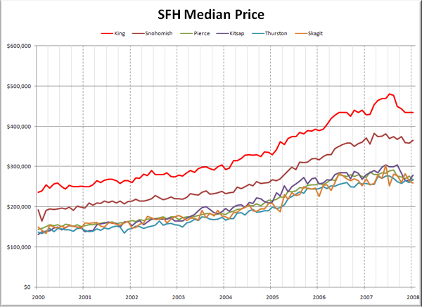
First up, let’s have a look at raw median prices.
Nothing too surprising here. King County sits way on top, with prices in Snohomish County following about 12-18 months behind. Prices in the remaining counties all clump together at 60-65% of King County’s level.
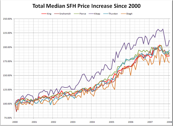
Here’s another take on the same data. This chart shows the total percent increase since January 2000 for each of the counties around the sound.
Obviously the first thing that jumps out about this chart is how much more prices seem to have increased in Kitsap County versus the rest. Peaking at 232% in September 2007 (versus King County’s peak of 204% in July), there’s definitely something odd going on in Kitsap County. Perhaps it’s got something to do with Bainbridge Island and California migration. I wonder if our resident Bainbridge expert could shed some light on that…
You may also notice that there’s a fair amount of volatility in the numbers from the less populated counties such as Skagit and Kitsap. Given the significantly lower volume of sales in these counties (see below), this is to be expected.
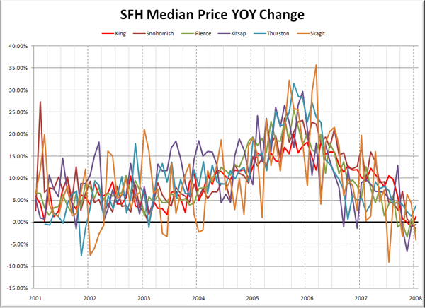
Here’s one more take on median prices, looking at YOY changes.
The volatility in the smaller counties is amplified even more here, turning it into a bit of a mess. Generally though, all six Puget Sound counties have followed pretty much the same pattern since 2000, with peak appreciation coming in Fall 2005, and January’s YOY price change ranging from -4.0% in Skagit to +3.7% in Pierce.
Moving on to listings:
It would seem that the larger the county, the larger the seasonal swing in listings. Again, all six counties show a pretty similar pattern of record-low inventory through 2005 and early 2006, with record-high inventory piling up throughout 2007.
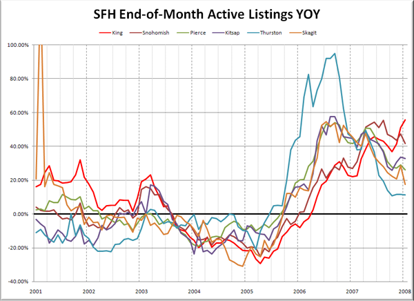
Here’s a look at the YOY change in listings.
What’s interesting to me here is the fairly broad range of time that it took for each county to head back into YOY positive territory. Thurston led the pack in July 2005, while King picked up the rear in May 2006. There’s also a fairly broad difference in the trend line for each county in the last six months. Inventory is still growing in all six counties, but in King the growth appears to be rapidly accelerating, while in some of the outlying counties like Skagit and Thurston, the growth is slowing (but still at over 10% YOY).
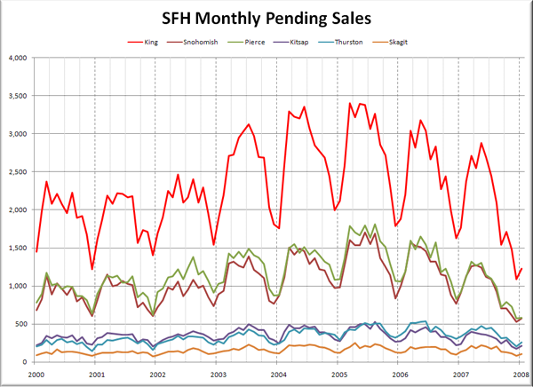
Lastly, let’s check out pending sales:
Pretty much the same story as listings. The hot market in 2005 saw record sales, while the bottoms seems to be dropping out in latter half of 2007. Of course the effect is amplified in the counties with more houses to sell.
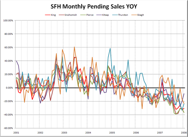
Here’s the YOY graph of sales:
Most everybody headed into YOY negative territory in late 2005 and have remained there since. Skagit has popped up into YOY positive a few times since then, but given the low total volume of sales, such volatility is not out of the ordinary. Another interesting thing is that pretty much every county had a little spike in March of last year. Don’t know why that is exactly, but it’s worth noting.
So here’s where each of the six counties stand as of January 2008:
King – Price: +1.3% | Listings: +55.6% | Sales: -30.6% | MOS: 7.5
Snohomish – Price: -1.5% | Listings: +41.9% | Sales: -36.8% | MOS: 8.8
Pierce – Price: -2.2% | Listings: +26.3% | Sales: -36.6% | MOS: 11.3
Kitsap – Price: -0.5% | Listings: +32.9% | Sales: -8.9% | MOS: 9.8
Thurston – Price: +3.7% | Listings: +11.2% | Sales: -23.7% | MOS: 7.0
Skagit – Price: -4.1% | Listings: +17.6% | Sales: -23.4% | MOS: 9.5
