Here’s an update to the NWMLS statistics for all six Puget Sound counties. I don’t personally want to live in King County, and maybe you don’t either. So, here’s a little graphical look at what the market looks like around the sound.
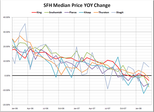
Here’s where the YOY stats stand for each of the six counties as of March 2008:
King – Price: -3.3% | Listings: +56.6% | Sales: -36.9% | MOS: 6.2
Snohomish – Price: -7.8% | Listings: +35.9% | Sales: -43.6% | MOS: 7.7
Pierce – Price: -5.5% | Listings: +18.8% | Sales: -30.1% | MOS: 7.7
Kitsap – Price: -5.5% | Listings: +32.6% | Sales: -33.1% | MOS: 8.7
Thurston – Price: -1.7% | Listings: +9.9% | Sales: -20.6% | MOS: 5.7
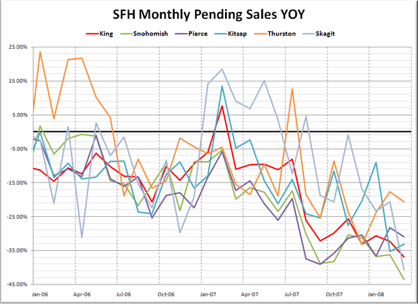
Skagit – Price: +6.0% | Listings: +29.7% | Sales: -40.7% | MOS: 8.9
Following below are updates to the seven graphs I introduced with January’s data. Click below to continue reading.
If you want to see the long-term trends, feel free to download the spreadsheet (or in Excel 2003 format) that all of these graphs come from, and adjust the x-axis to your liking.
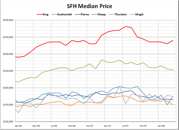
First up, it’s raw median prices.
King and Kitsap both saw a sorta-kinda spring bounce in prices last month, with a weak “recovery” of sorts. Prices in Snohomish, Pierce, Thurston, and Skagit all posted month-to-month losses.
Here’s how each of the counties look compared to their peak:
King – Peak: July 2007 | Down 9%
Snohomish – Peak: March 2007 | Down 8%
Pierce – Peak: August 2007 | Down 9%
Kitsap – Peak: September 2007 | Down 10%
Thurston – Peak: July 2007 | Down 9%
Skagit – Peak: June 2007 | Down 10%
Pretty consistent across the board actually.
Here’s another take on Median Prices, looking at the year-to-year changes over the last two years.
Pierce and Kitsap still look worse than most of the other counties, but this month we have a new price drop leader in Snohomish County, which posted nearly an 8% drop.
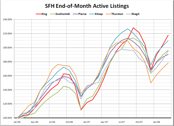
Moving on to listings, rather than display the raw listings, I thought it would be more instructive to index them so we could get a better comparison of how inventory is building in each county relative to some baseline for that county. I used January 2006 as the baseline for this graph:
This view makes it much easier to see how the counties compare in relative inventory growth. King County is still out in front, and inventory is growing least rapidly in Thurston, but even down there, they have still already exceeded the peak inventory of 2006 in March 2008, and are rapidly approaching the 2007 peak.
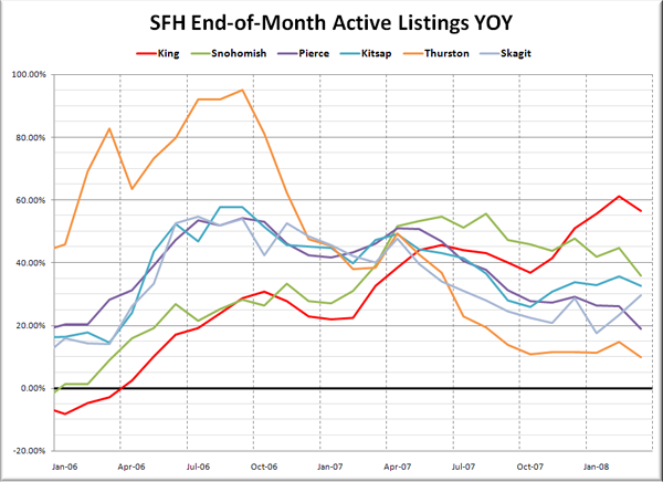
Here’s a look at the YOY change in listings.
The smallest number for March was again in Thurston County with relatively modest 9.9% YOY inventory growth. King County still leads the pack with its 56.7% increase. I continue to be amazed at how many houses are coming on the market, and staying on the market in King County.
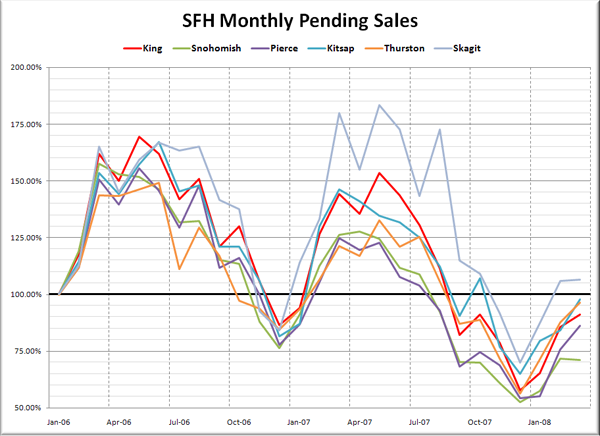
Lastly, let’s check out pending sales, also indexed to January 2006.
Sales are by far the weakest in Snohomish County, which saw just 71% as many sales in March 2008 as they did in January 2006, and actually had fewer sales in March than in February. Not a good sign. Skagit has been holding on with an unusually high volume of sales, which may explain why their year-over-year prices have been holding up so far.
Lastly, here’s the YOY graph of sales:
Not a lot of good news in this picture. The strongest performance compared to last year was in Thurston County, which still saw over 20% fewer sales than March 2007.
Things are still playing out pretty evenly across the sound right now. I have to say I’m surprised that we are seeing roughly the same degree of price drops in all six counties.
