Here’s our monthly look at Seattle’s price tiers from Case-Shiller. Remember that Case-Shiller’s “Seattle” data is based on single-family home repeat sales in King, Pierce, and Snohomish counties.
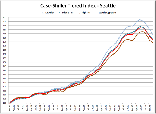
Now here come the graphs. First up is the straight graph of the index from January 2000 through March 2008.
At its peak, the low tier’s index was over 15 points higher than the high tier. As of March, the difference has shrunk to 10 points, a clear indication that homes in the low tier are so far experiencing steeper price drops than those in the high tier.
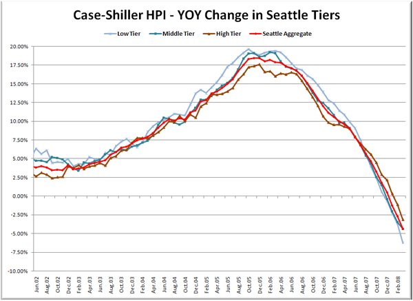
Here’s a chart of the year-over-year change in the index from June 2002 through March 2008.
The low and high tiers both nearly doubled their YOY decline from last month. Here’s where the YOY price change for the three tiers sit as of March – Low: -6.3%, Med: -4.4%, Hi: -3.2%.
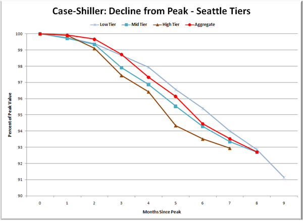
Lastly, here’s a decline-from-peak graph like the one posted yesterday, but looking only at the Seattle tiers.
Declines in the high and mid tiers continued to moderate somewhat, but the month to month drop in the low tier was the largest yet, at nearly 2%. The total decline from peak ranges from 7.0% for the high tier to 8.9% for the low tier.
At this point, even if the index suddenly and unexpectedly leveled off, prices in the three tiers would be down between 7 and 8 percent year-over-year by August. If values continue dropping between 0.5% and 1.0% per month, all three tiers will hit -10% around August.
(Home Price Indices, Standard & Poor’s, 05.27.2008)


