Here’s our monthly look at Seattle’s price tiers from Case-Shiller. Remember that Case-Shiller’s “Seattle” data is based on single-family home repeat sales in King, Pierce, and Snohomish counties.
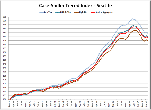
Now here come the graphs. First up is the straight graph of the index from January 2000 through May 2008.
As you can see, April’s spring bounce was essentially erased in all three tiers with May’s drop. The low tier dropped the least in May, but also gained the least in April, and therefore continues to set new lows. The gap between the low tier and the high tier is 9.0 points.
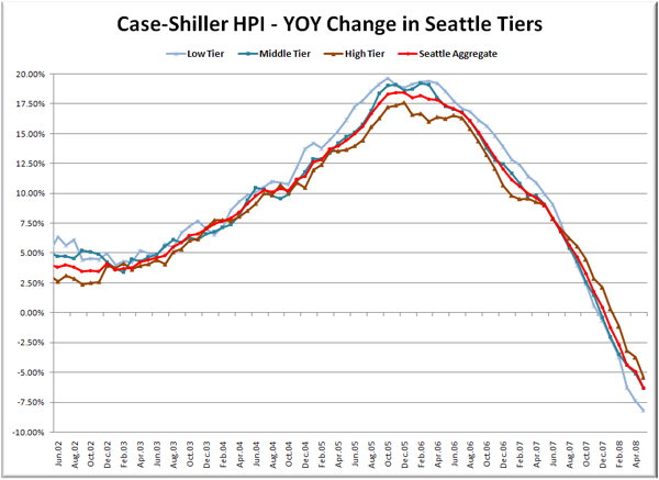
Here’s a chart of the year-over-year change in the index from June 2002 through May 2008.
All three tiers continued to extend their YOY declines in May. The low and mid tiers are well into record YOY decline territory, while the high tier is still somewhat short of its -6.74% YOY performance in June of 1991. Here’s where the tiers sit YOY as of May – Low: -8.2%, Med: -6.3%, Hi: -5.4%.
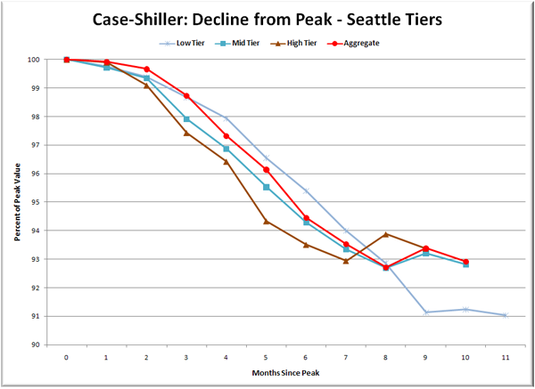
Lastly, here’s a decline-from-peak graph like the one posted yesterday, but looking only at the Seattle tiers.
The low tier is definitely getting hit the hardest, but the difference is not yet severe. The total decline from peak ranges from 6.6% for the high tier to 9.0% for the low tier.
(Home Price Indices, Standard & Poor’s, 07.29.2008)


