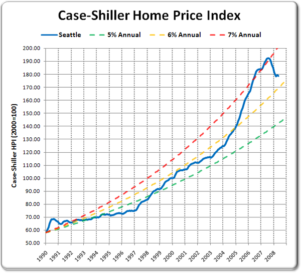
Here’s an interesting way to look at the Case-Shiller data: comparing the actual index values to theoretical values as they would look if they grew at a steady rate year-over-year.

The data starts in 1990 because that is the first year that the Case-Shiller index began tracking Seattle. 1990 may not be the best year to use as a baseline, since it was right at the peak of a good-sized run-up (see the 60-year Seattle home price graph), but it still gives us a good idea of where home prices would be if the appreciation curve had remained in a healthy range.
Up until about 2003, home prices in our area held pretty close to the 5% yearly appreciation curve. At our peak, we crested just over 7% per year, and as of the latest data, Seattle’s Case-Shiller HPI sits at around 6.3% per year, or 25% above the 5% level.
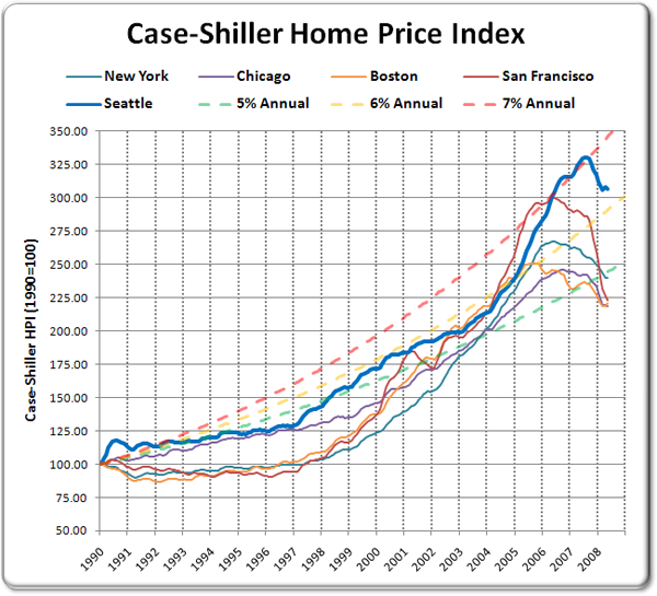
For comparison, here is the same plot, but with New York, Chicago, Boston, and San Francisco added, and all cities re-indexed to 1990=100:

Is there some compelling argument why home prices in Seattle should be averaging around 6% per year appreciation since 1990, while values in other larger, more world-class cities are all tumbling below the 5% per year mark? If there is, I’d love to hear it. If not, I don’t see any reason to expect that prices won’t keep falling here in the Puget Sound until they are more in line with the norm.
This method was inspired by the Median House Price vs. Annually Compounded Interest tool written by regular commenter Jonness. You can use the tool to compare hundreds of other cities in this manner. Jonness also has a number of other valuable home price comparison tools on his website HousingCorrection.com.