There has been some discussion in the comments over the weekend about whether or not the current home price boom in the Seattle area is “unprecidented.” We have already explored the long-term home price trends in King County going back to 1946, but I thought it would be instructive to look at the data in a slightly different way.
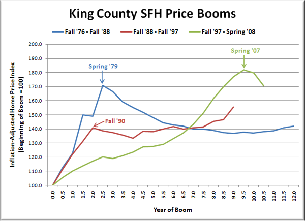
The following chart shows King County’s three major home price booms since the 1970s. The indices are based on King County SFH prices adjusted for inflation using the CPI. For each boom, home prices are indexed to 100 at the start of the boom.
The start of a boom is defined as the semester before home prices began experiencing double-digit appreciation rates. The end of a boom is defined as a period of at least one year of flat or declining inflation-adjusted prices.

Here’s a breakdown of the three cycles depicted above:
Boom 1: 71% increase in 2.5 years.
Bust/Flat 1: 17% drop in 9.5 years.Boom 2: 41% increase in 2 years.
Bust/Flat 2: 11% increase in 7 years.Boom 3: 82% increase in 9.5 years.
Bust/Flat 3: ??? (6% drop in 1 year so far)
The present boom in King County single-family home prices lasted three times as long as previous booms, and prices rose 11 percentage points higher from the pre-boom price. I’d call that unprecedented.
Note that after the 2.5-year ’76 to ’79 boom there was a period of nine years of stagnant / declining home prices. With a larger increase and a longer run-up, it seems quite possible that the fallout from the current boom will last even longer.
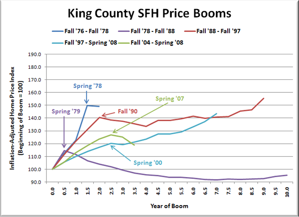
Some may argue that my definition for the end of a boom is not fair, and that one full year of flat or declining prices is not loose enough. Fair enough. Let’s look at the graph if you define any period of flat or declining prices as the end of the boom.

In this version you have:
Boom 1: 50% increase in 1.5 years.
Bust/Flat 1: Slight drop (<0.5%) in 6 months.Boom 2: 15% increase in 6 months.
Bust/Flat 2: 17% drop in 9.5 years.Boom 3: 41% increase in 2 years.
Bust/Flat 3: 11% increase in 7 years.Boom 4: 20% increase in 2.5 years.
Bust/Flat 4: 19% increase in 4.5 years.Boom 5: 27% increase in 2.5 years.
Bust/Flat 5: ??? (6% drop in 1 year so far)
Basically, defining the end of the boom in this way splits the blue and green lines from the original chart into two separate boom/bust cycles each. That results in the odd apparent consequences of a 9.5-year bust following a mere 6-month 15% price increase, and a “bust” that is actually a strong showing of price increases, totaling a gain of 19% in just under 5 years. Neither of those make any sense.
So, unless you believe that the nonsensical second graph is a better representation of King County’s home price booms, the current boom is indeed unprecedented.