I’d like to draw your attention to a post I made earlier this week on the Redfin Sweet Digs blog: Where are buyers getting the biggest discounts?
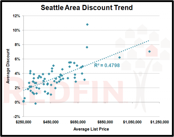
The specific portion that I believe may be of interest to Seattle Bubble readers is the following chart, which is a scatterplot of Seattle-area zip codes, with the average list price of homes sold in each zip code in the last 3 months on the x-axis and the average percent discount from the final list price that they closed at on the y-axis.
I thought it was quite interesting to see a relatively strong correlation between the average price of a neighborhood and the percent below asking price that homes are closing at.
For anyone that is out there right now making offers (not that I think it’s a great time to buy yet), be aware that the more inexpensive the neighborhood, the less likely a seller is to accept an offer significantly below asking price.
If you’re interested you may download the full data summary here.
