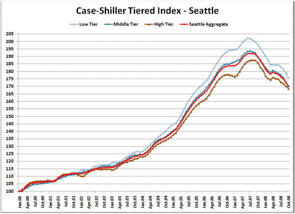
Let’s check out the three price tiers for the Seattle area, as measured by Case-Shiller. Remember, Case-Shiller’s “Seattle” data is based on single-family home repeat sales in King, Pierce, and Snohomish counties.
First up is the straight graph of the index from January 2000 through October 2008.
Prices fell at virtually the same rate in October as they did in September for all three tiers. This brings the low and middle tiers back to February 2006, and the high tier back to April 2006. The middle tier took the biggest percentage hit in October for the third month in a row, falling 1.7% in a single month.
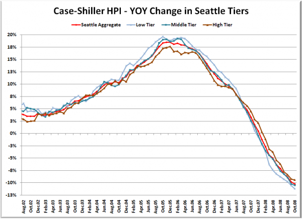
Here’s a chart of the year-over-year change in the index from August 2002 through October 2008.
The low tier again had the biggest year-over-year hit. And again both the low and the middle tiers fell over 10% YOY in October, while the high tier just barely came in under 10%. Here’s where the tiers sit YOY as of October – Low: -11.2%, Med: -10.5%, Hi: -9.4%.
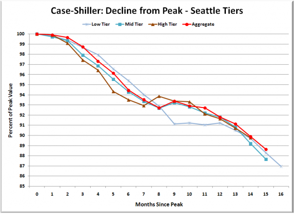
Lastly, here’s a decline-from-peak graph like the one posted yesterday, but looking only at the Seattle tiers.
The decline continues to track remarkably closely across the three tiers, despite the fact that the low tier saw a larger run-up during the bubble.
Here’s one more bit of data that’s somewhat interesting. For the tiered index, Case-Shiller provides dollar amounts that define each tier. Here’s the way they break down the tiers, according to their methodology pdf:
For the purpose of constructing the three tier indices, price breakpoints between low-tier and middle-tier properties and price breakpoints between middle-tier and upper-tier properties are computed using all sales for each period, so that there are the same number of sales, after accounting for exclusions, in each of the three tiers.
Last October’s tiered breakdown was as follows:
Low: <$363419
Mid: $363419 – $523613
Hi: >$523613
Here is this October’s breakdown:
Low: <$299720
Mid: $299720 – $433549
Hi: >$433549
While the tiered index values have only fallen 9-11%, the tier breakpoints have dropped around 17% in the last year. If I’m interpreting this data correctly, that means that the mix of homes selling has shifted down noticably toward the less expensive homes in the past year. If I were guessing, I’d say that is probably due to the difficulties in getting jumbo loan financing for homes priced above $567,500.
(Home Price Indices, Standard & Poor’s, 12.30.2008)


