The time has come for our regularly scheduled monthly check on the Case-Shiller Home Price Index. According to December data,
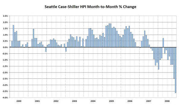
Down 3.6% November to December.
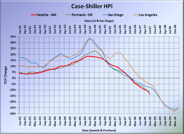
Down 13.4% YOY.
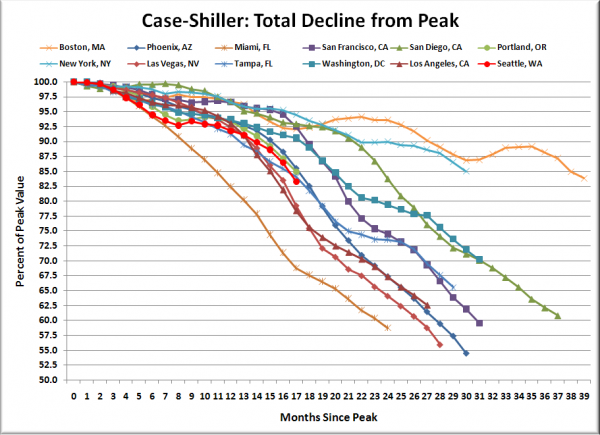
Down 16.7% from the July 2007 peak
Last year prices fell 1.2% from November to December and year-over-year prices were up 0.5%.
It’s interesting to look at the month-to-month changes over the last three months of 2008:
October: -1.4%
November: -2.5%
December: -3.6%
It certainly appears that the price drops are really beginning to accelerate. In 2007 the same months saw month-to-month changes of -0.9%, -1.4%, and -1.2%. So it’s not entirely a seasonal effect going on here.
Unfortunately I’m away from the home office until later this afternoon. I will update this post at that time with the usual graphs.
In the mean time, here’s an ugly chart of the ugly month-to-month numbers:
(Update: Changed the chart above from an area chart to a column chart.)
Update: As promised, here are your regularly scheduled Case-Shiller graphs.
Here’s the usual graph, with L.A. & San Diego offset from Seattle & Portland by 17 months. Portland and Seattle traded places again in December, with the city that still has an NBA team turning in a very slightly smaller year-over-year loss. The YOY declines in SoCal also continued the upward trend that began last month, falling “just” 24.8% in San Diego and 26.4% in Los Angeles.
Note: This graph is not intended to be predictive. It is for entertainment purposes only.
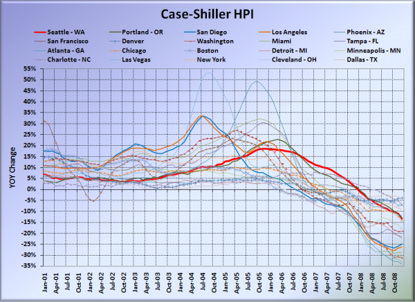
Here’s the graph of all twenty Case-Shiller-tracked cities:
In December, eight of the twenty Case-Shiller-tracked cities experienced smaller year-over-year drops than Seattle (two more than in November). Denver at -4.0%, Dallas at -4.3%, Cleveland at -6.1%, Boston at -7.0%, Charlotte at -7.2%, New York at -9.1%, Atlanta at -12.0%, and Portland at -13.1%. Phoenix had the largest year-over-year drop yet again, with prices falling barely short of 34% in a single year.
Here’s an update to the peak-decline graph, inspired by a graph created by reader CrystalBall. This chart takes the twelve cities whose peak index was greater than 175, and tracks how far they have fallen so far from their peak. The horizontal axis shows the total number of months since each individual city peaked.
In the seventeen months since the price peak in Seattle prices have declined 16.7%. The decline in Seattle deviated from the trail blazed by Phoenix 13 months earlier, for the worse. Seattle’s present rate of decline from the peak is most similar to that seen in Tampa, Florida.
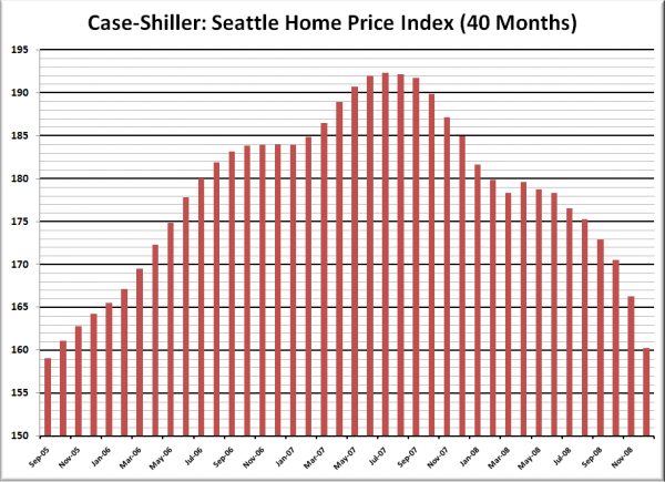
Here’s the “rewind” chart. The horizontal range is selected to go back just far enough to find the last time that Seattle’s HPI was as low as it is now. This gives us a clean visual of just how far back prices have retreated in terms of months.
Seattle’s Case-Shiller value for December 2008 of 160.19 came in just above its September 2005 value of 158.99. In one month, prices gave up four months of prior gains. Prices have now “rewound” over three years.
Check back tomorrow for a post on the Case-Shiller data for Seattle’s price tiers.
(Home Price Indices, Standard & Poor’s, 02.24.2009)
