Let’s check out the three price tiers for the Seattle area, as measured by Case-Shiller. Remember, Case-Shiller’s “Seattle” data is based on single-family home repeat sales in King, Pierce, and Snohomish counties.
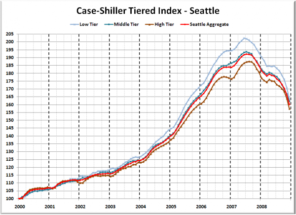
First up is the straight graph of the index from January 2000 through December 2008.
December was downright rough in all three tiers, with the low tier again taking the largest hit—4.2% in a month. The low tier has rewound to August 2005, the middle tier to September 2005, and the high tier to October 2005.
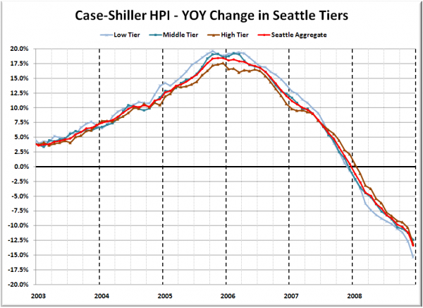
Here’s a chart of the year-over-year change in the index from January 2003 through December 2008.
The low tier also holds the title for largest YOY declines (still). Meanwhile, the high tier moved into second place with a nearly 3-point increase in the YOY drop. Here’s where the tiers sit YOY as of December – Low: -15.3%, Med: -12.4%, Hi: -13.0%.
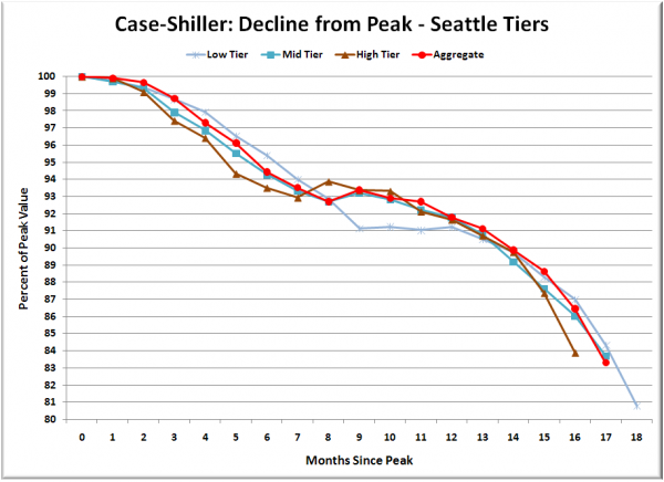
Lastly, here’s a decline-from-peak graph like the one posted yesterday, but looking only at the Seattle tiers.
The high tier deviated noticeably from its recent pattern of following the tracks laid by the low and middle tiers, which continued to track each other fairly closely.
It is somewhat unusual that the high tier would be experiencing a larger correction than the low and middle tiers, since it did not see as much of an increase during the bubble. I imagine this might have something to do with the conforming loan limits, but there is really no way to be sure.
(Home Price Indices, Standard & Poor’s, 02.24.2009)


