Although the median price has its drawbacks, it does at least give us a reasonably accurate measure of the general direction and magnitude of price changes in an area.
While we have had regular monthly updates on the county-wide median prices, we haven’t really taken a look at the price breakdowns by neighborhood for a while. Let’s check in on the total drop in median prices by neighborhood.
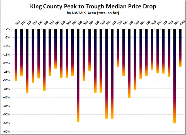
The chart below shows the total drop in the single-family median price from the peak month to the lowest month to date for each of 29 NWMLS neighborhoods (701—Downtown Seattle excluded, see a map here).
Note that the peak months ranged from January to November 2007. For the price troughs came in February for 11 areas, in January for 9 areas, in October through December in 8 areas, and in June for Area 550 (Redmond, Carnation).
The largest drops so far have been in Mercer Island (510) and Medina/Clyde Hill/West Bellevue (520) tied at 52%, Skyway (360) at 54%, and Vashon Island (800) at 55% off.
The smallest drops so far have been in Ballard/Greenlake/Greenwood (705) at 24%, Black Diamond/Maple Valley (320) at 23%, and East Bellevue (530) at 22% off.
It’s interesting that at 22% off, the county-wide drop from the peak is equal to the smallest drop that has been seen to date in any individual neighborhood. Due to the low volume of closed sales in individual neighborhoods, the median price tends to fluctuate more than it does county-wide. When comparing the individual peaks to February 2009, 8 neighborhoods have dropped 22% or less.
Does a median price drop of 50% off or more in a neighborhood mean that most houses in that neighborhood have had their values drop 50%? Probably not. But it is definitely more likely that houses in such neighborhoods have dropped in price considerably more than those in neighborhoods with only a 20% drop.
