Let’s check out the three price tiers for the Seattle area, as measured by Case-Shiller. Remember, Case-Shiller’s “Seattle” data is based on single-family home repeat sales in King, Pierce, and Snohomish counties.
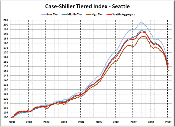
First up is the straight graph of the index from January 2000 through January 2009.
All three tiers continued their steep declines in January, but this time the high tier took the largest month-to-month hit: 4.2%. The low tier has rewound to May 2005, the middle tier to August 2005, and the high tier to July 2005.
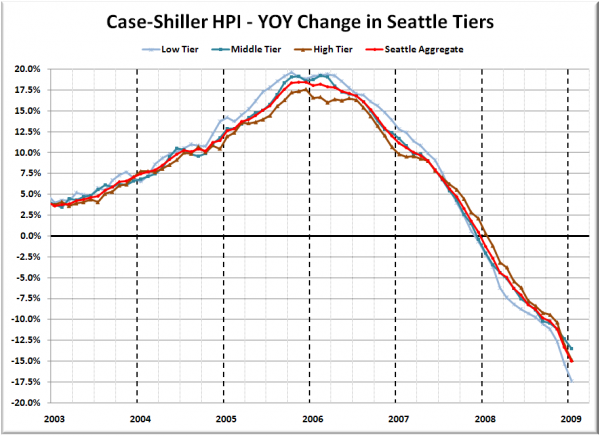
Here’s a chart of the year-over-year change in the index from January 2003 through January 2009.
The highest YOY performance turned in by any of the tiers during the bubble was October 2005 for the low tier, coming in at +19.6%. The way things are trending right now, it looks as though all three tiers could turn in negative YOY performance in greater quantities as early as March. The low tier also kept its title for largest YOY decline. The high tier held its position in second place. Here’s where the tiers sit YOY as of January – Low: -17.4%, Med: -13.5%, Hi: -14.8%.
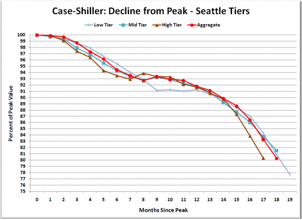
Lastly, here’s a decline-from-peak graph like the one posted yesterday, but looking only at the Seattle tiers.
The high tier continued the trend that began last month, falling slightly faster than either of the other tiers that far from their respective peaks.
Seattle’s respective performance of the high tier vs. the low tier stands out as unusual when compared to other cities such as San Francisco, where the low tier has fallen quite a bit further than the high or middle tiers.
(Home Price Indices, Standard & Poor’s, 03.31.2009)


