Inspired by this post from Rich Toscano down in San Diego showing that home prices there have reached historically reasonable levels when compared to rents and incomes, I thought I would put together some similar charts for Seattle to see how close we are to reasonable home prices.
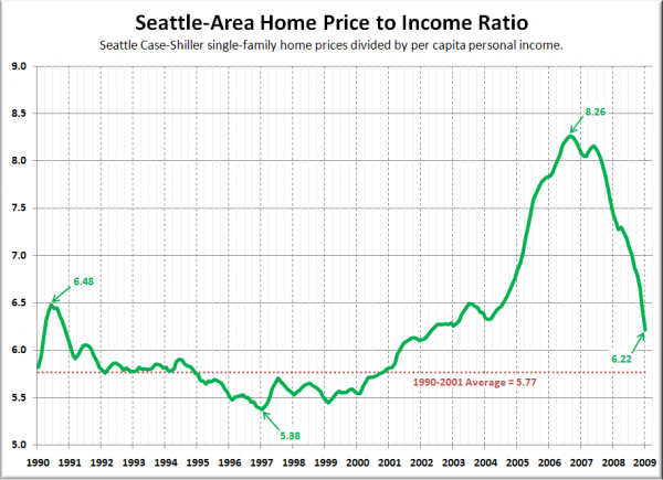
Here’s the chart for home prices to per capita incomes, from January 1990 (as far as Seattle’s Case-Shiller data goes back) through January 2009:
As of January, Seattle’s home price to income ratio is at levels last seen in May 2002. Not bad, but still about 8% higher than the 1990-2001 average, and 16% higher than where the ratio bottomed out during the bust that followed the early ’90s housing boom.
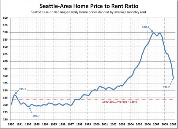
And here’s the chart for home prices to rents:
The home price to rent comparison has “rewound” to approximately October 2003, and is overall less in balance from a historical perspective than the price-to-income ratio. January 2009’s value came in 23% higher than the 1990-2001 average, 34% higher than the previous bottom, and even 17% higher than the June 1990 peak value.
[Update: I should add that the specific area-wide rent ratio values are somewhat arbitrary, and are only really useful to compare to their own past performance. I strongly recommend against using them as a valuation tool for any specific home or neighborhood.]
It’s worth pointing out that both rents and incomes in the Seattle area are currently on downward trends of their own, which will only serve to prolong the inevitable correction to historically sustainable ratios.
The good news is that at the present rate of correction, Seattle-area home prices will likely hit the “reasonable” range compared to local incomes and rents sometime late this year to early next year. Note that home prices will likely continue to fall even after we hit that range, (as they are currently in San Diego), but that would at least indicate that homes are no longer overpriced with respect to historical fundamentals.

