It’s everybody’s favorite time of the month again. That’s right, time for the latest data from the Case-Shiller Home Price Index. According to July data,
Down 0.1% June to July.
Down 0.3% June to July (seasonally adjusted)
Down 15.3% YOY.
Down 22.3% from the July 2007 peak
Last year prices fell 1.0% from June to July (not seasonally adjusted) and year-over-year prices were down 8.2%.
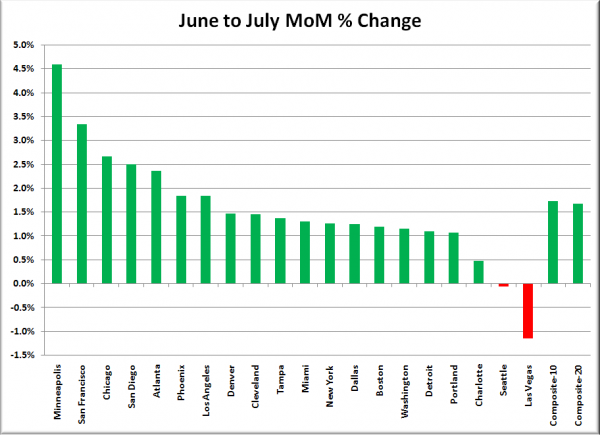
Since the national media outlets will no doubt be crowing once again about a month-to-month increase in the nationwide 20-city index, here’s a new chart to kick things off: every city’s percentage change from June to July (taken from the non-seasonally-adjusted data, since that’s all the national media usually reports on):
So, there’s that.
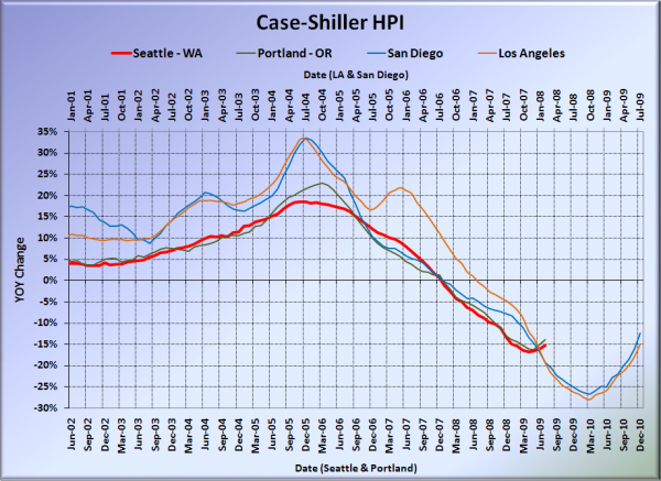
Here’s our offset graph, with L.A. & San Diego time-shifted from Seattle & Portland by 17 months. Still the summer of improvement on this one, with Portland up to -13.9%, Los Angeles at -14.9%, and San Diego again coming in better than Seattle at -12.3%.
Note: This graph is not intended to be predictive. It is for entertainment purposes only.
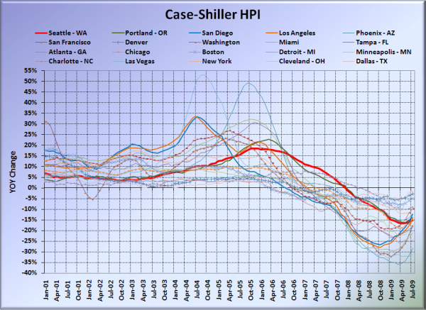
Here’s the graph of all twenty Case-Shiller-tracked cities:
In July, twelve of the twenty Case-Shiller-tracked cities experienced smaller year-over-year drops than Seattle (vs. ten last month). Cleveland at -1.3%, Dallas at -1.6%, Denver at -2.9%, Boston at -5.0%, Charlotte at -9.0%, Washington, DC at -9.8%, New York at -10.0%, Atlanta at -12.1%, San Diego at -12.3%, Portland at -13.9%, Chicago at -14.2%, and Los Angeles at -14.9%. Vegas held the #1 spot for the largest year-over-year drop, with prices still falling over 30% in a single year down there.
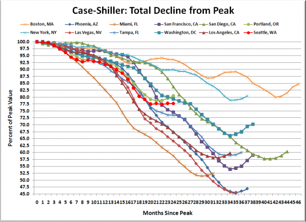
Here’s an update to the peak-decline graph, inspired by a graph created by reader CrystalBall. This chart takes the twelve cities whose peak index was greater than 175, and tracks how far they have fallen so far from their peak. The horizontal axis shows the total number of months since each individual city peaked.
In the two full years since the price peak in Seattle prices have declined 22.3%. We still haven’t quite moved over to the DC trend, but the summer of flatline prices did at least move Seattle off the Phoenix price drop trend.
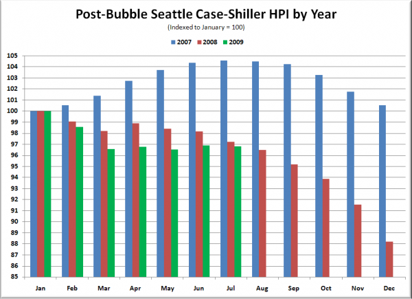
The following chart takes the post-bubble years of 2007, 2008, and 2009 and indexes each January’s Case-Shiller HPI to 100 so we can get a picture of how this year’s declines compare to last year:
Still slightly below where we were this far into last year, at just over 3% off January.
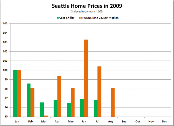
Here’s an update to the Case-Shiller vs. NWMLS median chart. The following chart shows Seattle-area 2009 home prices, indexed to January = 100, as reported by the NWMLS and by Case-Shiller.
While Case-Shiller has been mostly flat since March, the NWMLS median has been swinging all over the place.
Check back tomorrow for a post on the Case-Shiller data for Seattle’s price tiers.
(Home Price Indices, Standard & Poor’s, 09.29.2009)
