Looks like it’s time for September market statistics from the NWMLS. Here’s the NWMLS press release: Northwest MLS brokers agree "there’s a lot to be optimistic about".
Here’s your King County SFH summary, with the arrows to show whether the year-over-year direction of each indicator is positive or negative news for buyers and sellers:
| September 2009 | Number | MOM | YOY | Buyers | Sellers |
| Active Listings | 9,360 | -1.4% | -19.4% |  |
 |
| Closed Sales | 1,618 | +0.6% | +14.3% |  |
 |
| SAAS (?) | 1.82 | -5.1% | -19.3% |  |
 |
| Pending Sales | 2,289 | -1.0% | +29.5 |  |
 |
| Months of Supply | 4.09 | -0.4% | -37.8% |  |
 |
| Median Price* | $382,160 | +1.9% | -7.9% |  |
 |
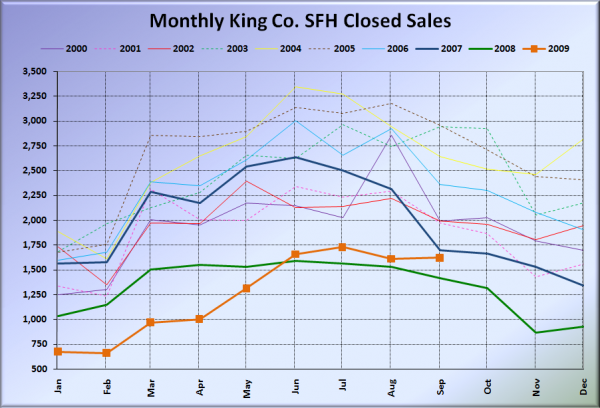
Closed sales were basically in a holding pattern the last four months, trending similarly to the pattern we have seen in pending sales since roughly April. April – September pending sales have ranged between 2,114 and 2,447, while June – September closed sales have ranged between 1,609 and 1,727.
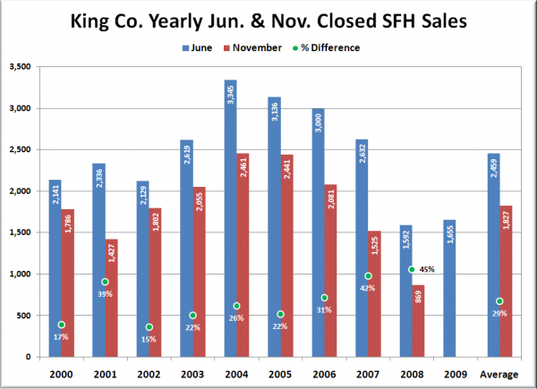
I suspect we will see a much stronger November for closed sales than usual, due to the impending expiration of the free money handout for knife-catchers, but I doubt that it will climb much above the 1,600-1,700 range we have seen through the summer. Historically (2000-2008), November closed sales volume has averaged 71% of June volume. 71% of this year’s June volume would be 1,179 sales this November. I’m guessing it will be higher than that, but I don’t see it going much above 1,500 – 1,600.
Here’s a visual of June volume (usually at or near the peak in the summer) vs. November volume since 2000:
Here’s how the closed sales situation is shaping up compared to previous years:
Feel free to download the updated Seattle Bubble Spreadsheet, and here’s a copy in Excel 2003 format. Click below for the graphs and the rest of the post.
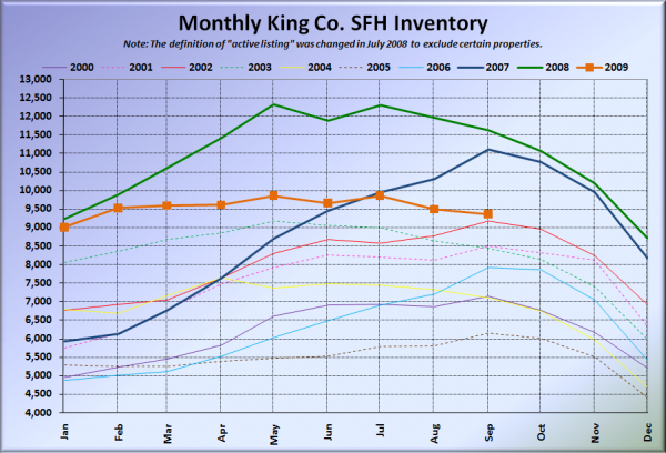
Here’s the graph of inventory with each year overlaid on the same chart.
Inventory still pretty much flat-lining. Just enough people putting their homes on the market to satisfy the monthly demand. Not much more, not much less.
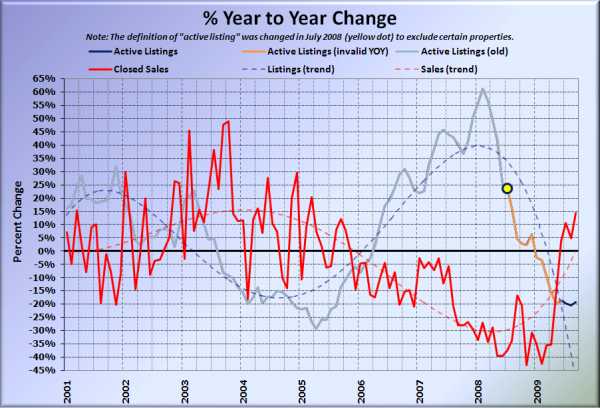
Here’s the supply/demand YOY graph. In place of the now-unreliable measure of pending sales, the “demand” in the following two charts is now represented by closed sales, which have had a consistent definition throughout the decade.
Another bump back up for the YOY closed sales. I suspect this will be in positive territory through November at least, and possibly December, depending on whether the tax credit is extended / expanded or allowed to expire.
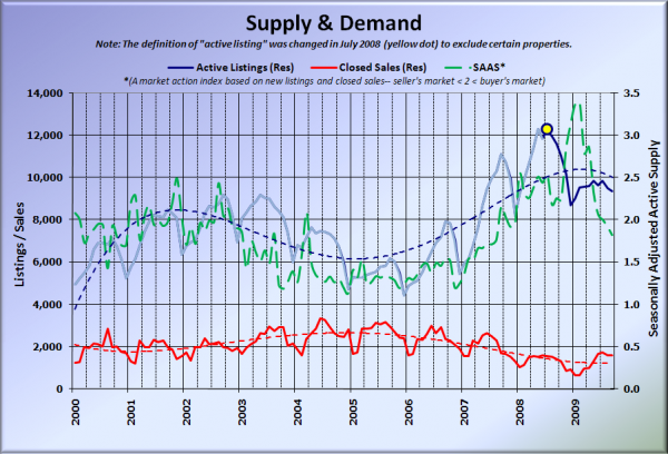
Here’s the chart of supply and demand raw numbers:
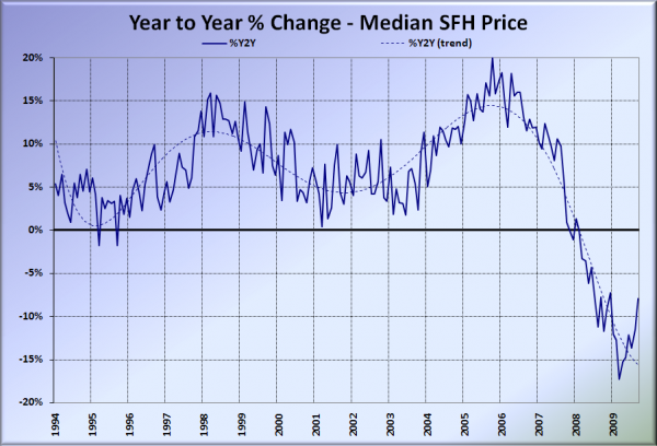
Here’s the median home price YOY change graph:
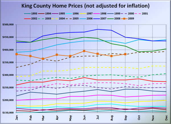
And lastly, here is the chart comparing King County SFH prices each month for every year back to 1994.
Pretty much right at 2005 pricing. September 2005: $381,250. September 2009: $382,160.
Here’s a few news blurbs to hold you over until tomorrow’s reporting roundup, which may be posted later in the day than usual to give this post a longer period at the top of the page.
Seattle Times: Home sales in September surge in King County but prices still declining
Seattle P-I: King County home sales surge, but pitfalls remain
Go back up to the second chart in this post for a sec. Would someone mind explaining to me which part of that data constitutes a “surge”?
