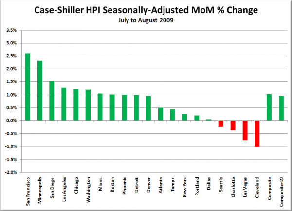
It’s that fun time of the month once again. That’s right, time for the latest data from the Case-Shiller Home Price Index. According to August data,
Up 0.1% July to August.
Down 0.2% July to August (seasonally adjusted)
Down 14.7% YOY.
Down 22.2% from the July 2007 peak
Last year prices fell 0.7% from July to August (not seasonally adjusted) and year-over-year prices were down 8.8%.
Once again, here’s a little dose of sanity to contrast with what is no doubt set to be a day full of crowing and hoopla over the month-to-month increases seen in most of the 20 cities tracked by the Case-Shiller index.
It still looks as though Seattle is being somewhat left out of this party.
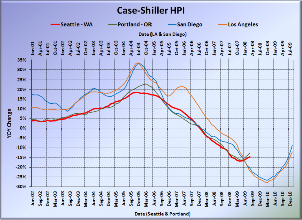
Here’s our offset graph, with L.A. & San Diego time-shifted from Seattle & Portland by 17 months. Look at SoCal’s year-over-year skyrocketing back up to zero. Portland came in at -12.5%, and now both Los Angeles at -12.0%, and San Diego at -8.9% came in better than Seattle.
Note: This graph is not intended to be predictive. It is for entertainment purposes only.
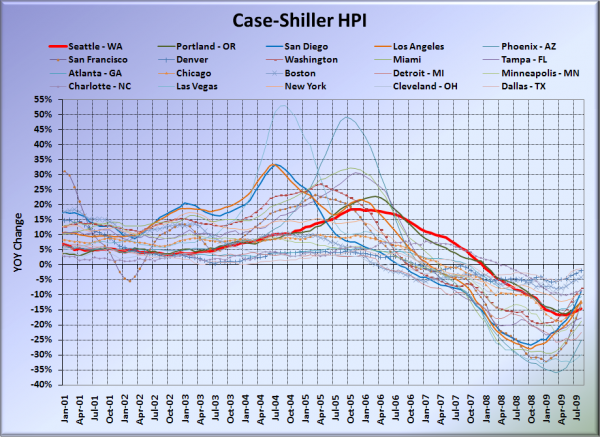
Here’s the graph of all twenty Case-Shiller-tracked cities:
In July, fourteen of the twenty Case-Shiller-tracked cities experienced smaller year-over-year drops than Seattle (vs. twelve last month). Dallas at -1.2%, Denver at -1.9%, Cleveland at -2.8%, Boston at -4.2%, Washington, DC at -7.9%, Charlotte at -8.6%, San Diego at -8.9%, New York at -9.6%, Atlanta at -10.6%, Los Angeles at -12.0%, Portland at -12.5%, San Francisco at -12.5, Chicago at -12.7%, and Minneapolis at -13.7%. Vegas took the #1 spot again for the largest year-over-year drop, with prices still falling over 30% in a single year down there—stimulus? What stimulus?
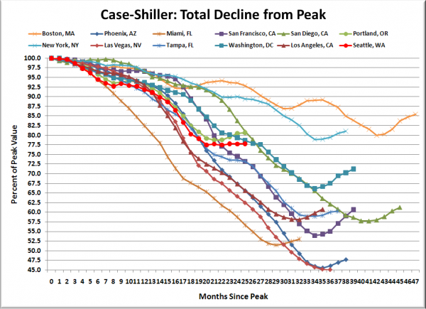
Here’s an update to the peak-decline graph, inspired by a graph created by reader CrystalBall. This chart takes the twelve cities whose peak index was greater than 175, and tracks how far they have fallen so far from their peak. The horizontal axis shows the total number of months since each individual city peaked.
In the two years and a month since the price peak in Seattle prices have declined 22.2%. Definitely seems to be stuck moving sideways.
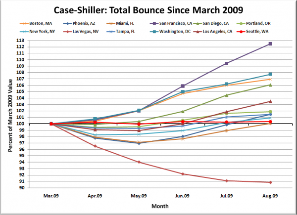
Here’s a complimentary chart to that last one. This one shows the total change in the index since March for the same twelve markets as the peak decline chart.
With just a 0.3% increase since March, the summer of stimulus seems to be having little effect on Seattle home prices. But hey, at least we’re not as immune to stimulus as Vegas apparently is. Down 9% in just the last five months. Ouch!
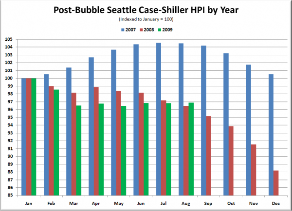
The following chart takes the post-bubble years of 2007, 2008, and 2009 and indexes each January’s Case-Shiller HPI to 100 so we can get a picture of how this year’s declines compare to last year:
Thanks to the tax credits, abnormally / artificially low interest rates, and lots of hype about a so-called recovery, it would seem that we have pulled 2009 into slightly better territory than 2008.
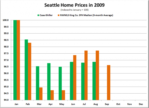
Lastly, here’s an update to the Case-Shiller vs. NWMLS median chart. The following chart shows Seattle-area 2009 home prices, indexed to January = 100, as reported by the NWMLS (using a 3-month rolling average) and by Case-Shiller.
Check back tomorrow for a post on the Case-Shiller data for Seattle’s price tiers.
(Home Price Indices, Standard & Poor’s, 10.27.2009)
