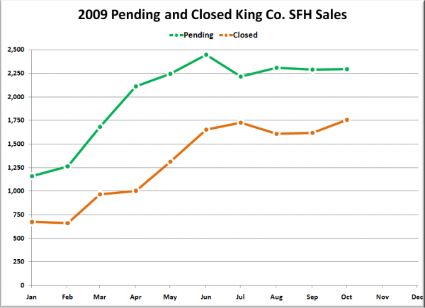
On Friday I posted this graph of 2009’s pending and closed sales to demonstrate just how out of whack the two have become:
In the comments, a reader claimed that I was “reading this graph wrongly,” and that plotting the data in this manner “will always see a giant gap.”
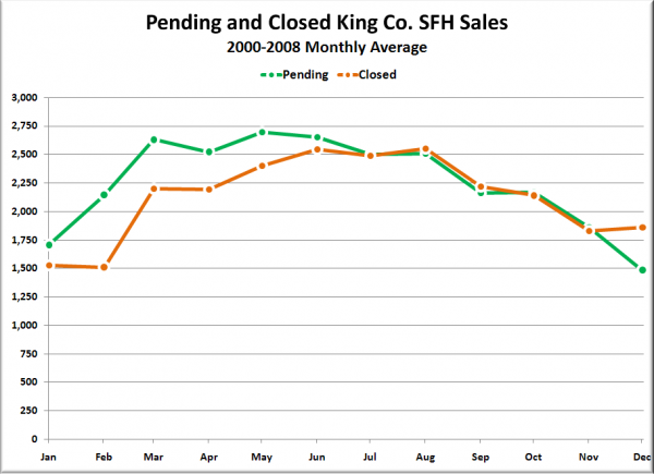
Since there is typically a delay between when a sale goes pending and when it actually closes, this would make sense logically. Unfortunately, the data does not bear this theory out. In general, the gap tends to appear only in the spring, with pending and closed sales generally evening out in the summer and fall.
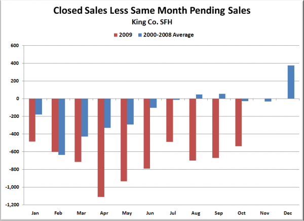
Here’s another way to visualize the difference between this year and previous years:
Six of the ten months so far this year have blown past the lowest average monthly difference in 2000-2008 (-635 in February).
If you’re interested, I have also plotted the pre-bubble years 2000-2003 individually:
No matter which way you slice it, this year is incredibly out of whack when it comes to the number of pending sales that actually turn into closed deals.


