The latest (third quarter) personal income stats from the Bureau of Economic Analysis came out today. Washington State showed a 0.6% increase from the second quarter to the third, but a record 1.5% year-over-year drop from the third quarter 2008.
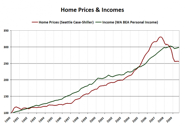
I thought it would be interesting to compare this measure to home prices. Keep in mind that what we’re looking at here is statewide income and King/Snohomish/Pierce home prices, so it’s not a perfect comparison. For this chart I have indexed the BEA data to Q1 1990 = 100, and re-indexed the Case-Shiller index to January 1990 = 100.
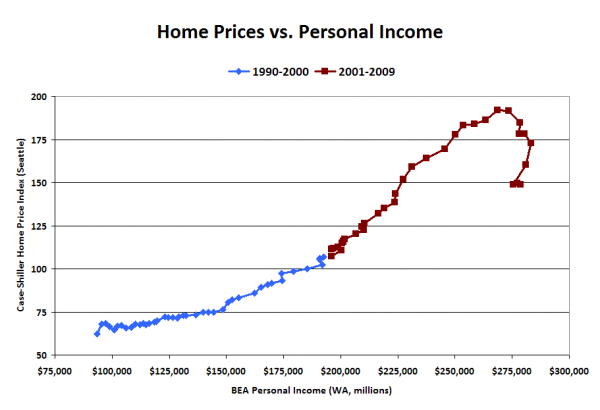
This is a similar comparison to one Deejayoh made in June, but the statewide data is released quarterly (vs. yearly for county data), so we can get a more timely snapshot. When we view the same type of x-y scatterplot that Deejayoh posted, we can see the reversion to the long-term trend as well. The following chart is based on the raw BEA and Case-Shiller data without any re-indexing.
Home prices are still slightly above where they would be if their 1990-2000 relationship between incomes had held steady, with the latest Case-Shiller index reading coming in around 12% higher than the trendline. This falls roughly inline with my expectation that Seattle-area home prices probably have about another 10% left to fall before they reach a natural market equilibrium.

