Let’s have a look at the latest data from the Case-Shiller Home Price Index. According to December data,
Down 0.7% November to December.
Up 0.2% November to December (seasonally adjusted).
Down 7.9% YOY.
Down 23.3% from the July 2007 peak
Last year prices fell 3.6% from November to December (not seasonally adjusted) and year-over-year prices were down 13.4%.
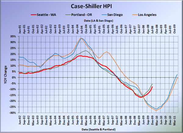
Here’s our offset graph, with L.A. & San Diego time-shifted from Seattle & Portland by 17 months. San Diego was above zero again, while LA was right at zero. Portland came in at -5.4%, Los Angeles at 0.0%, and San Diego at +2.7%, all better than Seattle.
Note: This graph is not intended to be predictive. It is for entertainment purposes only.
Here’s an interactive graph of all twenty Case-Shiller-tracked cities, courtesy of Tableau Software (check and un-check the boxes on the right):
Also in positive YOY territory: San Francisco, Denver, DC, Boston, and Dallas.
In December, fourteen of the twenty Case-Shiller-tracked cities experienced smaller year-over-year drops (or saw year-over-year increases) than Seattle (same as August through November). San Francisco at +4.8, Dallas at +2.9%, Denver at +0.5%, San Diego at +2.7%, Washington, DC at +1.9%, Boston at +0.5%, Los Angeles at 0.0%, Cleveland at -1.2%, Minneapolis at -2.3%, Charlotte at -3.8%, Atlanta at -4.0%, Portland at -5.4%, New York at -6.3%, and Chicago at -7.2%.
The only other cities still experiencing larger year-over-year declines than Seattle are Phoenix, Miami, Detroit, Tampa, and Las Vegas.
Because I can, here’s an interactive chart of the raw HPI for all twenty cities through December.
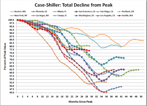
Here’s an update to the peak-decline graph, inspired by a graph created by reader CrystalBall. This chart takes the twelve cities whose peak index was greater than 175, and tracks how far they have fallen so far from their peak. The horizontal axis shows the total number of months since each individual city peaked.
In the twenty-eight months since the price peak in Seattle prices have declined 23.3%, another new post-peak low.
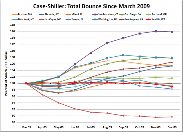
Here’s a complementary chart to that last one. This one shows the total change in the index since March for the same twelve markets as the peak decline chart.
Not all markets are bouncing equally.
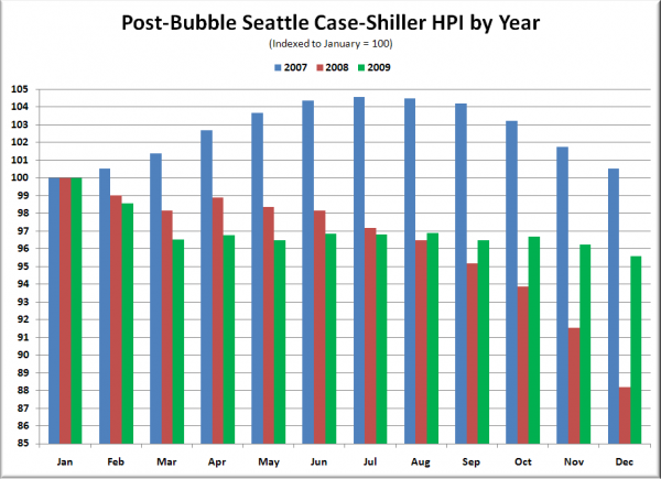
The following chart takes the post-bubble years of 2007, 2008, and 2009 and indexes each January’s Case-Shiller HPI to 100 so we can get a picture of how this year’s declines compare to last year:
Almost the entire difference in this year’s performance came in the last four months of the year.
Check back tomorrow for a post on the Case-Shiller data for Seattle’s price tiers.
(Home Price Indices, Standard & Poor’s, 02.23.2010)


