March market stats have been published by the NWMLS. Here’s a link to the NWMLS press release (not live quite yet), once again headlined with a totally meaningless statistic: Northwest MLS brokers report 51% jump in pending sales.
Home sales around Washington state surged last month, with brokers reporting activity at levels “like we haven’t seen in a while,” according to the owner of a Seattle brokerage. Northwest Multiple Listing Service members reported 8,605 pending sales during March for a 51 percent increase over the same month a year ago.
Nothing like a good surge in pending sales.
Here’s your King County SFH summary, with the arrows to show whether the year-over-year direction of each indicator is favorable or unfavorable news for buyers and sellers (green = favorable, red = unfavorable):
| March 2010 | Number | MOM | YOY | Buyers | Sellers |
|---|---|---|---|---|---|
| Active Listings | 8,816 | +8.6% | -8.1% |  |
 |
| Closed Sales | 1,596 | +60.1% | +64.9% |  |
 |
| SAAS (?) | 2.22 | -11.0% | -20.5% |  |
 |
| Pending Sales | 2,749 | +32.2% | +63.3% |  |
 |
| Months of Supply | 3.21 | -17.8% | -43.7% |  |
 |
| Median Price* | $367,250 | -1.5% | +0.9% |  |
 |
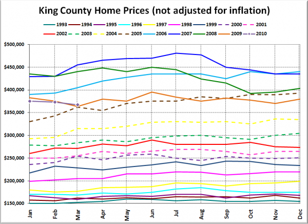
It is worth noting that March 2009 was the post-peak low point to date for the median SFH price, coming in at $363,850. This March 2010’s median is the second-lowest. If we see another 1.5% decline next month, we’ll hit a new low at about $361,750.
Closed sales surged from February, not surprising given the impending expiration of the $8,000 mortgage buyer tax credit (for real this time, supposedly). I fully expect closed sales to continue climbing at least through May. We may even hit Greg Perry’s 2,000 level this year.
Feel free to download the updated Seattle Bubble Spreadsheet, and here’s a copy in Excel 2003 format.
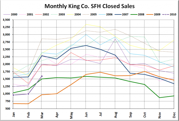
Here’s your closed sales yearly comparison chart:
Hey, we climbed above 2009 and 2008 finally, but we’re still a fair bit lower than every other year. I won’t be suprised to see the purple line climb up close to that dark blue 2007 line, but I doubt we’ll exceed it by much, if at all, throughout the course of the year.
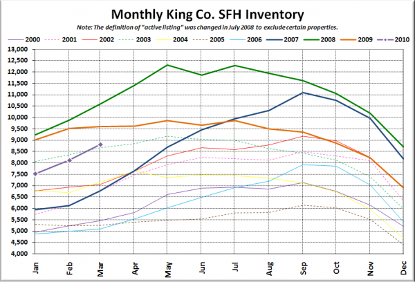
Here’s the graph of inventory with each year overlaid on the same chart.
At this rate it looks like we’ll exceed last year’s inventory in a month or two.
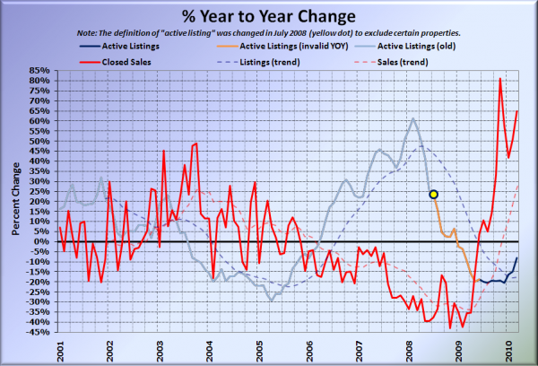
Here’s the supply/demand YOY graph. In place of the now-unreliable measure of pending sales, the “demand” in this chart is represented by closed sales, which have had a consistent definition throughout the decade.
Sales remain highly elevated compared to a year ago, while listings are quickly climbing back up toward zero.
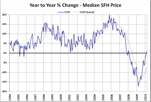
Here’s the median home price YOY change graph:
Ooh, look at that. Despite a month-over-month drop, median prices eeked out a tiny 0.9% year-over-year gain.
And lastly, here is the chart comparing King County SFH prices each month for every year back to 1994.
Still hovering around vintage 2005.
I’ll update this post with the news blurbs from the Times and P-I when they’re posted (slowpokes).
[Update]
Seattle Times: King County house prices post year-over-year rise for first time in 2 years
Seattle P-I: Home prices post first year-to-year rise in more than two years
Times are tough. The Times and P-I have to share a headline writer.
