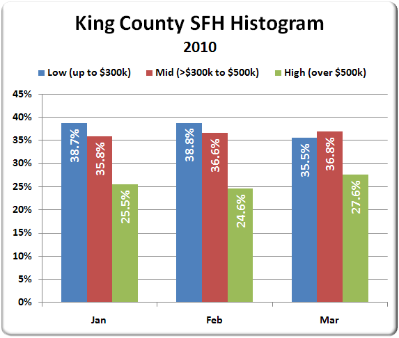
This may be getting a little too numbers-geeky for some of you, but I’ve had a few requests in the past for a histogram chart of sales prices. Unfortunately, since the NWMLS does not release the full breakdown of every individual sale, it has been difficult to obtain the necessary data to compile one on my own.
However, I have been able to extract all the individual sales for the first three months of the year, so let’s have a look at a simple histogram for January, February, and March, each broken into three price bins:
- Low: up to $300,000
- Mid: >$300,000 to $500,000
- High: over $500,000

Not a whole lot of variation between January and February, but there was definitely a noticable shift away from low-priced homes into the high-priced homes in March.
Looking at the sales data in this way can help us to understand some of the movement in the median price. Since the median in a given month is just the sale price that half the other sales were above and half were below, a shift like this away from cheaper homes and into more expensive homes will cause a shift in the median toward the higher end.
Note that the data I am pulling comes from a combination of the NWMLS and the public records, so there are a larger number of sales being analyzed than in the monthly NWMLS releases. Here is a quick comparison of a few data points in my data set vs. the NWMLS:
| Month | NWMLS Sales | The Tim Sales | NWMLS Median | The Tim Median |
|---|---|---|---|---|
| January | 956 | 1,080 | $375,000 | $353,000 |
| February | 997 | 1,251 | $373,010 | $345,000 |
| March | 1,596 | 1,897 | $367,250 | $362,000 |
For those who are interested in even more data-geekery, hit the jump for a more detailed breakdown of sale prices in each of the last three months in interactive Tableau chart form.