Let’s check out the three price tiers for the Seattle area, as measured by Case-Shiller. Remember, Case-Shiller’s “Seattle” data is based on single-family home repeat sales in King, Pierce, and Snohomish counties.
Note that the tiers are determined by sale volume. In other words, 1/3 of all sales fall into each tier. For more details on the tier methodologies, hit the full methodology pdf. Here are the current tier breakpoints:
- Low Tier: < $255,632 (down 0.2%)
- Mid Tier: $255,632 – $389,649
- Hi Tier: > $389,649 (up 0.5%)
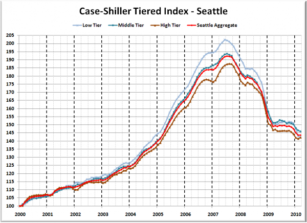
First up is the straight graph of the index from January 2000 through March 2010.
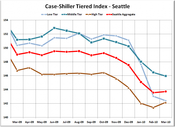
Here’s a zoom-in, showing just the last year:
The low tier and middle tier both continued to fall in March, while the high tier gained slightly. The low and middle tiers are again at a new post-peak lows. The low tier has “rewound” to November 2004, the middle tier to March 2005, and the high tier to February 2005 (same as last month for all three tiers).
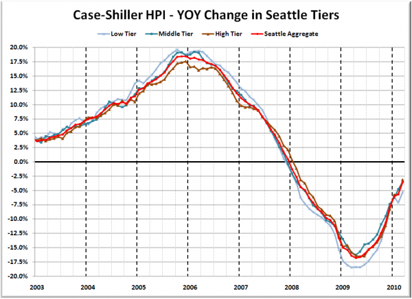
Here’s a chart of the year-over-year change in the index from January 2003 through March 2010.
All three tiers fell less YOY than a month ago, since March 2009 was the last month of big MOM price drops. Here’s where the tiers sit YOY as of March – Low: -5.3%, Med: -3.5%, Hi: -3.1%.
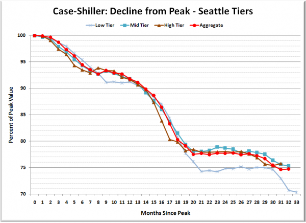
Lastly, here’s a decline-from-peak graph like the one posted yesterday, but looking only at the Seattle tiers.
The low tier is still way out in front of the other two tiers, though just short of forcing me to re-scale the vertical axis on my chart.
(Home Price Indices, Standard & Poor’s, 05.25.2010)


