Let’s take a look at May NWMLS statistics from around the sound. As usual, courtesy Tableau Software (available free to use online), the Around the Sound update is rocking sweet interactive data visualizations.
Feel free to download the old charts in Excel 2007 and Excel 2003 format. To get specific info about a certain point on any graph in the post below, float your mouse pointer over the data.
Before we get to the cool stuff, here’s the usual table of YOY stats for each of our eight covered counties as of May 2010.
| May 2010 | King | Snohomish | Pierce | Kitsap | Thurston | Island | Skagit | Whatcom |
|---|---|---|---|---|---|---|---|---|
| Median Price |  1.1% 1.1% |
 9.7% 9.7% |
 2.2% 2.2% |
 1.5% 1.5% |
 7.3% 7.3% |
 0.9% 0.9% |
 6.2% 6.2% |
 4.1% 4.1% |
| Listings |  3.6% 3.6% |
 1.6% 1.6% |
 3.4% 3.4% |
 4.1% 4.1% |
 11.4 11.4 |
 5.1% 5.1% |
 2.7% 2.7% |
 12.5% 12.5% |
| Closed Sales |  34.6% 34.6% |
 25.3% 25.3% |
 16.7% 16.7% |
 20.6% 20.6% |
 21.4% 21.4% |
 9.3% 9.3% |
 35.1% 35.1% |
 23.3% 23.3% |
| SAAS | 1.44 | 1.54 | 1.80 | 1.44 | 1.67 | 3.10 | 1.98 | 1.59 |
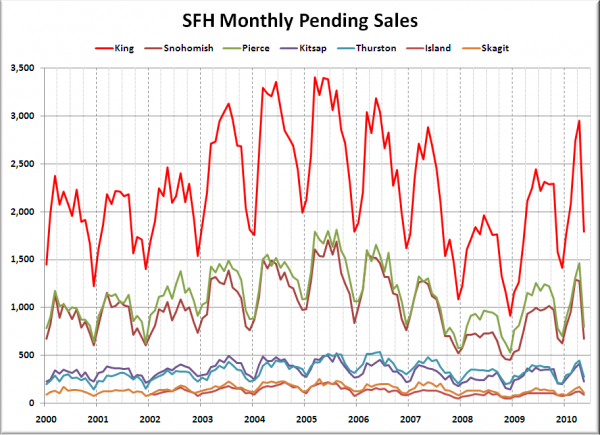
And again, one more county bumped into positive YOY territory for listings this month. Now just King and Snohomish are below where they were a year ago. Meanwhile, pending sales fell April to May between 30% and 48% across the Sound. Completely unprecedented.
Summary
Hit the jump for the rest of this month’s visualizations.
The visualization below looks at closed sales in each county in May 2009 and May 2010:
Closed Sales
The huge YOY surges in closed sales shrank considerably around the Sound in May, with Island actually flipping from +48% in April to -9% in May. Yowza.
Here’s our comparison of median prices in each county at their respective peaks and in May 2010:
Change from Peak
Still in the tax credit holding pattern.
Seasonally Adjusted Active Supply
The expiration of the tax credit led to a drop in listings (sellers know the party’s over), but since closed sales won’t likely drop off significantly until July, the SAAS reading is skewed downward in May and will probably be low again in June before a likely increase in July.
Just for kicks, here’s a bonus chart from the old spreadsheet, showing pending sales back through 2000. Keep in mind though that the NWMLS broadened the definition of pending sale in July 2008.
Note how incredibly out of the ordinary it is to see such an extreme drop in a second quarter.
